Play game
Hyperdrive Havoc's itch.io pageResults
| Criteria | Rank | Score* | Raw Score |
| Do the animations/effects improve the player experience (game juice!)? | #23 | 3.758 | 3.758 |
| How cohesive is the game art (do all visual elements work well together)? | #26 | 4.061 | 4.061 |
| Overall | #27 | 3.630 | 3.630 |
| Did you enjoy this entry? | #28 | 3.424 | 3.424 |
| Is the art appealing (do you want to spend more time in this world)? | #30 | 3.485 | 3.485 |
| How well was the Theme implemented? | #32 | 3.424 | 3.424 |
Ranked from 33 ratings. Score is adjusted from raw score by the median number of ratings per game in the jam.
Which team were you in and what was the modifier for your team?
Team Endmark - 2 Button
Which game engine did you use?
Unity
If you are chosen as the wildcard will you continue in the competition?
Yes
Leave a comment
Log in with itch.io to leave a comment.


Comments
Love it, love it, love it! Creative controls, beautiful pixel art, satisfying VFX, what is there not to love?
Very unique controls, pretty hard to get used to, but still fun. Nice graphics and very fitting audio. Cool entry!
Did the best I could with that 2 button modifier. That one threw me off! But I'm glad you found it fun. That's the ultimate goal, yeah?
I appreciate the feedback and the kind words!
Hey there BF! Nice work on a rock solid arcade game. I played it a half dozen times and never even got CLOSE to the leaderboard, but it was really fun. Haha. The sprites were adorable. The itch page was complete, inviting, and told me everything I needed to know (which is weirdly rare in jams... why don't people do that? It's so little work compared to all the coding and stuff.)
Anyway, since you seem like a super chill guy who sincerely wants a lot of feedback, I've made a few notes. Take 'em or leave 'em! ... hope something in my rambling is helpful, in no particular order. (AND YES this is an invitation to please give me absolutely any criticisms on my games so I can get better) Now, these are more about the game than the graphics... which I completely get isn't the point of this round... but anyhoo...
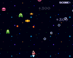
1) I found the score super motivating... it would cool if the score was way bigger so I can read it without taking my eyes off the action.
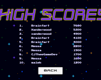
2) on that note, it would be cool to see the lowest score on the leaderboard displayed above my score (or maybe even a "fake" leaderboard score that tempts to try one more time) ... anything to up that sweet tension as the player gets closer to their next goal. Maybe at 10,000 points you get a new rocket or something haha I never got that far? If so it would be cool to see that goal as I'm chasing it.
3) With so much going on, it'd be interesting to knock back the background stars to 30% or 50% and see if that helps the sprites pop ('course that might actually take away some of the challenge)
4) The protag flashes (I think to indicate a period where you're invincible) but the flash is a little slow so it makes it hard to see where your rocket is while it's invisible. Might be interesting to try flashing 2-10x faster so the eye doesn't lose the rocket's location.
5) Like the score, your extra "mans" is a critical piece of info. Would be neat if that were way bigger.
6) It's a hard and frantic game, which is GOOD, but it might be nice to have a "learner wave" where the enemies don't shoot yet, so you can get your bearings before it gets really challenging.
Thanks again for your niceness and leadership on the discord! You're the best!
Hey, now THIS is the kind of stuff I like! Super constructive and good reasonings to go along with it. All really solid suggetions. Definitely on the "take 'em!" side.
The UI/visual elements are all fairly simple suggestions. I can make those happen!
The lowest leaderboard score is a fantastic addition. Will take a little work, but I can add that to my leaderboard template.
The 10,000 points unlock is partially in place. That and a few other features were added (powerups and whatnot), but in the interest of time/balancing were cut. Maybe if I keep going on this in round 2...
Learner wave, also started but cut for time.
All absolutely spot on advice and I agree with your logic behind all of them. I appreciate all the feedback!
And sure thing! GDKO is one of my favorite game jams. I got SOOO much helpful advice and progress in the past. So anything I can do to help pay it forward, I'm there. Cheers!
i found it Kinda annoying with the movement but i guess thats the modifier that you had to use😅
Hey, that's completely fair. Tried the best I could with the modifier. You win some, you lose some. I appreciate the feedback anyways!
Very cool and clever implementation of 2 buttons, although I'm definitely pretty bad at it myself! I loved the simplicity of the whole setup, while still giving me a challenge to work towards in trying to master that control scheme. One small thing I noticed was all the enemies were shooting directly at me, which was causing some unfortunate situations when I was in the corner with no path out. I think it would be neat if there was a little random variance to the angle at which enemies shoot at you, that way there's a bit more unpredictability in there as well. All in all though, very solid entry, I enjoyed it!
That's a great suggestion! Give a little more lenience to the player. Adding that to the to-do list if I use this in round 2.
Super satisfying game! The controls took a little getting used too but it felt super fun. The art and vfx came out great as well, nice job :)
Tried to do the best I could with that 2 button modifier. That sucker threw me for a loop!
Glad it felt fun. That's the ultimate goal, yeah? I appreciate all the kind words!
Clever use of two buttons, but I was not very good at it. The art and effects were really great.
Thanks! I appreciate the kind words!
I love how you went for the option to let the player shoot instead of just left-right movement, and the overall artstyle is really nice
Thanks, ProSmashy. Did the best I could with that 2 button modifier!
As others said, a clever way to sneak in 2-button! Though I only wish there was some in-universe, onscreen visual reinforcement as to why this was the case, versus just the automated sliding left.
Very cute and fun you got (indirect, ofc) assistance from your son!
That's a great point. If I continue this in future rounds, I'll certainly add in the visual reinforcement! Great suggestion!
Right? I never honestly considered the idea that regular people like me could make games until I was well into my 30s. I just wanna make sure he sees all the different possibilities open to him. Seems to be working so far! (Plus its just darn fun.)
Great use of the 2 button modifier! Also great use of the asset packs you listed to create a cohesive vision. It's a "simple" game in concept, but definitely challenging! (for me, anyway... XD) It's also awesome that you let your son "help" on this.
If you carry the game through to a future round, I'd like to see some difficulty balancing/scaling. I probably just suck at the game, but I did find it hard to ramp up to a flow state where I could consistently dodge bullets. Also, maybe a quicker restart after dying.
Best of luck in the round!
Difficulty and scaling are definitely on the agenda. There's actually a few other mechanics already implemented, but I cut them due to time constraints. (And I think I made the right call. But we'll see...)
All completely fair feedback, and I appreciate it!
Clever use of the 2 button modifier. This element adds a new perspective on simple space shooters. The idea of a leaderboard in a game jam game is nothing short of impressive. Great job!!
It was actually my wife's idea! And it worked surprisingly well. (Maybe I should listen to her a little more often? ...Nah!)
Thank you for the feedback!
The leaderboard may be beyond my skill level haha. Fantastic game! The bullets looked really cool.
I only think they got on there because of a bug early on. Corrected after Loten pointed it out. Now I can't on there either! (Developer reset is in order, methinks...)
Thank you for the kind words!
This is pretty impressive. The art looks amazing and everything fits together soo good. I really like the music in the title screen :)
Thank you for the compliment! Cohesion was something I really struggled with last year. You made my day with this!
(I haven't forgotten about your video feedback!)
My boy Brainfart coming with another banger! This was a lot of fun and super addicting. The sound design and the quick games had me coming back for more and more (eventhough Im not good lol). The implementation of the 2 button modifier is impressive (I truly think that was the hardest one). A good ole arcadey fun time!
Not a fan of 2 button, honestly. But I did what I can to get that classic arcade feel. Glad to see it came through!
I appreciate all the kind words and the feedback. Cheers!
Very fun, just wish I was better to get my name on that score board!! Everything matchs perfectly color and art!!
I only think they got that high because I missed something prior to the submission. They got on there before the bugfix!
I appreciate the feedback!
Very fun game, glad to see my name is just about on the leaderboard for the time being. Really like the explanation of the hyperdrive being damaged and it works really well with the 2 button controls
I can't claim authorship on that one. My wife came up with the idea! Felt perfect, so had to integrate it into the lore. Wasn't sure people would catch it, but I'm glad they did. You made my wife really happy!
I appreciate the kind words and the feedback!
Holy I cant believe the scores some of the players got, I tried, I got better and then I gave up (I realised can never get on the board lol). Lovely art sound and overall design well done and you definately nailed two button modifier with the interesting movement mechanic :)
Yeah, it's pretty nuts. I think there was a bug early on that was letting people get a little higher. That's been corrected, so I think that may be why it's a little harder to get on there. Slightly unfair advantage. Making note of that for future rounds...reset once the jam deadline is up.
Really appreciate the feedback and the kind words. Cheers!
Always look forward to playing your entries! Really love this, the animations and effects are great, and I love how vibrant the sprites and background are. Sometimes I struggled a bit to see the enemy bullets because they blended in a bit with the background, but that might just be a me thing lol. I think you implemented the 2 Button modifier very well, the controls felt great!
I really appreciate all the kind words!
That's completely fair on the bullets. I've been researching different accessibility options lately, so things like this are slowly becoming more and more on my radar. I'll make sure I have that contrast bumped up in the future. Some great feedback there.
nice use of 2 buttons! the game is very difficult but the leaderboards make me want to try again. great job!!
Tough modifier, but I'm glad I hit the mark!
I appreciate you playing and taking the time to comment!
I really like how vivid the colors are and the sprites are a good fit for the gameplay. Might be cool to add some variety to the background for more of a sense of progress as you play through the game. Overall really nice entry!
Completely fair. Multiple levels of parallax coming in the future, just for you!
I appreciate the feedback and you playing.