Play game
Spellbound Rollers's itch.io pageResults
| Criteria | Rank | Score* | Raw Score |
| Presentation | #1729 | 3.271 | 3.271 |
| Enjoyment | #2010 | 2.856 | 2.856 |
| Overall | #2213 | 2.966 | 2.966 |
| Creativity | #3001 | 2.771 | 2.771 |
Ranked from 118 ratings. Score is adjusted from raw score by the median number of ratings per game in the jam.
How does your game fit the theme?
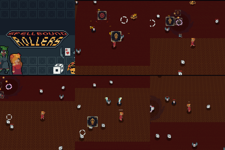
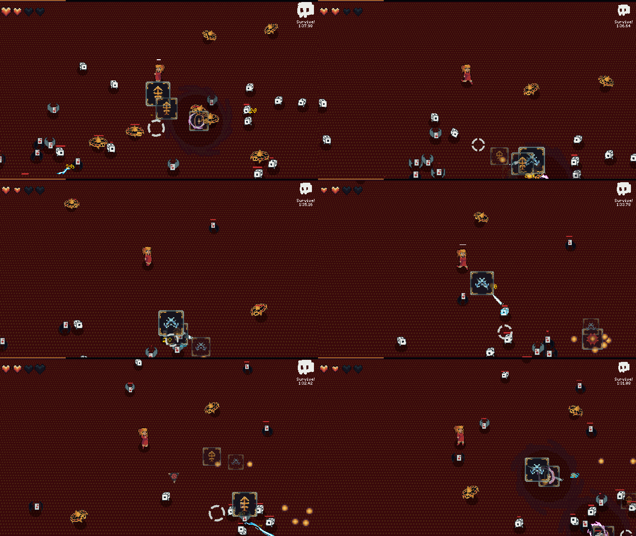
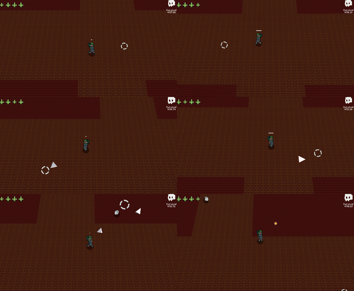
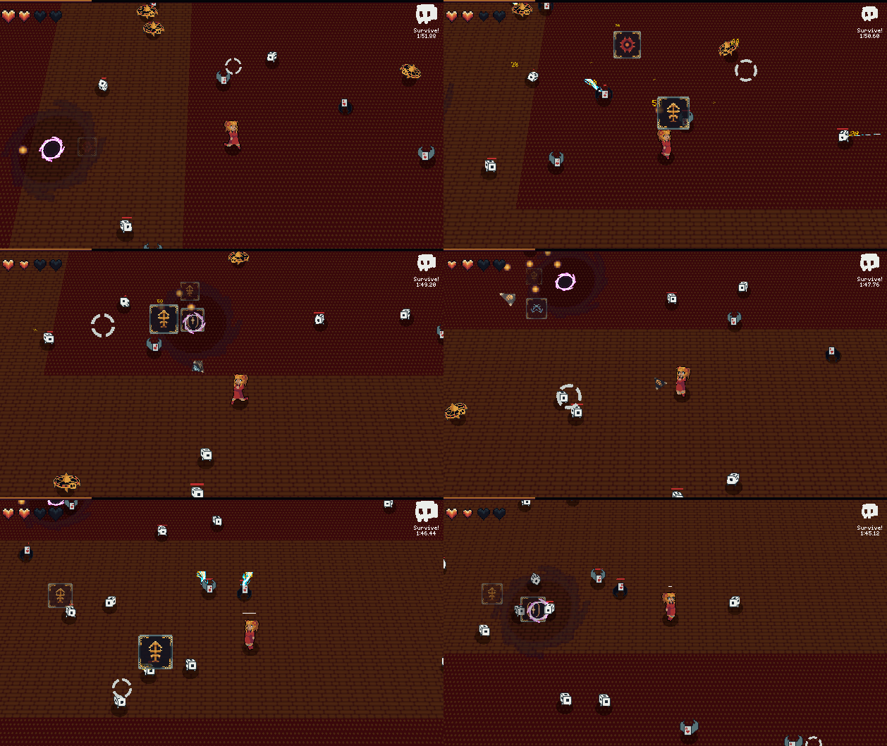
The player attacks by rolling a dice. Depending on the upgrades they have purchased, when the die lands on a certain number it triggers a certain spell. As well the theme of the game is around a casino with rolling dices, flying cards, and roulette wheels.
Did your team create the vast majority of the art during the 48 hours?
Yes
We created the vast majority of the art during the game jam
Did your team create the vast majority of the music during the 48 hours?
Yes
We created the vast majority of the music during the game jam
Leave a comment
Log in with itch.io to leave a comment.



Comments
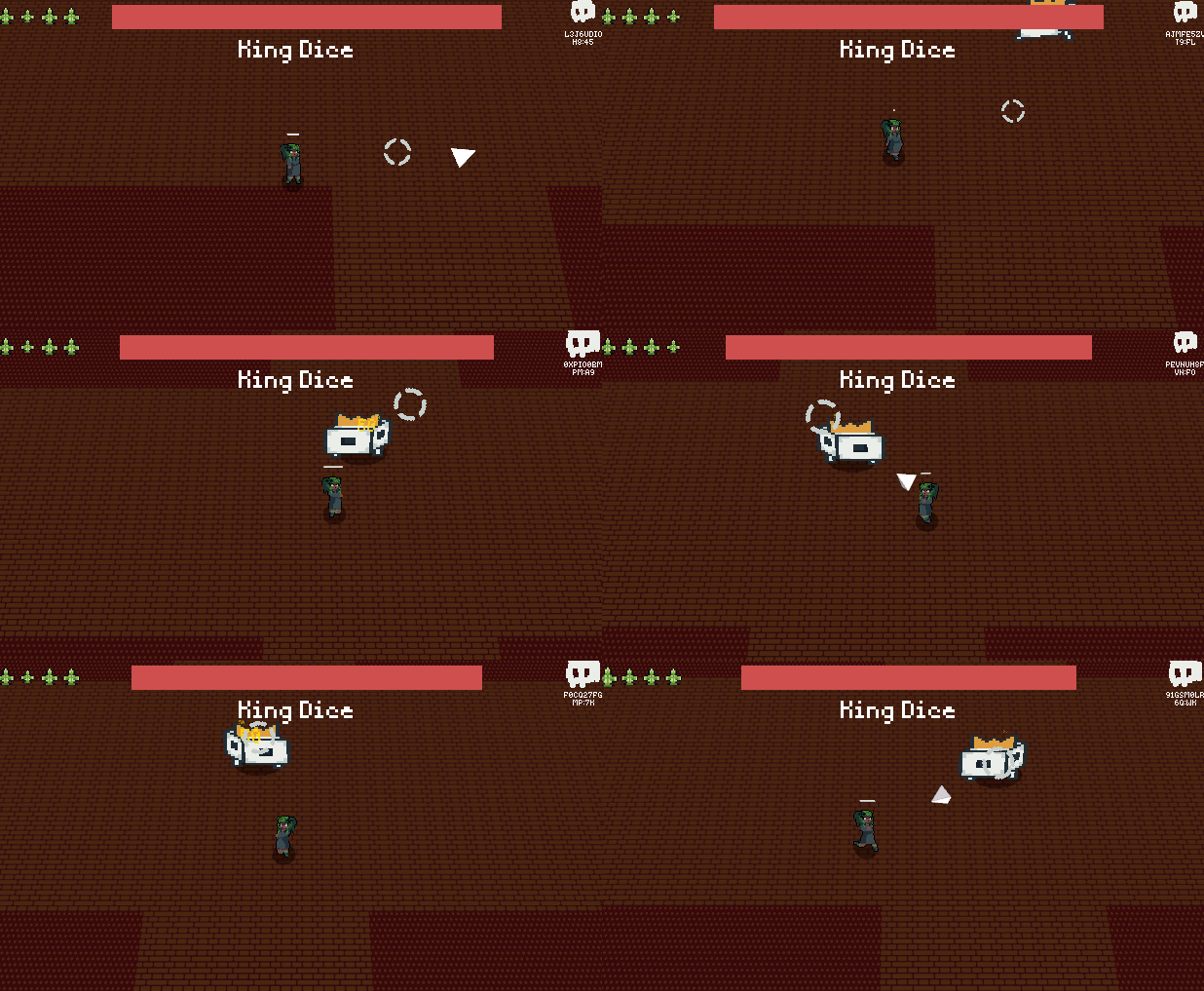
Really good visuals and sounds. Gameplay is cool, but I feel I'm just running in circles while shooting to get the xp, and no much more skill involved. I had like 5 minutes left but my screen was full of dices everywhere. The king dices were spawning more and more, but my clear rate was never up to the summoned ones, so I had nothing to do but run. I liked it though, it was fun. Will definitely be checking the post jam version
the main disappointment is that a girl is running backward when you are trying to run to the right :D
Apart form this, the game is fund and the visual part is lovely!
Nice job!
The character direction is based on where your mouse is pointing. If you run to the left + your mouse is to the left then you'll be walking forwards but running to the right + mouse to the left = running backwards. Same for running to the right
Oh! Thank you for the clarification!
In this case, the game is great without any drawbacks!)
This is so well presented, clean, and intuitive. I love the aesthetic and the upgrading aspect makes it stand out among similar games. Not sure if it was because I played the web version, but my attacks always seemed to fall short or not be as responsive as I expected. I think someone else also mentioned this, but increasing the player's speed just a bit would make it feel a little more fluid. Either way, man, this was so well done^^
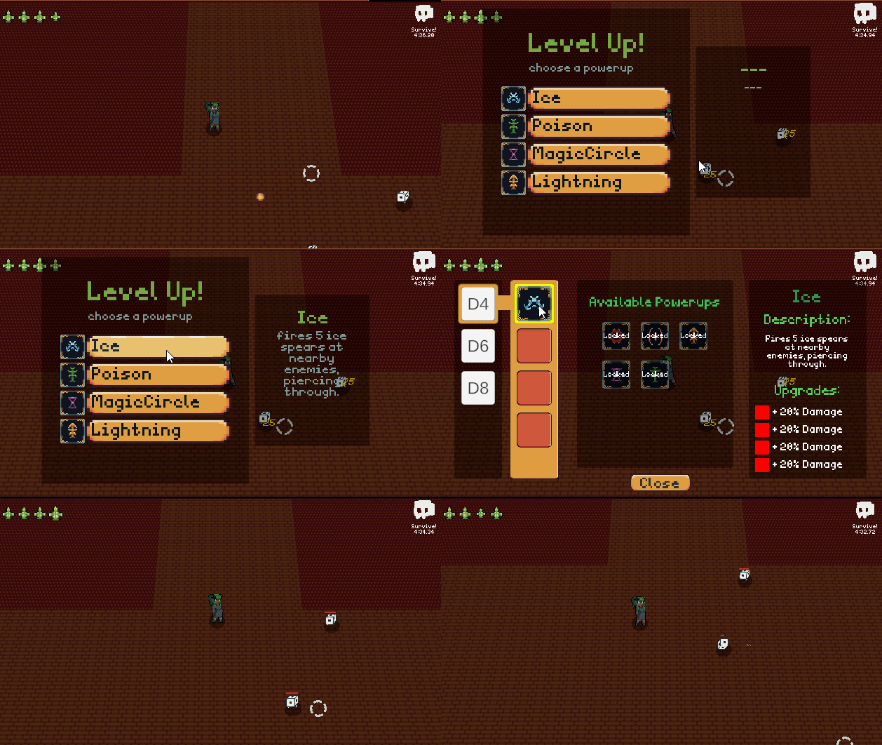
I enjoyed this. Survived like 6 minutes and started fighting these giant Dice. the powerups were satisfying to trigger and leveling up felt good. I did keep getting ++ on things and was never sure if it would upgrade it more or was already maxed. Fun concept and cool effects and sounds to add to it. Had a good chill time. I do kind of wish the die roll was represented on hit with like a particle effect for the side it landed on or something for more feedback. Overall solid game for the gamejam!
I think a lot of aspects have been pointed out by other comments like the long survival time and weapon game feel, so I won't repeat those. I think the game right now has a really interesting rougelike upgrading system, though some of the spells doesn't seem to have a low trigger chance. I really liked the feeling of gradually power up and use more spells, but I couldn't last more than the 7min mark, maybe a offer health refills as an upgrade? Other than that, I think it could also be interesting to have upgrades that changes the fire rate or projectile size, to give the upgrade system more depth. I saw you guys are gonna keep working on this, so good luck!
I like the art in this game, and it is a really good concept, but on the difficult side and long side. I couldn't get to most of the content in the game after a bunch of attempts. For a jam game, in my opinion, you should make it shorter and easier so people can experience everything your game has to offer. I also think there should have been some more visual and especially auditory feedback for firing weapons. Attacks just didn't feel great to fire. I think you were going for a chaotic feel, but most of the time I just felt overwhelmed with enemies and couldn't kill them fast enough to level up and handle them. My biggest problem is the difficulty because I really wanted to try out these spells and play through the whole game but after a while it just started to get annoying because I couldn't progress past a certain point. With a little more balance and polish this would be a really good entry, good job!
Well put together, but I think this would have been a better "jam" game if you had aimed for a 5 minute experience
The character selection idea sounds really nice, it's unfortunate that you didn't have enough time to give them skills. The upgrades are really nice and satisfying to hit, though I would've wanted more visual feedback for the hitting itself. The enemy really overwhelmed me most of the time, considering how much damage I do to them. Most of the exp I should've gotten was left alone since the enemies are blocking the path. It also would've been cool if the enemies were also 3d, considering the projectile was 3d already.
Nice concept and gameplay! Adding different enemies would shake things up a little, and increasing the player speed would make the gameplay feel faster.
I'll be very honest, this game kinda feels like a bunch of asset packs thrown together trying to make a cohesive experience. The sprites aren't consistent with one another, as an example, the main character's sprite has a way more realistic and anime-esque artstyle with black outlines, while the dices have a way more simplistic artstyle with blue outlines. The songs, while good, also don't fit with one another, I can't explain this very well since I'm not a musician but the main menu song has a more whimsical and cloudy feel to it, as the song that plays while you're fighting has a way more medieval and naval feel to it. The controls on the menus can also be a bit confusing since you can't use the mouse in the character select screen, while you can in every other menu. The level up screen can also be quite jarring since it stops the gameplay completely. Great game but needs more polish. P.S: sorry if I sounded harsh, it wasn't my intention.
Yeahh some of these are bugs some are definitely due to it being rushed. My logic with the outline differences was the black outline would make the player stand out more compared to the enemies but yeah it feels a bit off. The controls in the main menu was a bug that we unfortunately couldn't fix in time before we had to submit. Thanks for the feedback!
It would make more sense if the player's outline were blue and the enemy's one red.
I too have made a similar game. I quickly threw away the idea of the moving camera for a more snappy and predictable control. The concept is really not that bad. Especially the core mechanic: the powerups. They are different and worth to get, each and every one! Maybe I would have added some differentiation among the enemies and the background! :D
Hope to see it refreshed after the jam ends!
Very nice sprites work for the playable characters, and a good amount of content. I think combat is really cool especially with all the upgrades available. I am honestly impressed so much was done with so little time. If you choose to expand on this game post jam, my suggestion would be to make the combat more punchy audio wise. overall, its a very cool game.
Fun to play and lots of content for making it in 48 hours!
You implemented a lot of features in such a short time, impressive! I think the enemies should have some kind of feedback when they're hit. In my opinion, the small dices are way too fast. I like the Vampire Survivors formula so I had a lot of fun playing this game too. My team and I also made a similar game, just implemented it very differently than yours. Nice to see how many interpretations there are of the same idea. Anyways, i think you did a great job on this submission.
Nice art! Might wanna adjust the pacing a bit and introduce more enemies faster. Also, it seems that the gravity and magic circle never came out during my gameplay. Apart from that, I like the idea of getting different powers based on your dice.
Wow so many devs! Y'all managed to pull together a lot of features in such a short time. Well executed! Thanks for stopping by the stream to share! :D
Great art and music. Love the variety of powers. I'm a big sucker for satisfying feedback, so I'm kind of sad that there wasn't any sound effects or much visual for attacks/taking damage. Wasn't in due to time constraints I'm sure, but definitely would have upped the enjoyment for me. Nice job!
Thanks for playing! Yeah we unfortunately ran out of time before they could be added, they're coming in a post jam version though!
I like the idea, and the art is really good! But I had a hard time getting the magic effects to trigger.
Not the most original but i definitely liked the pixel art. Nice game!