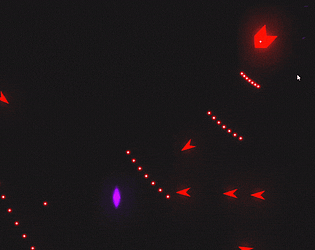
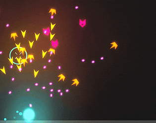
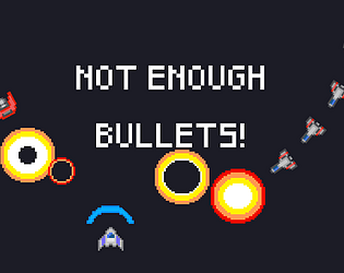
I had feared the icons would look like pickups. So when you run out of ammo you reroll a new weapon and the icon over your character is the reroll animation selecting a new powerup. When an enemy dies it rolls a buff as well so it also shows an icon over where they died. The boss icon is a permanent buff (if you max out all his buffs and kill him you win) while the grunt enemies get a temporary buff for that life and basically exist to annoy you. The boss icons definitely look like powerups though since they're buff icons for the boss itself (+boss hp, + boss speed, + boss shoot pattern, + enemy spawn). I'm glad you still enjoyed the game though!
Durbo
Creator of
Recent community posts
The presentation was superb but I did find the gameplay a little lacking. I think I rolled rather luckily on some of the encounters so I ended up not really using any of the dice that reduce your number. Also there was a bug where the game let me walk past the last encounter. I think I failed the roll once and then the arrow appeared?
Sticking cards into enemies and the walls was a nice touch and I can definitely feel the gungeon inspiration. I would suggest capping the firerate and letting the player hold down fire to continually fire since I sort of just mashed click really fast to DPS down the boss (also will help prevent carpal tunnel!).
It's oddly satisfying gradually become so powerful that everything just kind of dies when you breath on it. I liked the enemy spawn rate early on it felt pretty well balanced if you were trying to play more greedy.
One issue with giving every enemy chase AI is that you'll notice that they bunch up a lot and then the player will gravitate towards circle strafing that blob of enemies. One way to help mitigate this without having to introduce more enemy types is to give the enemies some push away factor from each other so they're less inclined to bunch up so heavily. You can look up boid flocking for a relatively simple way to introduce some spread.
I'd also maybe tone down the offensive upgrades since bullet count and penetration are basically stacking multipliers to your damage and can easily snowball the player DPS.
I liked the aesthetic and firing to the beat while trying to dodge and aim was pretty fun. I would've liked to see a change in the tempo that maybe correlated with a different weapon type. Sound effects would be nice too but I'm guessing you couldn't quite get that in the time limit of the jam. Oh also I would like the see the HUD either not overlap with the game field or be more minimized since sometimes things could get lost under the HUD.
I also found the physics a bit too fast on the ball. I felt like the ball would roll over an activated flipping and into the drain even from a pretty low height and sometimes it was a little hard to react in time. The visuals were great and while it was a little confusing what was going on I honestly feel the same when I play actual pinball since I'm more focused on trying not the drain the ball.
Being able to rotate the camera was nice to check where each side is but it's still hard to track multiple sides mentally as you move about. An undo button would be very helpful for the later levels especially level 6 where it was hard to remember what steps I had already taken upon restarting. The aesthetics were nice; clean and minimalist is usually looks good when done well.
I like how it's like battle yahtzee-poker and it's a good gameplay loop. I did find it was kind of hard to parse the enemy turn since it would happen so fast and there wasn't too much visual feedback on what was going on.
I also ran into some bugs where the enemy would die(?) and then it would be replaced with a boss and my cards would be different or the enemy would die prematurely and I would get to pick loot.
It was a little confusing at first but the point system made sense in the end. The input was also a little confusing at first but honestly it just felt like classic jank gameboy input in a somewhat endearing way. I think the overall strategic aspect of the game would be improved either playing against a human or having multiple CPUs with personality so you could try to guess what kind of strategy they would use. Otherwise against a faceless CPU it's sort of arbitrary on what they're going to do.
I liked having to roll moon physics to be able to make some jumps and would have liked to see more effects like that. For example if there were enemies in the game I would consider an effect that makes both you and the enemies faster. I also felt like the default move speed was too slow and it getting back from the checkpoint tedious.
Explosive jumping is always fun. I would've liked to see a visual or audio timer for the dice to explode (ticking or a bar) since it kept trying to sync my jump with the explosion. Granted, if you roll a high enough dice you really don't need to jump but as someone who got into rocket jumping in TF2 you can't make me not jump for every explosion.
I think the camera could be zoomed out a little I felt like I was getting hit by dice that I could not react to in time. I liked how there was a tradeoff between the dice type you rolled but I felt like there were a lot of situations in the later levels where there would be so many dice that I would probably die regardless of my number since I would probably be hitting two dice at minimum to make a risky play.
The zoomed it camera made it a little hard to follow the trajectory of a single die which made it a little hard to adjust my aim for the next throw. I liked how you weren't necessarily looking to score as many points as possible since it could screw you over for the next round if you scored too high.
There was a bug where I got all my dice eliminated via timeout and the game soft-locked but I wouldn't have won that round anyways so it's not a huge deal.
I played a bit more to about level 7 into the fourth area. The dark element definitely helps in making the game more varied. The light element on the other hand didn't really do much for me but it wasn't a bad inclusion either. I would suggest maybe shortening the tutorial since the relationship between the three basic elements is relatively straightforward (and even displayed at all times). I would also suggest the restart button be always visible since sometimes you know you already messed up and it's kind of annoying to have to start spamming moves to get the prompt or exit out and go back in.
Lastly, I exited on level 7 (I think?) and the map looked like this where 7 is missing (8 was not the level I exited out of):
The change from colors to elements definitely makes the game a lot more intuitive. Unfortunately it makes it a bit too easy to remember so I ended up sort of not caring about elements since it was fairly trivial to set it up so that the end result was the correct element. Then the game basically became a find the right numbers that add up to the sum you want affair which wasn't too exciting.
It would probably be better to not have the camera rotate when you change directions since it makes it hard to aim properly. The enemy bullets are also too fast to really react to in time to dodge. It was kind of hard to be tactical with the buddy system in general which means I ended up just running around spamming jump and shooting in the general direction of my enemies. It also seems like you can't hold down shoot to continuously fire which can be pretty annoying.
The added dash mechanic helps a lot of with trying to get across the screen in time. I would've liked to see some kind of indication that the dash ability was on cooldown/ready such as changing the player color when it's down. The game speed felt fine but I only reached like 600ish in my score so I'm not sure about capped speed. I would also suggest you make the player explode when they hit a red square since it's kinda odd that you can just move around after losing.
Having objectives in a stage system makes the game more fun since you have a more concrete goal. That said preventing the granny from getting hurt is sometimes kind of tough/annoying if the leash gets caught on a prop if you slingshot the granny too far by accident. I found level 4 easier than 3 since trying to avoid people and avoid the granny from hitting objects (including those people you're avoiding) required a lot more finesse compared to just running for the goal bowling people over. I didn't finish level 5 since I didn't really remember where all the hydrants were and didn't really want to go back and look for them in level 1/2.
If this game was 2 player co-op it would remind me a lot of We Were Here, which is neat. The game felt alright to play it did trigger my motion sickness a little bit but it was short and didn't require too much looking around so it wasn't too bad. Visually I would say the player arms are positioned a little oddly and combined with their floppiness looks a bit goofy (but it's kinda good in it's own way?). I wasn't sure if there was a solution to the coffee stain that wasn't just brute forcing. It did look a little bit like an 8 or 9 so that's what I guessed. The vitiligo (I'm assuming it was vitiligo?) on one of the characters was a nice touch for distinguishing between the two.
The music fit very well with the sense of exploration. The speed you get flinging yourself off a planet was also satisfying, especially compared to firing your engines when you're limping in space. I did feel like if you missed a planet altogether it felt especially bad. Having to restart could get annoying if it happened late and if it happened early the music would restart which could get annoying as well.
Chaining and then destroying enemies was pretty satisfying. I liked how the chain dragged things together letting you set up some nice quick kills. I did feel like the melee enemies moved/aggro'd a bit too quickly and it was hard to react in time. The cooldown on the chain was also maybe slightly too long as well since if an enemy aggro'd you'd typically want to chain on a box then the enemy (unless you get lucky and they're already right next to a box).
I'm not sure how I feel about health being tied to energy. On one hand I totally get that you want to discourage just shooting since I noticed enemies take significantly more hits to kill unchained. On the other hand it kind of feels bad when you lose most of your health setting up the chain and then you don't actually have enough energy to kill the chained enemies.
This felt a bit confusing to play. It's hard to keep track of which viewport is yours since they're all linked and it jarringly adds/removes a viewport when you create/delete a clone. The synchronous movement essentially turns the game into a turn based one; which isn't a bad thing. Making it turn based does give you all the time you need to get your bearings but it's a still hard to reorient yourself every time you make/delete/swap to a clone. Additionally, putting delete and switch on the same button makes it hard to know if I'm deleting a clone or not. Lastly, the lack of a persistent crosshair (there's only the cube that tells you where the clone is going to be spawned) makes it hard to know if I've selected a clone or not for deletion. I can't help but think that maybe this concept might have worked better in 2D since it's a lot of information to juggle in 3D—especially since 2D allows you have a fixed third person camera to see the whole field.
The idea and theme are pretty interesting but I felt like if you didn't find enough resource nodes in time you someone would die. I also thought the nodes turning red to show the ones with the least resources was a bit misleading since all your nodes could be pretty stocked up but they would show up as red if they were the "lowest" which would visually indicate they were lacking.
The game looks great and flipping between the two mountains was cool. I felt like sometimes it would be unclear whether I could climb a certain area or not since the jump seemed to be inconsistent. Unfortunately I got rather motion sick playing this since the FoV was a bit low and the mouse sensitivity was rather high (or rather, my mouse sensitivity/DPI was probably high but I couldn't lower the look sensitivity in game).
Each level of skeleton completeness being different was a nice concept but I would've liked to see switching between the forms being used more like giving up bones on purpose to cross a gap a certain form can only cross. I also though the full skeleton form was a bit too slippery—maybe some acceleration from standing to full speed instead of hitting full speed instantly would help with correcting the movement.
I really appreciate that the player has acceleration instead of instantly moving at max speed as it makes small movements way easier. I think the pits on the last level that required you do form a chain of buds to get the bud out were a little annoying since if I fell in the pit by accident it would require restarting the level. I think maybe turning the pits into a hazard and then putting the buds in a little alcove would better communicate the intention.
Here's a crude picture of what I mean:

The game has a nice polished feel and I like the difficulty of trying to control yourself in a frictionless environment. I also like how when something is attached to your ship the steering is changed since your center of mass is different. That said I felt like it was unreasonably hard to connect your ship to other modules especially in mission 2. It was also hard to tell where I should bump my ship into a module to connect it. Lastly, I think it would help if the game displayed your speed and direction so you would have a rough idea how fast you're going when there isn't anything on screen to use a reference point.
The puzzles were nice and I liked the little cute ending. I think I missed out that the buttons were toggle in the stage that teaches it by doing the puzzle correctly the first time. It made me think the buttons were one time use and would be wasted if the pillar was frozen; which threw me off on the last level.
Satisfying movement and destruction. I would say making the attacking hitbox for the player more generous would help a lot with those very close shots that seem to just whiff. I would also like to see some of the magnets to rotate the opposite direction. Well, maybe the later ones do but I'm just too bad to get far enough.
This reminded me of that one japanese game show where the contestants had to fit in an incoming wall with a cutout that would get increasingly absurd. Besides all the input bugs (which are understandable for a game jam) I liked this game. I especially like the coin mechanic which makes the player try some risky strategies that might end up costing them a piece. I would suggest that the wall patterns changes when you are down to 3 cubes to be more restrictive since it didn't seem like I would get any 3 block sized patterns.


