On Sale: GamesAssetsToolsTabletopComics
Indie game storeFree gamesFun gamesHorror games
Game developmentAssetsComics
SalesBundles
Jobs
TagsGame Engines

"Planetary Exploration Company" (Early alpha)

A topic by Christian Ibarra created Jun 04, 2021 Views: 3,872 Replies: 67
Viewing posts 1 to 60
(4 edits) (+2)

A simulation, managment, experimental, minimalist, exploration, crafting game. I will be posting news about it every week.
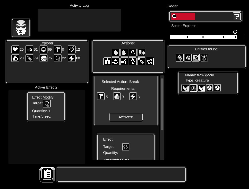

Hi, this is my first devblog of the early alpha of my game.

Link to the game page.

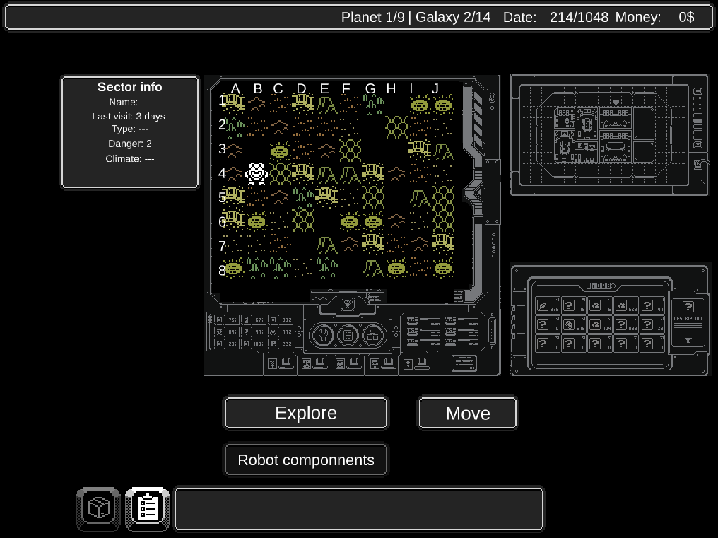
This is a very early version of the prototype, you cannot play from start to finish, but you can try a few things and have some idea of what type of game this is, and where its going.

In this first version of the game, these are the most important things you can do:

  1. Inside the Base:
    1. Check a few resources to build in the "Refinery". But you cannot build anything yet.
    2. Check a few tools to build on the "Workshop".
    3. See the list of available jobs to complete.
  2. Outside the Base:
    1. Click on a sector first.
    2. Then Click "Move" to move the robot to the selected map sector.
    3. Click "Explore" to send an employee to explore the sector.
  3. In the "Explore" screen:
    1. You can advance to explore the sector and discover new unknown entities.
    2. To reveal their identity, click on "Inspect".
    3. Try to do an action over a selected property of the entity to reveal its effects.

What I want to know:

I want to know If I should keep working on this game. I'm not sure if enough people are interested in playing this type of game. So I want to ask you a few questions:

  1. Are you interested in the ideas presented in the game?.
  2. Should I keep adding new mechanics and features?.
  3. What things you don't like?.
  4. Are there things you would like to see added to the game?.
  5. Do you want to follow the development of the game?.
(+1)

Seems like an interesting concept and I like the vibe from it, simulation/tactical survival.

To answer your questions:

1. yes 

2. first I recommend concentrating on the core pilar mechanics and later you can expand them if you want

3. the visuals can use a bit of polish, the interface can be a bit intimidating at first.

4. I am just curious about the natural process of development

5. from time to time


Thanks a lot for trying the game and for posting a reply! :D

1. I'm happy that you are interested in it :D

2. I will.

3. Can you elaborate on this?.

4. What do you mean?, can you be more specific?.

(+1)

I did not try the game yet, my feedback is based on your above presentation and screenshots 

3. Sure, there are a lot of buttons and tabs during the game, this can invade players with too much information at once. There is a difference between complexity and deepth.

4. Sure, I am a developer myself and it so happens that I develop/enjoy the type of sim/tactical/strategy games and I like to see how devs create these types of games naturally without me interfering in their creation.

(+1)

3. I'll keep that in mind. I like the complexity though, but I will pay attention to what people think about that, and change it if they don't like it. I do have planned a progression where you add more features and complexity the more technologies you unlock though.

4. I see, I'll try to write devlogs with people like you in mind then :)

Thanks a lot for your feedback!.

(+1)

3. yes, procedural unlocking features done right, will make it seem like a reward for the player rather than a plain tutorial.

4. That is very nice of you, tnx. 

Looking forward to more updates, please do post some gifs too when you have the possibility.

(+1)

Here's what I worked on this week:

  1. The quantity of resources needed to complete each job now depends on the difficulty rating of the planet.
    1. Higher rating means: more resources to deliver. Harder to complete jobs.
    2. Lower rating means: less resources to deliver. Easy to complete jobs.
  2. The quantity of the resources gathered while exploring now depends on the difficulty rating of the planet.
    1. Higher rating means: its harder to find enough resources. Harder to complete jobs.
    2. Lower rating means: its very easy to find enough resources. Easy to complete jobs.
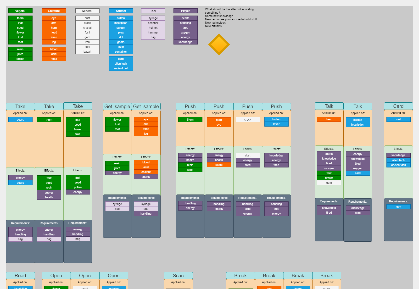
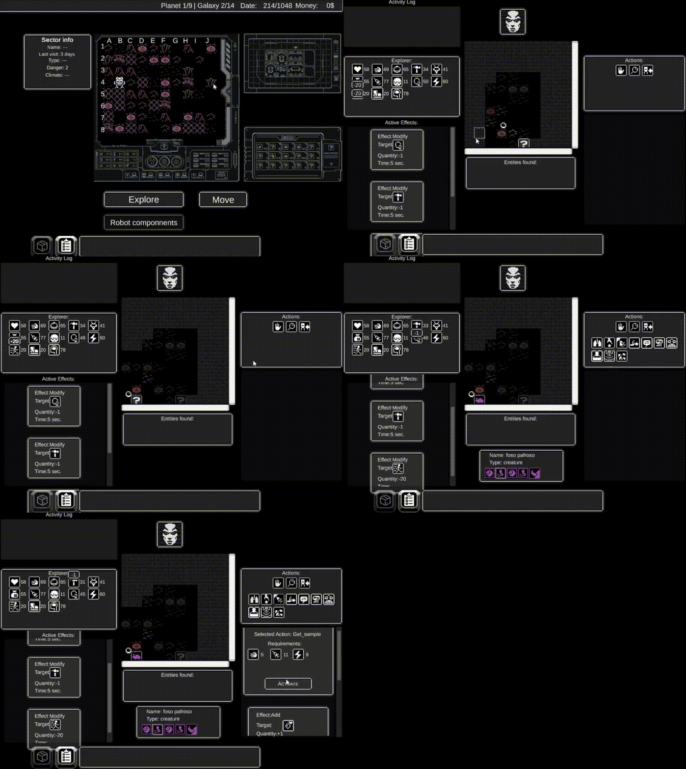
  3. I designed the actions better so that they make more sense when trying to find which ones will work and which won't.
    1. (Check the graphic for extra info about this).
  4. Added more resources that can only be gathered by doing specific actions on specific properties of entities.
    1. I still need to paint the sprites for them, so for now they all share the same placeholder graphic, that means its unplayable for now.
  5. Changed the layout of the actions so that they are visually organized a bit better.
  6. I won't upload a new version today because I think you cannot play with this changes, so it does not change much with the previous version you can play right now.

About the graphic/diagram:

When I design games, I first start writing ideas in a numbered list (like the one above). But at some point, everything starts to get very confusing and hard to think about.

So, I start making diagrams to make the design easier to understand and to analyze. This graphic is an example of that.

I color coded each type of entity, and section, and I can easily copy and paste, move, and drag and drop object wherever I want. This makes designing so much easier because I can evaluate and compare things really fast, which is really hard compared to going up and down a numbered list.

This diagrams shows specifically which actions work on what type of entity,  the effects they have when applied to different properties, and the requirements of each.

This diagram is also easy to convert to code. By the way, I use "diagrams.net" to make my diagrams and graphics.

(+1)

This is what I finished this week:

  1. Added new sprites for new actions, entity properties and resources.
  2. Now each entity “specie” is a bit more unique and different from the rest, because each action can have varied effects over different species of entities.
    1. Example: if you break a fruit, one entity may give you “juice”, while other species of fruit will only give you “seeds”.
  3. Now you can complete jobs. The delivery button on the base should work.
    1. Choose a job by clicking on the “jobs list” button and selecting one job by clicking it. When you click “Deliver” it read the resources you gathered when exploring, and delivers the resources requested to the base.
    2. The completed job in the list is left marked as complete and cannot be selected again.
    3. When you complete a job, it pays you increasing your amount of money indicated on the upper right corner of the screen.
    4. In the future you will be able to travel to another planet once you complete a specific number of jobs.
    5. There are some resources already included so you can try this function quickly.

I uploaded a new version of the game with these changes mentioned above, its a new version that also includes the changes mentioned in the previous devlog, check it out too if you want details.

Link to the game page.


Here's what I worked on this week:

  1. The map state is saved (to memory, not disk).
    1. The robot position is saved.
    2. The entities that you find on each sector is saved.
    3. The actions that you apply to the entities you find are also saved. So if you go back to a sector where you activated actions, you will see that you cannot activate the same action again on the same entities than before.
      1. In the future I plan to reset the entities to their original state after a few days have passed.
  2. The map is made of sectors that contain biomes.
    1. You can recognize each biome by its unique tile graphic, that way you can also remember what is inside.
      1. If you need to find a specific entity type, remember how the tile looks, you'll find the same type of entities in other tiles that look the same.
    2. Each biome holds different entity species.
    3. Each biome has its color, and each planet has its own characteristic color.
  3. Entity species have unique colors now, so they are easier to recognize when you encounter them.
  4. Added a few new map biome sprites. 

The game is more playable than before, so please try it and let me know what you think!.
https://chrisibarra.itch.io/pec

One of the most important things I've learned is to be honest on how much fun I'm having with my own games, not as a game developer, but as a player. Because if I'm not having fun with my own game, probably other people won't have fun playing it either.

This week I realized that exploring sectors sucks. Whenever I had to do it to test something, I just feel I don't want to do it. It's very boring to just click "move" and wait for something to happen, and since exploration is one of the core experiences of the game, something that you will do very often, I have no other option but to change it and make it fun.

I succeeded at my initial goal, which was to simulate the experience of giving orders to an employee which is on the sector exploring, you should not be able to see anything because you are supposed to be inside a robot, you just receive information of what the explorer sees. In the end this experience is very boring.

Even though I succeeded in creating the experience I initially intended, I need to forget that direction I committed to, and change it for the good of the game and its success. This was not an easy decision to make, I wasted a lot of time designing and coding this part of the game, but I also realize I need to design something better, or else this game won't be fun enough, I will not enjoy it, and nobody else will enjoy it.

I hope to not make the same mistake again ( even though testing ideas is what prototypes are for, I could have saved a lot of time and effort ), so I started to write the design of my game in a slightly different way, now I write ideas in this order:

  1. Always keep in mind that the mechanics are just a "means to an end", not an "end" in themselves. The end is to make the player go trough a meaningful, emotional experience.
  2. First: define an objective, the experience I want to player to feel.
  3. Second: define requirements to be able to reach that objective, the things that need to happen in order to reach it.
  4. Third: propose a mechanic designed to achieve the objective, one that fulfills the requirements above.
  5. Fourth: define "why" each aspect of the mechanic exists, this is to make sure that each part of the mechanic exist for a good reason. Some ideas seem good at first, but should be discarded after finding that their "why" does not contribute to the objective.

Once I write the first draft of the mechanic, I correct it again and again, until I get a final version I can analyze further.

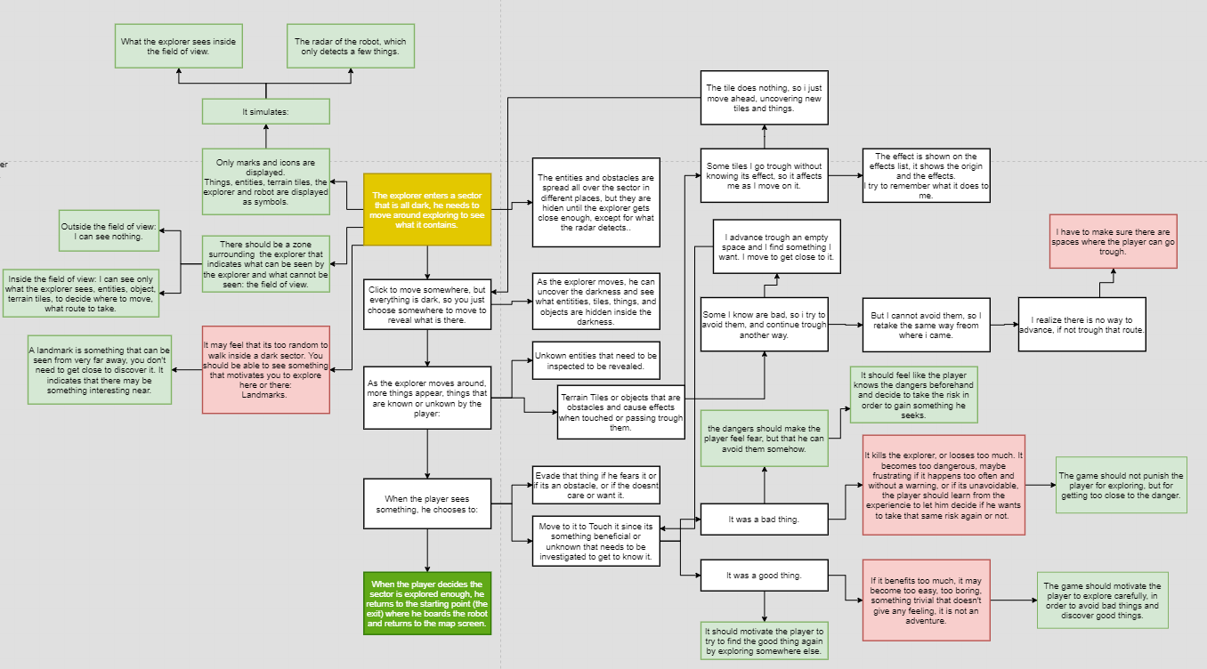
To analyze a mechanic its very useful to make a diagram of it, like the one below, where I write a step by step guide of the player experience. Then I analyze each step of the experience, I can write things I need to avoid or correct, I can write what possible thing could happen, that's why from one box can grow many arrows that point to other boxes.

(the starting point is in yellow, the red things are things I need to avoid, the dark green part is the exit).


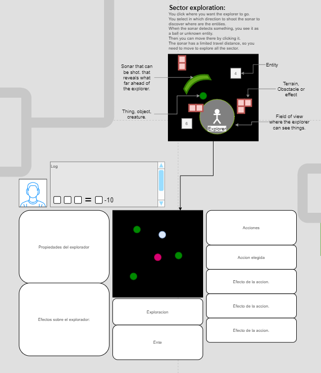
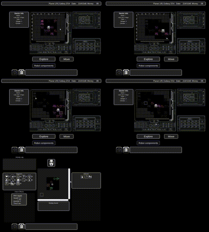
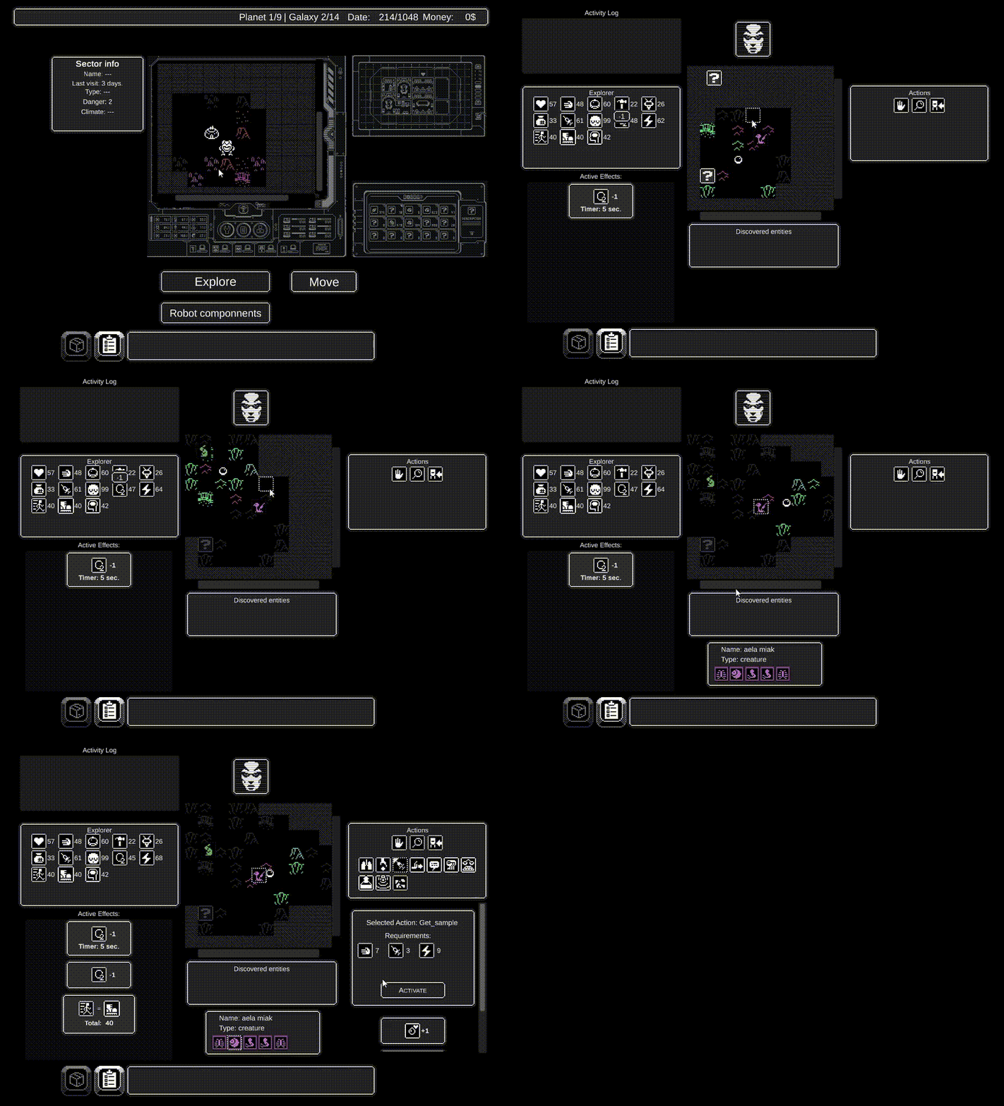
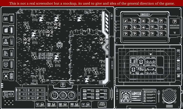
Besides the experience diagram, I also draw screen mockups with all the basic elements that could appear:


Well, that's it for today, I hope I created a better exploration experience, next week I'll start coding it.

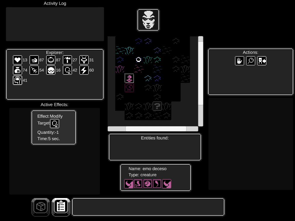
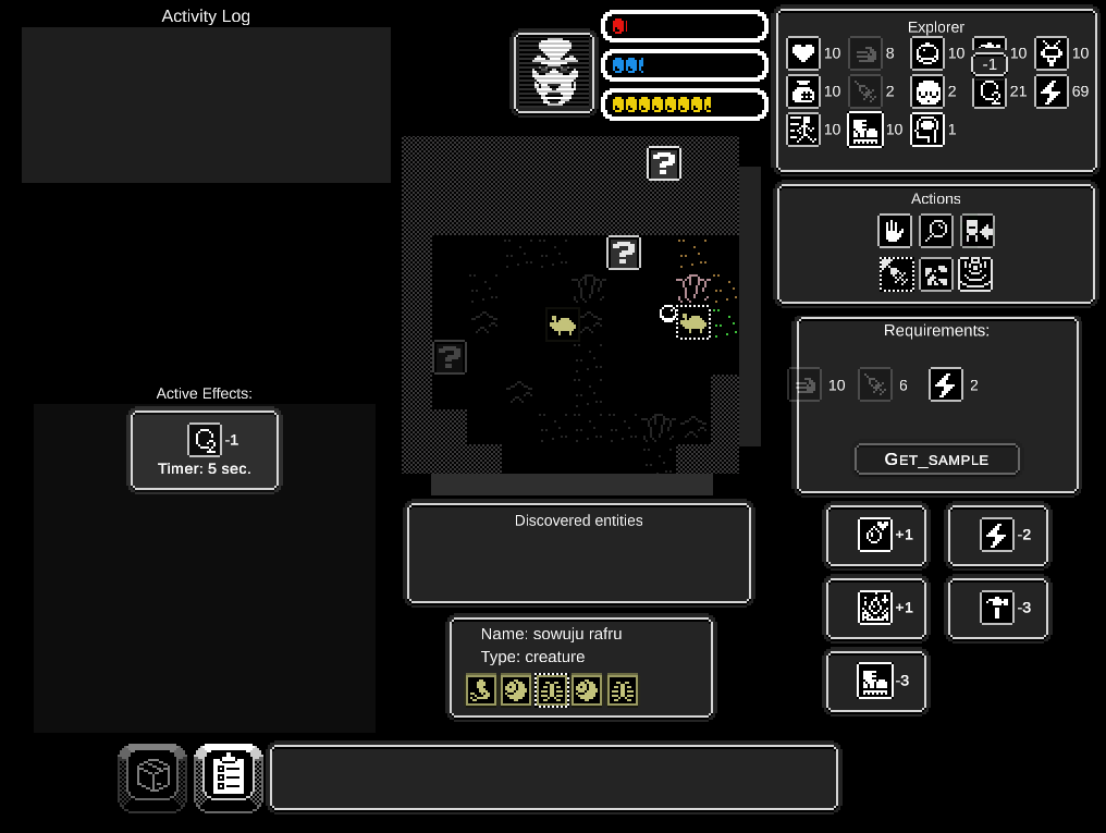
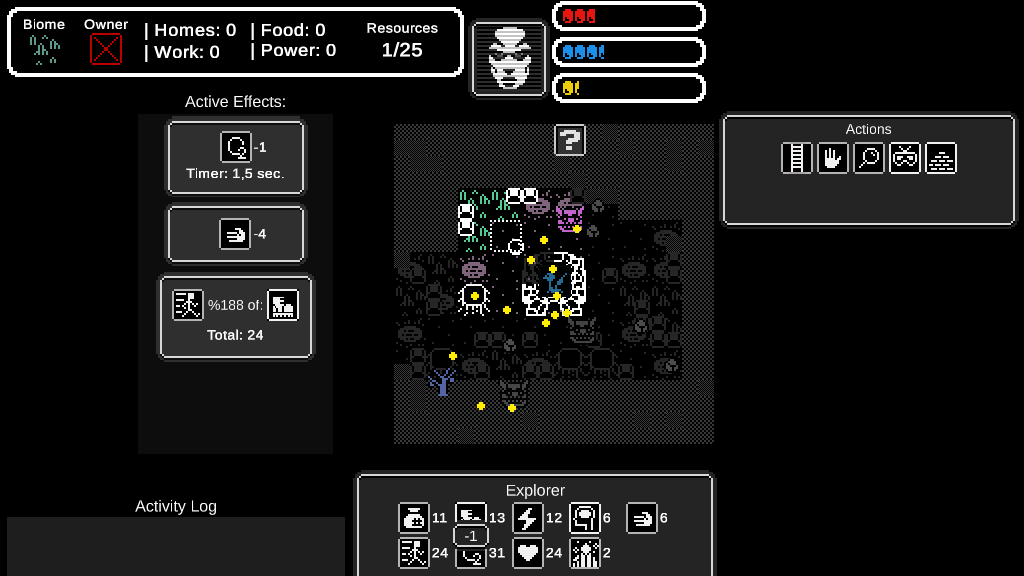
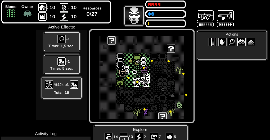
This week I worked on implementing the new exploration mini-game. Once you enter a sector and decide to explore it, you will see a small section in the middle of the screen where you will be able to direct your explorer to discover what the sector contains.

Besides finding entities like in the previous version, you will also find new terrain tiles, for now they only show graphics, but in the near future they will have different effects on the explorer. That way it will be more interesting to explore, having to evade some terrains that are hard or dangerous to traverse. Some could be too hot, like lava, or be walls that can be climbed with the right tools.

The things I implemented in this new sector map are:

  1. Fog: when you enter a sector it will be covered with fog, which hides the contents of each tile, when you get close enough, the fog disappears and it reveals what is underneath.
  2. Terrain depends on the biome: on the planet map you can see all the biomes of the planet. When you enter a map sector, you enter in its biome, which contains a specific terrain set for that biome. All other sectors of the planet that share the same biome will have the same terrain types.
  3. The sector is big: it can change its size too, some sectors can be bigger than others. If you hold your mouse button, and if you move the scroll bars, you can see more of the sector being explored.
  4. The sector has entities: like the previous exploration screen, the sector has entities you can inspect and gather its resources. Just choose an entity when you find it, click the "inspect" button, and wait until the entity is revealed.
  5. Click on the "return to robot" button to go back to the planet map screen.

I think this version of the exploration is much more interesting than the previous one, and has the potential of more possibilities, please try it and let me know what you think. Link to the game.

This week I worked on adding terrain effects: When you explore, and you touch a terrain, the effects belonging to that terrain are triggered and specific explorer properties are changed.


Each terrain can have a specific attributes, like "swamp", "rocky", "icy", etc, that determines which properties it affects, but each terrain has its own variation of those effects.

This allows for a lot of variety when you travel to different planets, since you will be able to find the same attributes, but with different effects, and its terrains, with different variations of those effects. The version I uploaded does not work perfectly yet, but it shows the main idea.

Try it here: https://chrisibarra.itch.io/pec

(+1)

That looks really good, and 90% complete? It's coming together nicely!

(+1)

Thanks a lot!, but its just 30% by the way, it still has a lot of things unfinished.

(+1)

Np, I must've miss read something. That game looks good enough that whenever you finish it could totally go on steam!

(+1)

I really appreciate your support, it gives me hope to keep working on it :) I'll upload it to steam for sure, when its ready to go on early access.

(+1)

Awesome!

  1. In this version you can explore the planet map with a new fog of war.
  2. It also has bigger dimensions which can change depending on the planet.
  3. You can drag and drop to see more of the planet map.
  4. The position of the robot gets saved after exploring a sector and going back to the planet
  5. I fixed some bugs on the sector exploration screen, now it detects only the terrain the explorer is standing on. Before it detected many terrains at the same time which provoked some bugs.
  6. The terrain effects while exploring should make more sense now. Each terrain has a couple of effects which can be viewed on the left side of the screen:
    1. All terrains affect speed of movement in some way, the speed is determined by the tool used to traverse the terrain, for example: boots.
    2. You can see immediately which properties and tools get affected at the top.
    3. If you want more details you can check the list at the bottom left side of the screen.
  7. Sorry for so little progress this week, correcting bugs took most of my time.


New things this week:

  1. Changed the active effects windows so the effects are easier to read.
  2. Now you can see the base on the planet map. You can enter inside too.
  3. Fixed being able to click map sectors outside of the window area.
  4. Fixed some visual glitches with the tooltips.
  5. Fixed opening multiple windows when inspecting entities.
  6. Added tooltips to the icons in the active effects section of the explore screen.

This week was mostly bug fixes, next week I'll work on improving the exploration experience because I still feel it's not good enough.

https://chrisibarra.itch.io/pec/devlog/278952/improved-exploration-screen

This week:

  1. Added the ability to shoot at creatures. Press the right mouse button to shoot anywhere you want.
  2. Creatures can move around the sector.
  3. Creatures can detect you when you discover them. For now they attack you on sight. Maybe later I can add stealth abilities.
  4. Creatures now have health.
    1. When you shoot a creature enough times, it dies, then you can interact with its properties, harvest its resources, etc.
  5. Changed how the effects of actions are visualized so now they are more simple and easier to understand.

    Link to the game page.

This week I worked on fixing GUI bugs, Unity is so un-intuitive sometimes, its hard to believe, I think I solved the problem now, but there are still some minor bug where some tooltips appear mixed with the tooltips below, I'll have it fixed for next week.

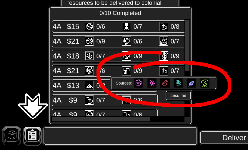
Now you can see in which entities you can find the resources inside the jobs list. You can see tooltips inside the tooltips, so if you hover over a resource, you can see the sources of that selected resource, and then the name of the source if you hover over it. There is also a little improvement where the bullet sprite changes when it hits a monster.

Link to the game page.

This week I worked on:

  1. Added a more immediate way to see your health, oxygen and energy, since they are so crucial to stay alive while you explore.
    1. Now you can see big bars of different colors next to the explorer portrait. They fill or deplete as the values of each property changes in real time.
  2. Actions:
    1. Added a few random effects for all actions, so that the decision to do it or not do it is more interesting.
    2. Action Requirements work once again. When a requirement is not met, the missing properties are highlighted so you know you need to increase it for next time.
    3. Changed which actions are available: the entity only allows the actions that can be done to it.
      1. Now its not so annoying or frustrating when you cannot do an action for no apparent reason. (I forgot to mention this on the previous devlog).
  3. Tooltips:
    1. Fixed the tooltips, now they look correct.
    2. Also added more tooltips to properties that didn't have them.
  4. Changed the UI of the exploration a little to try to use the space a bit better.
  5. Fixed bugs that appeared when trying some actions on a couple of entities.

Link to the game page.

Until now, I have been designing my mechanics with a type of diagram that goes from node to node (like the one above), that way I can analyze the player experience in a step by step manner.
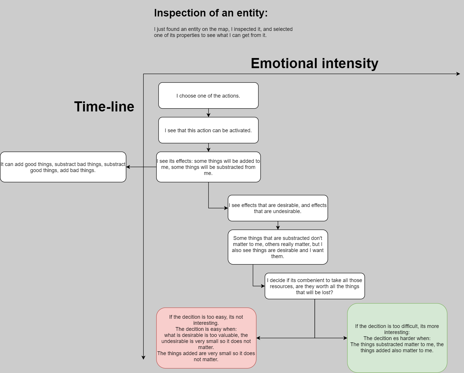
The bad thing about this way of designing the player experience, is that there is no way to visually measure the emotions the players feel, or when they feel it. So I created a new way to draw the diagrams.

With this new way I can better predict how the mechanics and systems will affect the emotional experience of the player.

I still draw nodes like before, but now they are placed in a X and Y axis.


The Y axis is the time-line, it shows how far apart in time each step is in the experience.

The X axis is the intensity of the emotion, so if its a very boring or subtle emotion, the node is to the left, and when its a very intense emotion, the node is to the right. The color green shows if its a desirable emotion, like happiness, and red for the undesirable emotions, for example boredom or frustration.

The latest way I used this was when I designed the effects of actions when exploring a planet sector. Before using this technique I had the problem of feeling that the effects where too boring, it was very easy make a decision, basically I had to activate all the actions since all of them were desirable, and that was boring.

So I analyzed this in the following diagram.

You can clearly see that there are some experiences that are more positive than others. If I see that a part of the experience is boring, I put it close the the vertical axis, and if its interesting I put in more to the right.

That way I can analyze the experience of play, and create a new mechanic that is a consequence of this analysis.

In this example, I could clearly see that I had to identify which properties where positive and which where negative, and then add a couple of them to the effects list of each action, that way I could make the player go trough a more interesting “decision making process” after deciding which effects where desirable and which where not.

This week I did these:

  1. Added a payment deadline:
    1. When you move your robot on the planet map, in-game time advances and days pass, if you reach the deadline you have to pay money for business maintenance and salaries.
    2. If you run out of money you go bankrupt and you loose the game.
    3. Hover your mouse over the deadline text at the upper bar to see a summary of your expenses.
  2. When you explore, if your explorer runs out of oxygen he starts loosing health until he dies.
    1. In future updates: You'll need to hire a new explorer to be able to explore again (I don't want to disable exploration since there is no way to hire employees right now).
  3. Creatures can attack the explorer and kill him.

  1. Added “news notification” pop-ups on the “planet map” screen.
    1. When an event happens, for example a deadline arrives, a pop-up appears so you don't miss it.
  2. Fixed dead creatures that revived when you touched them.
  3. Changed bullet size so its a bit more challenging.
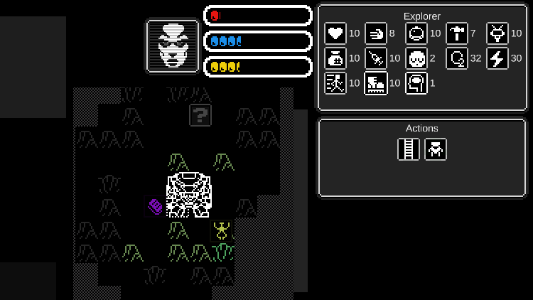
  4. Now the explorer has use the ladder to exit and enter the transport robot.
    1. If you want to explore a sector you have to use the ladder to exit the robot.
    2. When you want to leave the sector, first move the explorer to the robot, and then use the ladder, then you can return to the planet map.
  5. Here's a fun bug you can play with:
    1. If you shoot at the robot, the bullets will stick to it without disappearing.
    2. This will be fixed in the next update.

Link to the game page.

This week I worked on:
  1. Bullets no longer stick to the robot.
  2. Added a new continual effect when the explorer steps on a terrain, giving more variety to the terrains.
    1. Now the speed of travel is calculated by taking a percentage of an explorer tool. Example: Some terrains will use a percentage of the “boots” to calculate the speed of travel.
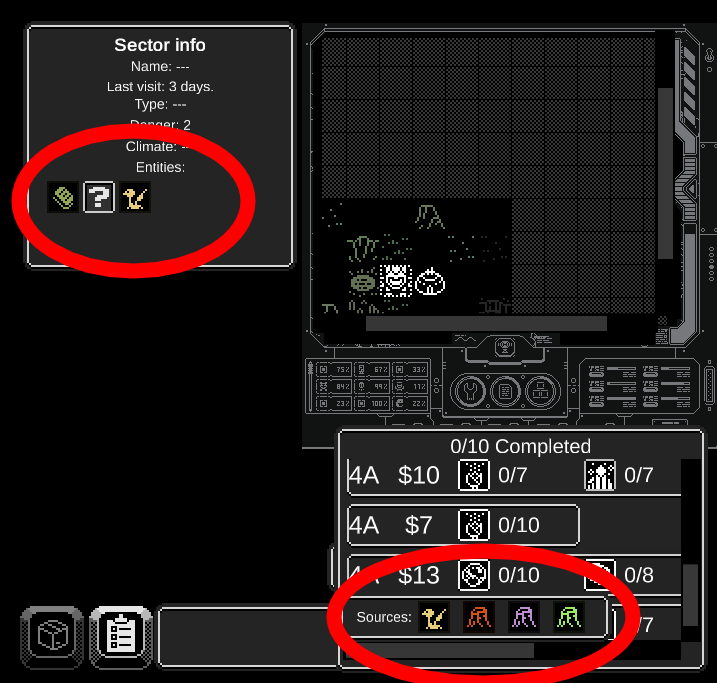
  3. Now you can see the discovered entities on the map.
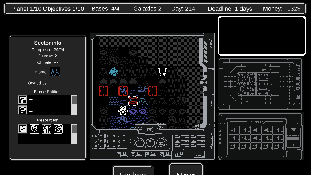
    1. Select a map cell on the planet map, and you will see the entities you discovered before inside the sector info panel.
    2. In this way you can select where to find the resources requested by jobs. You first need to explore the planet sectors to automatically save the location of each entity.
  4. Fixed a bug where the tooltips did not dissapear.
  5. Fixed other boring bugs.

Link to the game page.

This week:

  1. There is a new item Store on the base!.
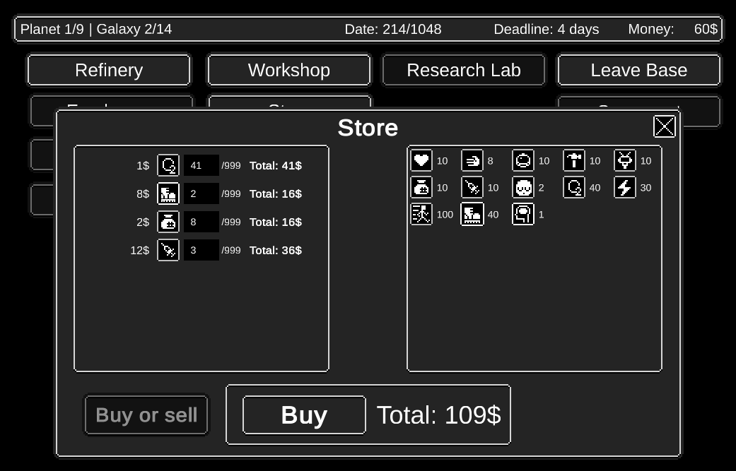
    1. If you run out of oxygen or other common resources, you can buy them at the store at the base.
    2. Just be careful not to run out of money!.
  2. There are new resources scattered in each sector.
    1. As you explore a sector, you can find resources laying on the ground.
    2. Just touch them to take them.

New things this week:

  1. Small resources scattered in sectors:
    1. Now they appear at the same time that a map sector is fully visible.
      1. Before, they appeared a second after discovering a sector, which looked weird since they appeared suddenly out of nowhere.
    2. There is more variety of resource types in each sector biome.
    3. Also the quantity of small resources gets saved: if you enter the same sector twice, you'll see that the quantity of resources stays just as you left it.
  2. Added a new action to see the resources of the terrain while you explore.
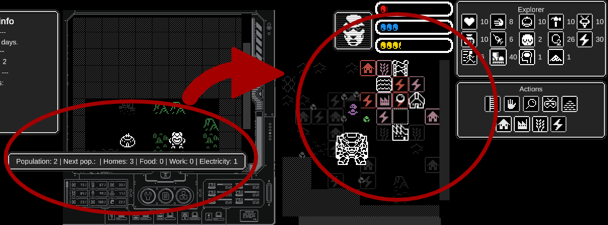
    1. This resources will be used to increase the population of the different bases in the planet.
    2. To increase the population you will need to build structures on top of these resources to gather them.
    3. Each base will have different resource requirements to increase its population.
  3. Added the ability to build structures to extract resources from the sector.
    1. These resources will be used to increase the population of each base.
    2. Each base will have its own requirements to increase its population, so these buildings will be used to meet those requirements.
    3. This does not work very well yet, it has some bugs and it's not completely implemented.
  4. When you hover over a base you can see its available resources inside a tooltip.
    1. Build structures to increase the quantity of resources.

This week:

  1. I worked on polishing the events system:
    1. Now you will be able to see branching narrative:
      1. Each action will open a different story branch, one branch if you fail, and another branch if you succeed.
    2. Each time you select an action you get:
      1. A section that tells you if you succeeded or failed the action.
      2. The effects of the actions.
  2. I started working on the employee management screen, when I finish it:
    1. You will be able to see available candidates for hire.
    2. Compare between actual employees, candidates, and between each other.
      1. You will be able to compare inventories/stats, name, face, and payment.
    3. Hire and fire employees.

I will not upload a new version this time since there is no actual new things to play with.

New this week:

  1. Last week I worked on the Hiring window, where you could find candidates and add them to your employee list, this week I polished it a bit more, but its not finished yet.
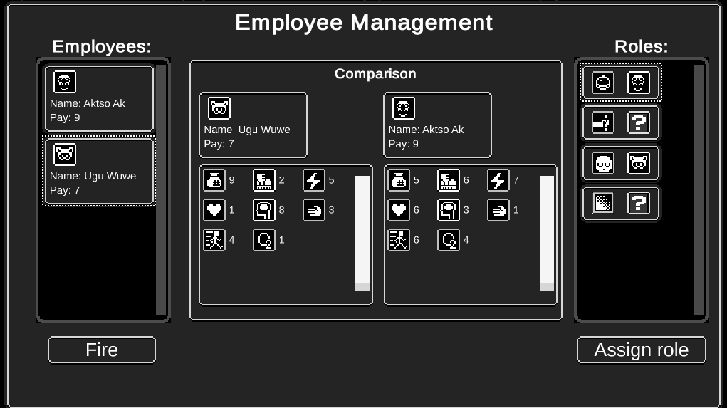
  2. I added a window where you can assign roles (or jobs) to the employees that your hired in the base.
    1. You can compare them.
    2. You can fire them.
    3. You can assign them to different roles like "Pilot", "Explorer", "Medic", etc. Since your bipedal robot is so big, you'll need to fill different roles in order to perform different activities, and also be as efficient as possible.
    4. You can see which employee is assigned to each role and also if a role is empty.

This new features are not playable yet but I think they will be ready for next week.


(4 edits)

This week I have a playable version you can download:

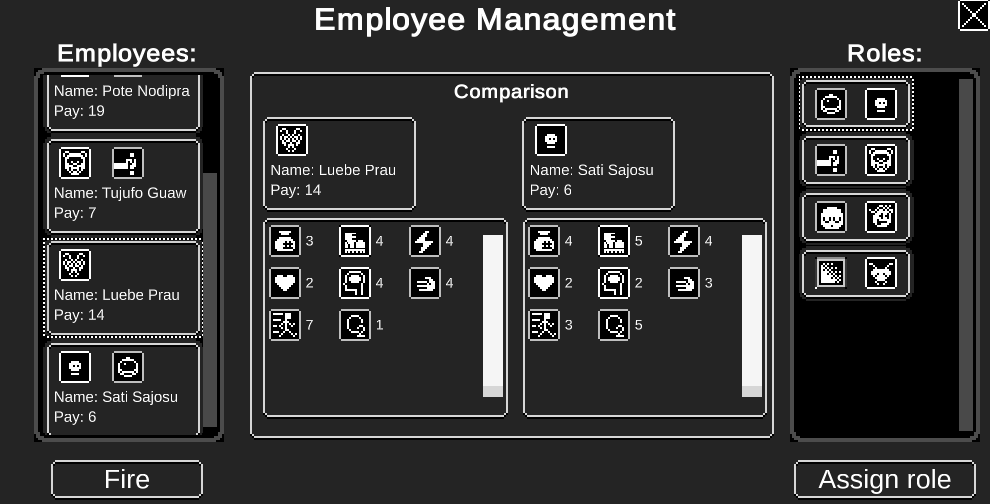
  1. I finished working on the "employee hiring" window and the "employee management" window. You can can hire, fire, change roles, and compare candidates and employees.
    1. To hire employees, click the "Hire employees" button at the base (the screen at the beginning).
    2. To manage your employees and change their roles, click the button with the "person" silhouette at the bottom left of the screen.
  2. I also worked on the tooltips, they should appear less of them and be less confusing.
  3. The deadline tooltip when you hover the deadline at the top bar also is updated, now it displays the total amount of employees and their payments, that amount will be discounted on the next payment deadline.
    1. That means the more employees you have to pay for, the more money you need to keep you company alive.


Try it here: https://chrisibarra.itch.io/pec


This week, I changed some things that make the game more playable, so I'm interested in receiving your feedback.

  1. Changed the text of the introduction window to explain a bit better the objective of the game.
  2. Entities will only appear once seen by the field of view of the explorer.
  3. While you explore a sector: There is a radar that shows creature position in a sonar like manner.
  4. Fixed a bug where you moved to the same place you where shooting.
  5. Now you can see the population inside the base, and how many resources you need to extract to advance to the next population level.

Try it here: https://chrisibarra.itch.io/pec

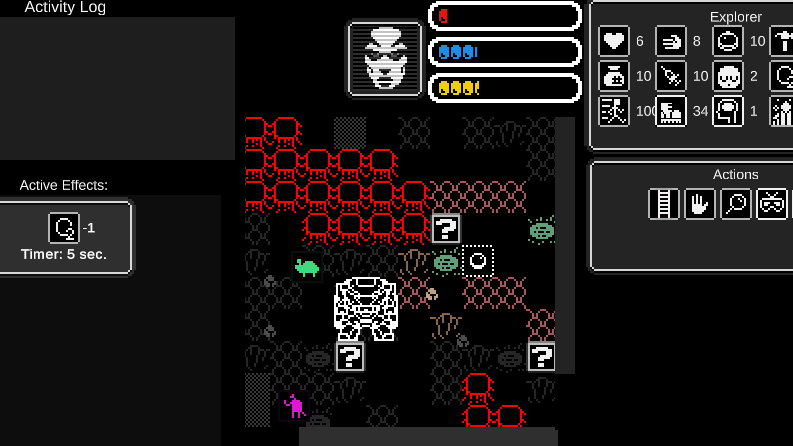
This week I started working on procedural maps, so that exploring planet sectors can be more fun. I implemented perlin noise and cellular automata to create them, but its not playable yet since the explorer goes trough the walls instead of being stopped by them, that's why I won't upload nothing today.

You can see an initial implementation in the screenshot, the walls are the red tiles, which are placed proceduraly.

This week I had to re-do the movement of the explorer, so that the explorer could collide with the new walls, it works well with the new system but there are a few details to work on, like for example the creatures appear on top of walls and can go trough walls, so I'm not going to upload nothing this week until I can polish this part a little bit more.

After so much work, trial and error, learning, bug fixing, etc, I got path-finding to work: This means that the creatures in the sector will chase you and avoid walls at the same time.

That's the main improvement in this new version, sorry it took so long. At first I used a plugin called "navmeshplus", but that has problems with using "AI agents" inside scroll views (which is where I put the sector map previously), actually it appears all methods have problems with that.

Then I switched to "A* pathfinding project", and it has similar problems with using it inside scrollviews. So in the end I changed the way I display the sector map entirely, the effect is the same, but internal workings are different. Besides that, this is also new: Bugfix: now you can drag and drop the sector map while you move the explorer, that way you can see farther away more easely while you explore.

Try it here: https://chrisibarra.itch.io/pec


New this week:

  1. Fixed: the explorer moved randomly when shooting, now it moves normally.
  2. Fixed: you could drag the map while shooting which was a bit disorienting, now the camera stays still while you shoot.
  3. Fixed: when the explorer collided with a wall, he could not reach the destination you clicked, now the explorer reaches your intended destination even when he collides with a wall.
  4. Visually re-arranged the exploration screen so its a bit better experience.
  5. The movement of the explorer is now more precise: when you move to a tile, the explorer is not centered inside it, it stops exactly where you clicked.
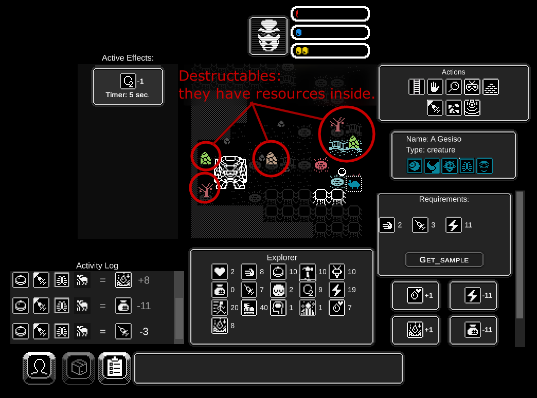
  6. Destructables: I added new objects that can be destroyed to extract its resources. This makes the exploration a bit more fun since there are more things to do.
    1. Each object has its own “health” and has a specific explorer property that needs to be used in order to destroy it, the value of the property will determine the amount of damage it does to it.
      1. This is not displayed anywhere in this version but it will, in the near future.
    2. To extract its resources, just move near it, and then click it many times until you destroy it.

Try it here: https://chrisibarra.itch.io/pec/devlog/325815/new-destructables-are-harvestables

New this week:

  1. When you explore and click on a destructable object: Now you can see its health, and what property is used to destroy it. The higher the value of that property, the faster you can destroy it.
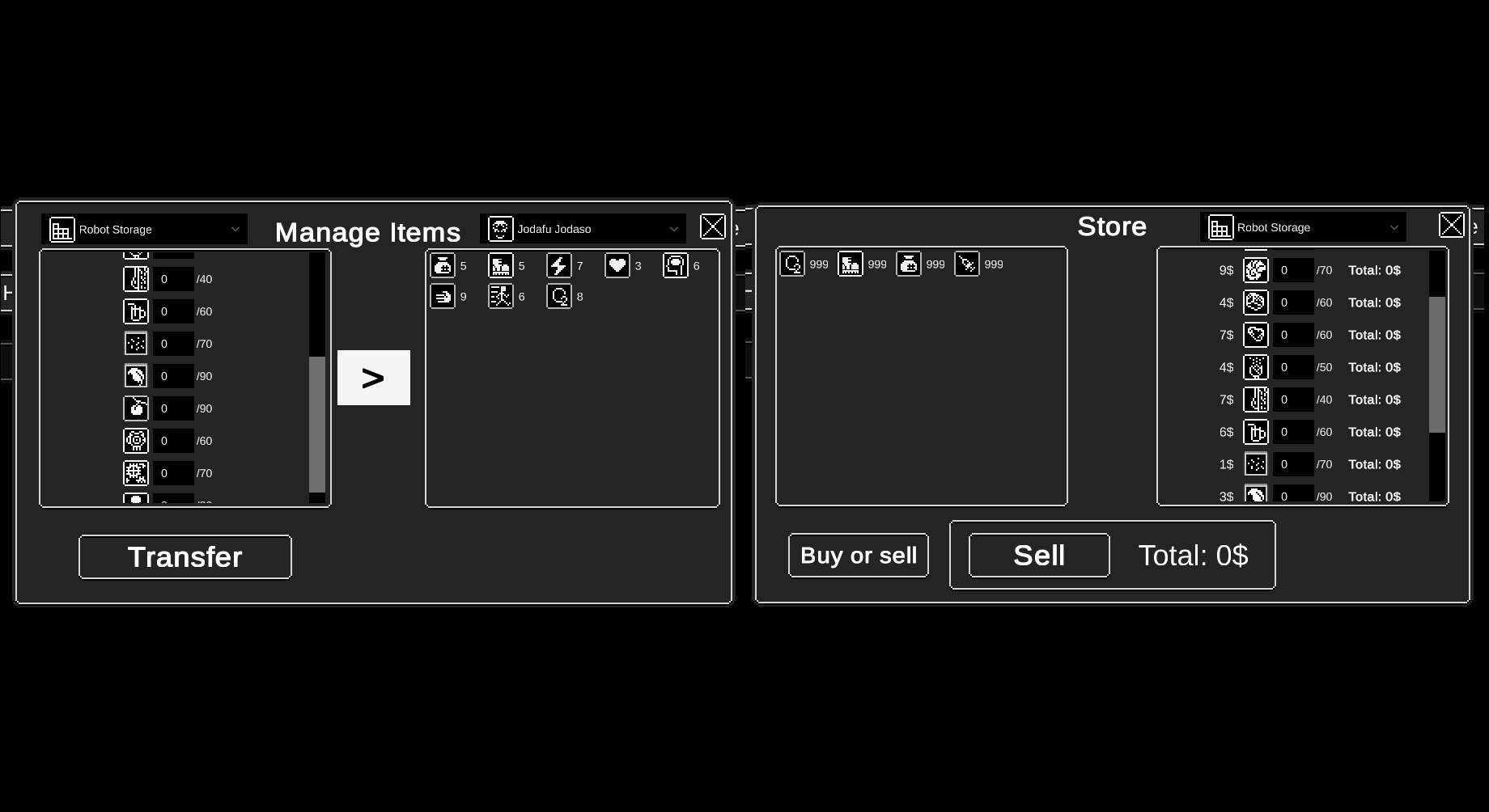
  2. No you can transfer items from many places, for example, you can transfer items between employees, or between your robot storage to the trash bin, and so on. You can do this from any screen of the game.
  3. Now you can sell items in the store inside the base:
    1. When you enter the store in the base, click the “buy or sell” button to switch between modes, and choose from what inventory to sell: you can sell items from an employee or the storage of your robot.

Try it here: https://chrisibarra.itch.io/pec/devlog/328265/sell-or-transfer-items-resources-t...

New in the previous week:

  1. Fixed: windows glitched visually when you opened more than one.
  2. Fixed: some bugs in the market and item transfer window.
  3. Fixed: when you clicked an icon, the square selected did not appear correctly.
  4. Fixed: the workshop did not read the resources you had in the robot storage.
  5. Fixed: now the game reads the employee you assigned as an explorer (in the role window) when exploring a sector.
  6. Changed the way planet tiles are placed, so that sectors are more interesting to explore and feel less random and chaotic.
  7. Added walls and pathfinding to the planet map.

Try it here: https://chrisibarra.itch.io/pec

New this week:

  1. Now there won't be things extremely close to the starting point when you explore a sector.
  2. Bullet hell experience: Added enemies that shoot bullets, there are many different types of shooting patterns: single, triple, 8 ways, and more modes coming.
  3. Enemy bullets can harm you so keep moving to evade them.
  4. Each biome has its own different type of shooting enemies with different shooting patterns.
  5. You can kill the shooters from very far away to avoid their bullets, for now, but that should change in future updates since leaving that as it is would make the bullet hell experience useless.

    Try it here: https://chrisibarra.itch.io/pec

New this week:

  1. Made each job easier to finish.
  2. Now there are many bases in the planet, each one with its own features.
    1. Each one has its own jobs list.
      1. You can only deliver jobs in the base it was given.
    2. Each base offers different services.
    3. Each base owns a few sector now, you can see the owner of a sector if you click it, and then look at the sector info to the left.

      Try it here: https://chrisibarra.itch.io/pec

New this week:

  1. When you explore a sector, now you can see all the resources of the base that owns that sector, that way its easier to know which structures you need to build to increase the population of that base.
  2. Now the resources in a single tile that are extracted with a building will dissapear, that is to not allow the same resource to be extracted by various buildings at the same time.
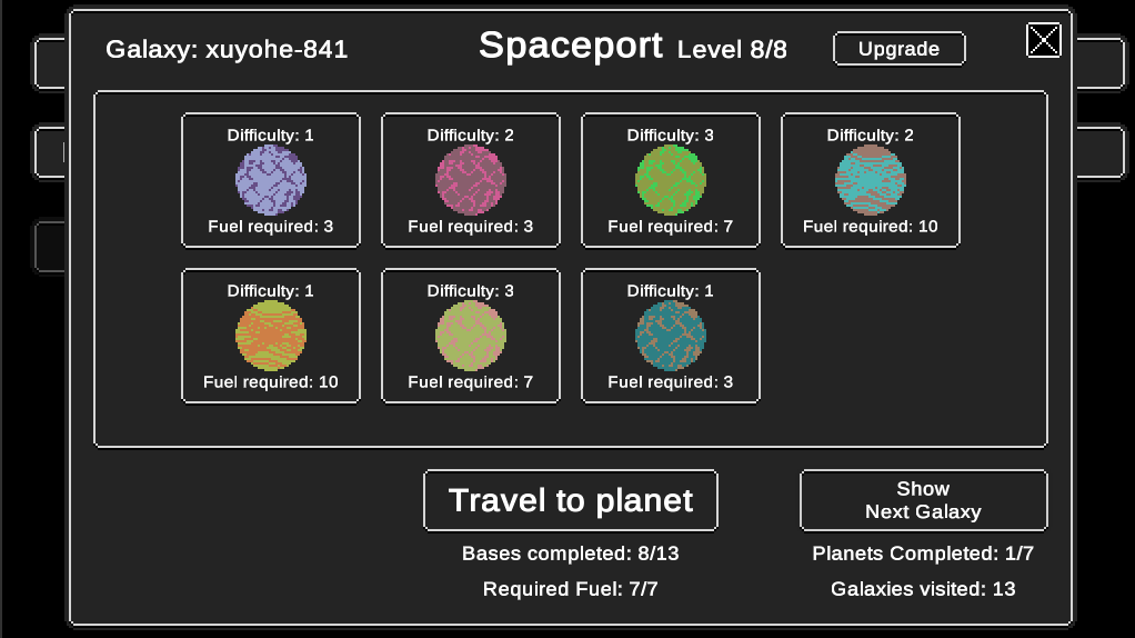
  3. Now the “Spaceport” button in the main base is enabled:
    1. In the near future you will be able to travel to different planets and galaxies.
    2. For now you can see that each planet has a different difficulty, and a fuel requirement to travel there.
    3. Click on “Show next galaxy” to create new planets.
  4. Service “Upgrades”:
    1. Inside the Spaceport window you can see a button that says “Upgrade”, each service of a base (spaceport, market, workshop, etc) will have this button:
      1. In this window you can upgrade various things, for example, the amount of fuel you have available to travel to different planets.
      2. You can buy this upgrades with the resources extracted with buildings. Remember that each base will have their own resources depending on where you construct buildings.

Try it here: https://chrisibarra.itch.io/pec


New this week:

  1. Finished the spaceport window, now it should work correctly:
    1. To travel to another planet you need to:
      1. Complete all the jobs of all the bases of the planet your are in.
      2. Upgrade the spaceport fuel to match the fuel of the planet you want to travel to.
  2. Entities: Balanced the amount of actions and their effects so its easier to make the decision whether to activate the action or not.
  3. Balanced the health of destructable objects so it takes a bit more work to extract their resources.
  4. Added smaller walls to the sector map to make it more varied and interesting to explore.
  5. Oxygen gets consumed faster so hurry up while you explore before it runs out.
  6. Known bugs:

1. New planets are not properly loaded.

2. Buying and selling items do not work properly.


Try it here: https://chrisibarra.itch.io/pec

New this week:

  1. Added new tooltips to lots of places.
  2. Added new information when you click a sector in the planet map:
    1. You can see the biome of the sector you selected.
    2. You can see the entities that you already found on previous visited sectors of the same biome.
    3. You can see how many resources are left on the sector.
  3. Now you can shoot bullets by holding the right mouse button.
    1. I am preparing a new system to customize your weapons in various ways.

Try it here: https://chrisibarra.itch.io/pec

New this week:

  1. New types of movements to the attackers: vertical, horizontal, diagonal, circular, random.
  2. Added a range to your weapon, so its not so easy to kill enemies from far away, you have to get closer to them if you want to kill them.
  3. Balanced the attacks of the shooting enemies.
  4. Added a visual fx when you kill a shooting attacker.

Try it here: https://chrisibarra.itch.io/pec

New this week:

  1. Explorer movement is more responsive now, making combat more enjoyable since you can move better to reach your enemies and avoid better the incoming bullets.
  2. Obstacles in the terrain are easier to evade, making exploration less frustrating.
  3. Added a border to the map on the exploration screen.
  4. If you double click you can make an evation roll to evade bullets, this makes combat more fun.
    1. Evading uses energy, if you run out of energy you cannot evade anymore.
  5. Added a visual indicator to indicate where the explorer is moving to.
  6. Added icons to the "base resources" in the base screen and the sector screen.
  7. Added targets to some sectors to make them objectives in the near future.

    Try it here: https://chrisibarra.itch.io/pec

New this week:

  1. I created a new type of enemy that makes exploration more interesting, its smaller, and has much less health than the bigger enemies, make it it quicker to kill.
    1. In the near future it will attack from a short distance.
  2. I added a hive in the "target sectors", in the future you will have to destroy that hive in order to complete the objective of the sector (it won't be easy though).

Try it here: https://chrisibarra.itch.io/pec

New this week:

  1. I implemented a weapon recoil system: each time you shoot, the crosshair moves to a new place, you have to move the mouse pointer to have more accuracy. This makes shooting more fun.
  2. New visual fx for shooting bullets that hit the floor.
  3. Small attackers can hurt the explorer when they reach him.
  4. Hives appear inside the marked sectors of the planet map.
  5. Waves of enemies appear when you find a hive inside a sector. You have to survive the enemy swarm and destroy the hive to make them stop coming.
    1. Destroying the hive will complete the objective of the sector.
    2. The sector changes graphic to show it was complete.

Try it here: https://chrisibarra.itch.io/pec

New this week:

  1. Changed the weapon recoil system to feel less random, now you can have more control where you aim.
  2. Now, to travel to a new planet, you have to:
    1. Complete all the jobs on all the bases.
    2. Complete all the objectives in all the marked sectors of the planet (destroy all hives).
    3. Have enough fuel.
  3. Fixed a bug that did not allow to use the base services the second time you entered a base.
  4. Fixed a bug that made the bullets not be destroyed.
  5. Added a new animation for the enemy bullets.
  6. I started work on the research laboratory window: in the near future you will be able to unlock technologies by researching the resources you gather, to create items and upgrade your robot and employees.


    Try it here: https://chrisibarra.itch.io/pec

I re-worked the crafting system used inside the bases, it works fine now, although its not completely finished.

  1. The "Refinery", "Workshop", and "Research labs" are working, and you have a few options you can play with.
  2. To build something, you have to let the time advance. This can be done when you move in the planet map, or if you click the "Pass day" button inside a base.
  3. When you finish something, the resulting item can appear in different parts:
    1. When the lab finishes building something, it unlocks something new in the refinery or in the workshop, depending on what is researched.
    2. When the workshop or refinery finishes building something, the result is placed in the storage of the base, it can be accessed inside the inventory management window (its the "box" button at the bottom left).
    3. A notification will appear in the news section to let you know what has finished building. For example: "A new technology has been unlocked in the workshop".

Try it here: https://chrisibarra.itch.io/pec

This update is important because players can see and have a better understanding of all the most important features of the game, some of them don't work perfectly yet, but you can have a better idea on the potential of the game.

Its still in early alpha, so expect many things that don't work very well.

I also made a tutorial since many people requested it, it also shows the main features of the game and the present state of development:

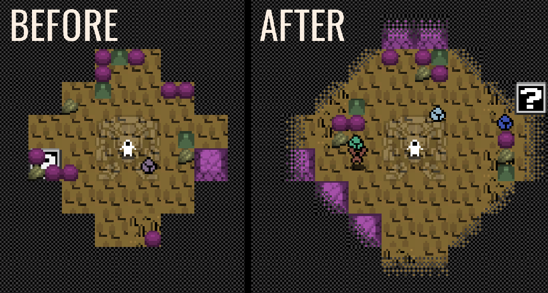
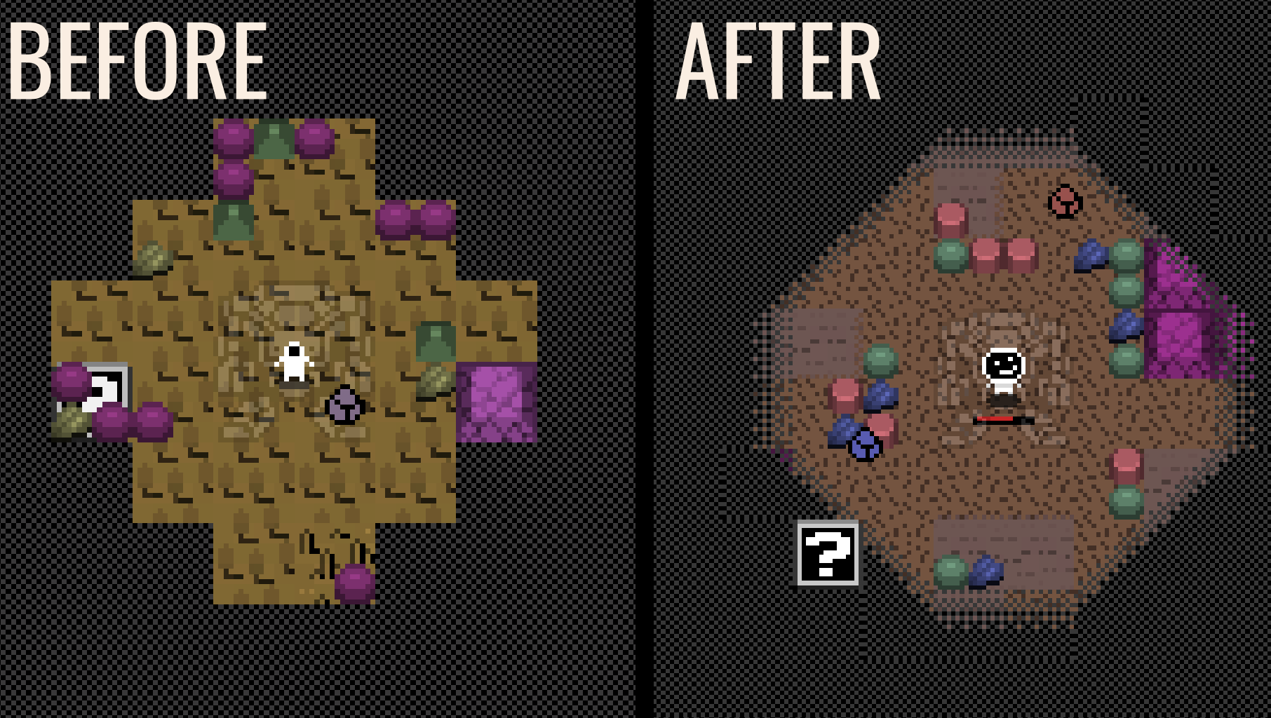
New this week:

  1. I'm experimenting with colors and new visual styles, I want to keep it simple but at the same time try something more colorful.
    1. Reason: Using only black and white makes it hard to distinguish the dozens of different symbols and icons the game contains.
  2. New visual style for the enemies:
    1. Now they can have 3 colors assigned to them.
    2. Now they can look very different from each other since they can have different images, not just colors.
    3. They have animations that make them look a bit more alive.
  3. The deadline info is updated:
    1. The tooltip when you hover the deadline section work better showing the correct numbers.
    2. It also shows the info in a better visual way.
  4. When your explorer dies, now you can exit the sector and replace him by assigning an employee to the explorer role, so you can continue playing.
  5. Fixed a bug that did not allow you to keep playing after entering and exiting a sector.
  6. Fixed many other small bugs.

Try it here: https://chrisibarra.itch.io/pec

New this week:

  1. The camera now follows the explorer.
  2. Changed the shape of the explorer field of view from a box to a circle.
  3. Sectors are now bigger, its harder for enemies to overwhelm when you start exploring.
  4. Resources that appear when you kill a small enemy are now visible.
  5. Enlarged the map screen when you explore a biome.
  6. Visual artifacts made by small walls no longer appear.
  7. Action requirements and effects are more balanced.
  8. Enemy waves are now infinite, they will appear coming at the attacker and will stop coming for a few seconds until the next wave starts.
  9. Big change (work in progress) : instead of imitating the combat mechanics of games like "Diablo 2", I will imitate the mechanics of "Vampire Survivor", which means that:
    1. Weapons and battle upgrades will only be available while you explore, and will be reset when you exit a sector.
    2. Enemies will become stronger as time advances, which motivates you to find new combat power-ups if you want to survive and discover new things inside the sector you are exploring.
    3. I made the decision to change these mechanics because the combat was not good enough, and to make it better I would have needed to add skills and special abilities that use "mana/magic" like Diablo 2, so instead of doing that I decided to imitate "Vampire Survivors" since its a better fit for a minimalist game like mine. Plus, its the type of game I'm playing the most nowadays.
(+1)

New this week:

  1. When you explore enough, a power-up item will appear, you have to select it to see a small power-up selection window.
  2. Added a new weapon: "Melee".
  3. Added power-ups for the pistol: power, rate of fire, speed.
  4. Polished a bit how the waves of enemies appear.

Try it here: https://chrisibarra.itch.io/pec

New this week:

  1. Polished the melee weapon, now its an animated punch.
  2. Added new weapons:
    1. Mine that freezes enemies. You can upgrade its size, freeze time and rate of fire.
    2. Defence drone that surrounds the explorer. You can upgrade its power and speed.
    3. Grenade that explodes. You can upgrade its size, power and rate of fire.
  3. Fixed a bug that made the tooltips not show on the exploration screen.
  4. Fixed the position of the camera when you open the planet map.
  5. Changed a few terrain sprites to experiment a bit more, I'm still trying to find the right look and feel for them.

Try it here: https://chrisibarra.itch.io/pec

New this week:

  1. Now you can buy medkits to heal your employees.
    1. To heal someone: Buy medkits on the market, add them to the inventory of who you want to heal, and let time pass.
  2. Now your employees restore energy when time passes.
  3. Added tooltips to the "comparison section" inside the employee management window.
  4. Fixed a bug that made the buy or sell button dissappear inside the market window.
  5. Added a visual limit to the energy, health and oxygen bars.
    1. You can increase this limit by building upgrades (in future updates).
  6. Powerups now appear above all obstacles, which makes them easier to see.
  7. Added a new animation for powerup creation. You'll see the powerups fly from the robot to a tile close to the explorer.
  8. Changed the powerup graphic.
  9. Added a new visual bar that shows how much new discovered terrain is needed to get the next weapon powerup.
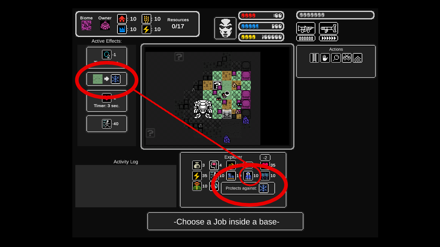
  10. Added new attributes to biome terrains:
    1. Each terrain has an atribute with different effects.
    2. You can equip items to protect against health damage, for example a "coat" to protect against "frost".
    3. You can equip items to increase the speed to travel that specific terrain, since each terrain has a specific travel speed.
  11. Added new weapon: Rifle. (it´s the same one I used before implementing "Vampire Survivor" mechanics, I thought that weapon was not going to be compatible with this new system, but thinking about it a little more I think it is possible with a few easy tweaks).
    1. You can upgrade its rate of fire and power, more upgrades coming soon.

Try it here: https://chrisibarra.itch.io/pec

New this week:

  1. Added Rifle powerup: recoil reduction.
  2. Added visual feedback on the duration of enemy waves and time between enemy waves.
  3. Added visual text for enemies danger level.
    1. As time increases, the enemy danger level increases, making them more powerful.
    2. You can see the sector danger level when you click on it on the planet map screen.
  4. Fixed a bug that made the small enemies stop chasing your after your entered and exited the robot.
  5. Balanced the enemy waves.
  6. Fixed a bug that crashed the game when a lab queue item was marked as not buildable and you tried to pass a day.
  7. When you get a new item while exploring the planet, you can research it in the "Lab" to unlock new technologies in the "workshop" or "refinery".
  8. Added researchable lab item "Ice".
    1. Unlocks "oxygen" as buildable in the workshop.
  9. Added workshop buildables: medkit, syringe, and 10 more. They need to be discovered in the lab order for them to appear there.
  10. Added new refinery buildables: plastic.
  11. Fixed how recent news show on the news section.
  12. Fixed visual glitches on the news section.


Try it here: https://chrisibarra.itch.io/pec

New this week:

  1. Added new sprites: terrains, buttons, window border, explorer sprite, and more enemies.
  2. New save system is working, still need some work to be completed. I did not upload a new version because the new save system brakes the game, I aim to have this finished by next week.

Try it here: https://chrisibarra.itch.io/pec

New this week:

  1. Changed the speed of the small enemies, making them easier to kill and avoid.
  2. Fixed many issues with the save system, now it saves and loads a lot more things than previous week, and it does not brake the game, try it.
    1. To save the game, quit the game when you are inside a base.
  3. This new save system changes this a lot because now collecting resources makes more sense: you collect resources and with time you can create upgrades for your employees, which get more powerful as time progresses.

Try it here: https://chrisibarra.itch.io/pec


New this week:

  1. Changed the introductory text to explain better the objective of the game.
  2. Changed some texts to make the game's goal easier to understand.
  3. Added new tooltips to the upper bar, and other elements.
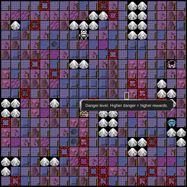
  4. New visual indicator for the danger level on each sector in the planet map.
    1. Higher danger equals higher rewards, so this is a useful information to have when deciding where to go next.
  5. Now when you discover entities and resources inside a biome, all the same biomes on the planet map will show what they contain. This way you can make a more informed decition on where you want to go next.
  6. Fixed: when you clicked a powerup box, the explorer moved to the center of the map, now it moves towards the box.
  7. Fixed: you could select a powerup from far away from the powerup box, now the explorer needs to touch it to enable the powerup selection window.
  8. Improved death animation of small enemies to make it more fun to kill them.
  9. Fixed: weapon attacks only affected one enemy at a time, now a single attack affects all enemies it touches.
  10. Known issues:
    1. the game might crash if you touch a single powerup box many times.
    2. If you enter another sector, the attacks are get glitched and multiply without dissapearing.

Try it here: https://chrisibarra.itch.io/pec

New this week:

  1. Fixed: You could open a powerup box window more than once if you clicked it many times, now you can only open it once.
  2. Fixed: each time you clicked a powerup box, you got different powerups, now they will not change each time you click it. So you will need to get a new powerup box if you want different powerups.
  3. Added: new animation for taking small resources while exploring a sector. Now it does not cover the player, its less intrusive.
  4. Added: 5 new graphics for small walls inside map sectors.
  5. Added: now each biome has its own small wall type with its own color and sprite.
  6. Added: terrain tiles have a less contrasting border.
  7. Added: field of view has a smoother transition with the fog of war.

New stuff!:

  1. Improved: I reworked the fog transition to make it look better.
  2. New: visual feedback for when the terrain damages the explorer.
  3. New: added a smaller health bar next to the explorer so that you don't have to look away from the action to see how much health you have left.
  4. New: added a death animation to the explorer so its more clear when he dies.
  5. Improved: travel speed scaling was reworked, now the explorer should not move too fast or too slow, even when upgrading travel speed.
  6. Improved: changed the creature attack sprite.
  7. Improved: changed the explorer sprite so that it has more personality.
  8. Fixed: enemy wave creation and delay was not showing correctly in the UI bar at the top of the screen.
  9. Fixed: visual depth of the explorer was broken. Now, objects that are further away from the explorer will appear behind him. Objects that are closer to the camera will appear on top of him.
  10. Fixed: sometimes when you clicked where to move the explorer, he glitched near the desired stop target.

New stuff!:

  1. New: map sector size changes depending on its danger level: lower danger means smaller area, higher danger means bigger area.
  2. Improved: the sectors with lower danger levels have more resources so there is a better incentive to explore them.
  3. Improved: balanced the enemy wave creation to make the combat more fun.
  4. Improved: balanced the amount of "bullet shooting mini-bosses" that can appear in a sector, now they are fewer depending on the danger level, sometimes they where too many and it was impossible to survive.
  5. Improved: changed the shape of the "target move position" of the explorer, now it looks a bit more tridimensional.
  6. Improved: new UI of the "danger level" and "resources quantity" on the "sector exploration screen" at the top left, now they have different horizontal bars.
  7. Improved: new market prices.
  8. Fixed: the shadow of the explorer was showing on top of him, now its below him.
  9. Fixed: the area of collision detection of the explorer was too big, now its smaller so its easier to evade enemy attacks.
  10. Fixed: trying to move close to the explorer was not possible because his sprite was blocking clicks on the floor.
  11. Fixed: employees inventories where not being saved properly when you changed screens. Now all their stats and numbers will be updated correctly if you switch screens and also when you quit and enter the game.
  12. Fixed: when the explorer entered and exited the robot there was an error, not anymore.
  13. Fixed: sometimes it was impossible for the explorer to use the ladder to get into the robot.
  14. Fixed: when you collected all the resources of a sector, the sprite indicating the completion percentage was showing in the wrong position.
  15. Fixed: when the explorer destroyed an object to extract its resources, the resources UI bar was not updating.
  16. Fixed: saving items to build was not working correctly.

Try it here: https://chrisibarra.itch.io/pec

Here is an auto generated planet in the game:


NEW:

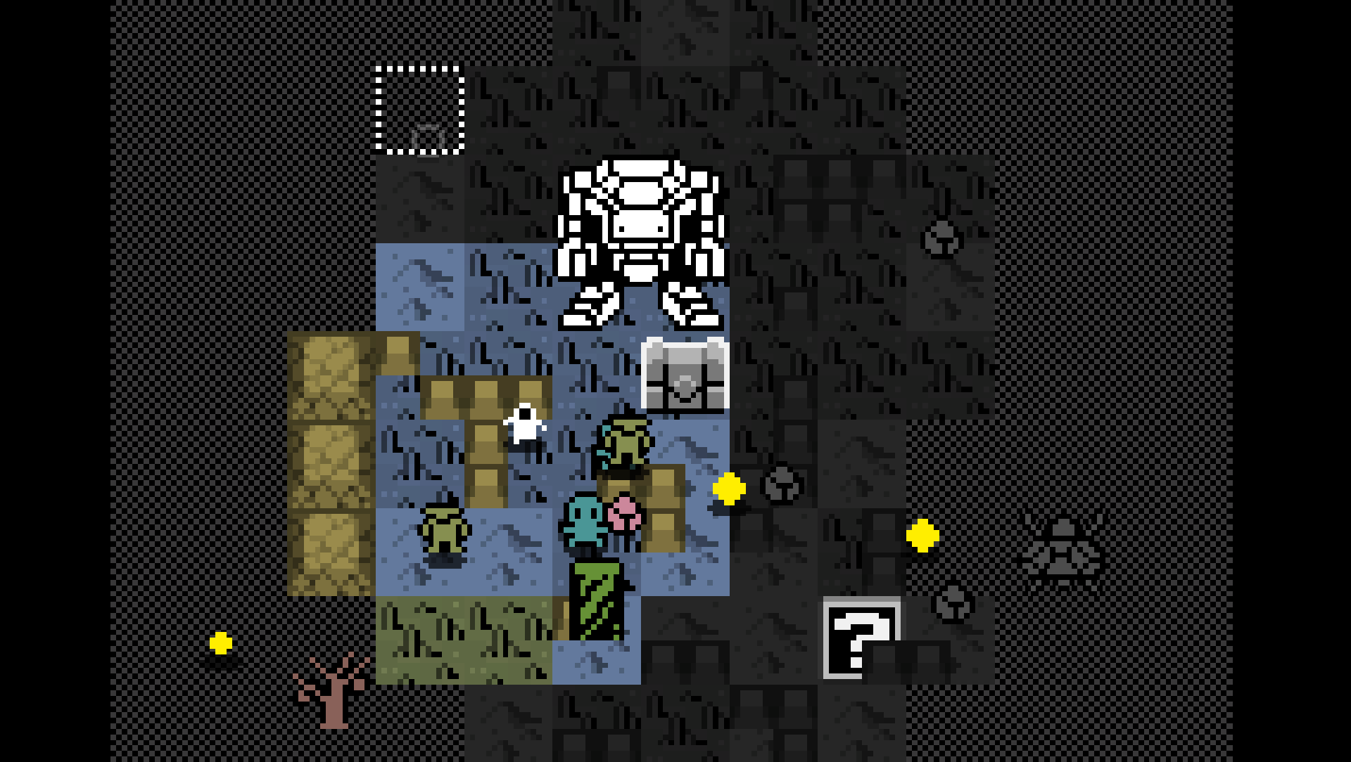
  1. Sprites: Many new images for biomes, terrains, walls.
  2. Tile discovery: The tiles you discovered when exploring a sector will remain discovered the next time you enter the same sector. This way you won't be able to cheat to get powerups the easy way by entering the same sector over and over again.
  3. Short term Objectives: Added a new type of short term objectives, they appear on the planet map as sectors marked with a blue border. Collect all its resources to get extra payment. A new one will appear after you complete it.
  4. Powerups reset: Weapon powerups get reset when you enter a base, so to survive sectors of a high danger level, start with low level sectors to accumulate powerups, then gradualy increase the danger level of sector you explore to slowly increase your survival chance.

IMPROVED:

  1. Tools news: At the end of the day, when an explorer uses a tool, a news is shown that displays a new icon of the specific tool used.
  2. Tiles: The tiles inside the fog have a visible grid, that way you know which ones you can uncover to increase your powerup bar.
  3. Health UI: Explorer mini health bar is always on top of everything so you never loose sight of your health.
  4. News: When news are created, they remain in the news list until the next day, so you have as much time as you need to read all the news.

FIXED:

  1. News: News items glitched when the text was outside of the news list.


Try it here: https://chrisibarra.itch.io/pec

NEW:

  1. Destructable UI bar: Added a visual bar that tells you when the explorer will hit the destructable object to extract its resources.
  2. Walking animation: Added new walking animation for the small enemies.
  3. Research News: when you research something, the news will tell you what has been researched and where the new unlocked items are located.
  4. UI: items and properties also show their max value, like this: 80/100.
  5. Bomb: a new weapon that explodes after a few seconds, sending small explotions in 4 different directions. (not damaging yet)

IMPROVED:

  1. Destroy objects: To extract resources you have to hold your mouse button instead of clicking many times, that way it doesn't activate an explorer "dash" when trying to extract resources or vice-versa.

FIXED:

  1. Resources: the small resources and destructable objects won't appear on top of walls anymore, so all of them can be extracted.


Try it here: https://chrisibarra.itch.io/pec

NEW:

  1. How to use Weapons: when you explore a sector, the robot will send you a box with a weapon that was stored in it. But when you go back to a base, the weapons the explorer has will expire.
  2. Book to increase handling: send it to an employee inventory and pass a day to increase his handling ability.
  3. Helmet to increase max oxygen: equip it to an employee's inventory to increase his max quantity of oxygen. This is the first of other items that increases the maximum quantity of a person's property.
  4. Exoeskeleton to increase max energy.
  5. Cyberheart to increase max health.
  6. + more items.

IMPROVED:

  1. Danger UI: the danger bar inside a sector is a different color that matches the color of the danger bar on the planet map.

FIXED:

  1. Saving: saving and loading was not working correctly. To save your progress, exit the game when you are inside a base.
  2. Extracting: the speed for extracting resources from destructible objects should work correctly.
  3. Tools: some tools did not work correctly, setting properties to 0 instead of increasing them, when being used by an employee when a day passed.

Try it here: https://chrisibarra.itch.io/pec

Follow on STEAM https://bit.ly/PEC_STEAM_itch

NEW:

  1. Bomb powerups: new upgrades for rate of fire, explotion size, and damage power.
  2. Missiles: your robot can launch missiles to kill enemies around the explorer, but its not very accurate. It can be upgraded in quantity, explotion size, and rate of fire.
  3. Boomerang: you throw it in a curved pattern. It can be upgraded in power, rate of fire, and size.
  4. Flamethrower: you throw flames to burn your enemies. It can be upgraded in rotation speed, rate of fire, and reach.
  5. Laser: (WIP) started to work on a laser that is shot from the robot.

FIXED:

  1. Enemy hit: fixed that you could deplete all the health of strong enemies with a single hit, now you have to reduce their health with multiple hits.


NEW:

  1. Robot Laser: finished working on the laser weapon. It can be upgraded in damage power, length of explosions and rate of fire.
  2. Item unlocks: All lab and workshop recipes are proceduraly generated when you visit a new planet.
  3. Research available: when you enter a base with and you have, you get "news" telling you that you can research a new item in the lab, if available.
  4. Sprites: new graphics for some new items.
  5. Tooltips: added tooltips to some items that had none.
  6. Build window: Added some text to the UI.
  7. Tutorials: added new tutorial windows to some parts of the game.

FIXED:

  1. When an item finished researching, it will not appear again in the list of the Lab.
  2. The "hire employee" window was not showing the complete values of a person's properties.

This is the beginning of the BETA version!, please give me feedback so I know how to keep improving the game.

Try it here: https://chrisibarra.itch.io/pec

NEW:

  1. Tutorials: many new tutorials where added.
  2. Tutorial button: added a new type of button that shows tutorials. Added it to many places and windows to explain how they work.
  3. Hives: they show a health bar so you know how much you have left to destroy it.
  4. Items: Added new items to change different stats, like speed, field ofview, and more.

IMPROVED:

  1. Planet Map: Reduced the size of the planet map because it was extremely big, making it overwhelming to complete.
  2. Explorer: the sprite faces the direction he is moving.
  3. Small enemy: added a small falling rotation to the death animation, so it doesn't only "dissapear".
  4. Tutorials: the game is paused in some tutorial, so you don't get killed while you read.

FIXED:

  1. Hives UI: Number of hives in the UI was not showing correctly.
  2. Market lists: the lists where not showing all available items.
  3. Market button: fixed the "sell" button that was not showing.
  4. Spaceport: now you can travel to other planets, and it will save and load your save file correctly.
  5. Weapons: some weapon upgrades did not maintain their upgrade level when entering another sector.
  6. Lab: When game over and starting a new game, lab unlocks do not work well.
  7. Game Over: starting again after a game over did not work correctly.