Play game
Until My End's itch.io pageResults
| Criteria | Rank | Score* | Raw Score |
| Overall | #3 | 4.452 | 4.452 |
| Music | #5 | 4.339 | 4.339 |
| Sound | #6 | 4.194 | 4.194 |
| Fun | #7 | 4.290 | 4.290 |
| Aesthetics | #8 | 4.613 | 4.613 |
| Mechanics | #11 | 4.194 | 4.194 |
| Story | #12 | 4.145 | 4.145 |
| Theme | #17 | 4.387 | 4.387 |
Ranked from 62 ratings. Score is adjusted from raw score by the median number of ratings per game in the jam.
How many people worked on this game in total?
3
Did you use any existing assets? If so, list them below.
Yes, mainly fonts (Pixbob Lite & Jersey), sound effects (taken from past projects/sound packs) & dialogue system used on previous projects (modified heavily for this game)
Leave a comment
Log in with itch.io to leave a comment.


Comments
Whoa, this game is phenomenal!
Not sure if this is something you want to talk about, but I’m really curios about your thought process on how you came up with the visuals.
I’ve been getting more into art myself, but it has been an uphill battle for me, I’m not very gifted. From what I understand, it’s mostly about finding references and other people’s work you like, and then incorporating them with your own flavor. Is that what you did? I’m curious if there were any inpsirations you had in mind while creating your visual design. I really love the black on red with white background (look at my profile image lol).
Hey no worries, thanks for reaching out (genuinely though, feel free to ask me anything!), I've also felt the struggle of fighting an uphill battle in terms of art/graphic design stuff... I often get overtaken/outcompeted by my peers & even younger students (which is quite scary to be honest but such is life XD). What matters is that if you're having fun, keep on doing what you do!
Also yeah, you're pretty much correct btw, it's mostly about finding your own style, What types of colors do you like? What sort of games do you enjoy? What kind of artstyle do you prefer to draw? etc. This is a culmination from all of your experiences! An easy way to find this is to make a visual reference board that strictly contains things that you like (followed a skillshare class for this, helped me quite a bit when I was lost trying to find my own style)
It's also great to know your own strengths & weaknesses! an example of this is that I'm incredibly good at picking colors (in my opinion atleast XD) but I'm extremely slow at drawing illustrations so I usually prefer to do pixel arts instead. If you don't really know your strengths & weaknesses, well... experiment! See what sticks, see what doesn't, then iterate on it more! (Try out new colors, new artstyles, try out other games & see what makes them stick)
For this particular game I'm acting as the "creative director" instead of the main artist, I'm still the one making all the artstyle decisions though! The way I approached this is by getting a vibe down first, I'm sketching out designs while listening to a music that's similar to the vibe that I'm trying to go for (for the title screen, I listened to this & for the gameplay stuff, I listened to this). For the title screen I was inspired by one of gal shir's old artworks (this one in particular), for the characters I was heavily inspired by this, and for the colors I was 100% inspired from Cult of The Lamb's title screen.
As you can see, it's a combination of all these interesting stuff, but I added my own flavors/preferences into the mix (Persona's Stylish UI, Hyper Light Drifter's colors, etc). I'm 100% planning to share a bit more detail about the process of designing this game if you're interested! (currently creating a devlog right now, planning to publish it to my YouTube Channel in the coming months, check it out if you're interested :D)
Art is defo quite a long journey & it's incredibly subjective, there's no right or wrong way to do things, so take your time & enjoy the process ✨!
P.S. I just saw your previous games & your twitter btw (you're making VR worlds! that's incredibly AWESOME!!) I think you're doing great, keep going!! I personally just got a Quest 1 a few months ago & I'm having a blast trying out VR stuff XD, this medium defo has a lot of potential so keep creating stuff! Cheers ;)
Oh! Thanks for the in-depth reply!
Yep, VR is why I got into game dev in the first place! I feel like I would’ve learned a lot more by now if I didn’t. Building things for VR is a lot more time consuming and there are less resources to draw inspiration from. But hey, I’m not giving up that easily lol I definitely want to learn as much as I can.
Not to mention, I started doing this whole game dev thing a bit late. So I definitely share your sentiment. I’m on the older side now and some younger people are just waaay to talented… I always tell myself that there are things that only I can do that people who are super talented cannot or won’t do. So that’s what I focus on!
I tend to be practical, but I think that’s why I’m having issues with art. The way my brain works is: If I spent my time on something, it better be useful and worth it. But often, I find art is the opposite and more about wasting your time until you get good results. It seems like it’s better to do a ton of things and then remove what doesn’t work, even if it feels like a waste. I definitely have to get over that more.
Your inspirations are all very interesting, especially that “Choose your deity” song, that’s sick looking and I’ll definitely put it somewhere as refernce myself.
My brain still gets confused about how you managed to actually combine everything in such a way though. I do think it’s all about experimentation and understanding what you like. I feel like that’s another thing I have trouble with. I need to make a lot of cringe and bad things to get to where I want to be, but it’s rough. There is a lot of hesitance on my side that I need to work on.
I do think that you are on the right track with just doing your thing, especially making that youtube video will probably be useful to yourself and other people. It’s how I got to the small successes that I had in the past, whenever I could just let go and do things.
Well, either way, that would be it from me. The last thing I’m curious about: Is skillshare actually worth it? I saw it advertised a lot, but my immediate reaction is that it’s not useful because of how much money they put into marketing. Maybe I should check it sometime.
It definitely takes time to get good at something, especially art! (it took me like... idk how long but several years to get good at drawing... but even so some people are just talented no matter what), sometimes it's better to just let go the feeling of failure & just think the journey as an experiment, if it fails well... try again! If it lands, keep going, you got something right! (I guess it's similar to this game, it's a mish-mash of inspirations that works together, but some of it doesn't so there's still room to tweak/edit stuff). Your style is never final btw! it's always evolving, even if you don't even notice it!
Combining things is 100% dependent your own preferences, I personally keep a note of stories & game ideas that I want to tell on Notion. It syncs to all of your devices, so I'll just quickly jot down inspirations whenever they struck, then I'll just store them until I need them, in which I'll browse through them until I find something that I particularly like & fits the style I'm going for.
Keep in mind, most of it is... not great/quite cringe XD but those are the stories/game ideas that I want to read/play but... nobody is making them!!! We're creators, we can make things happen. Sometimes I forgot about that & I'm just waiting for something that will never come, so I'm taking things on my own hands!
Also yeah for the YouTube video part, Thank you for the words of encouragement! The goal of it is mostly just an outlet for me to have fun & share my stories, it's not about making it big or become famous & earn money from it (if that happens I'm 100% not complaining XD). I'm trying to give myself room to fail so it's alright for me to experiment with wierd new wacky video ideas/editing style ;)
For skillshare... it depends... there's some courses that I really liked on skillshare but most of the time I prefer learning from YouTube videos. Skillshare is pretty great for beginners (it's great to learn when everything's structured neatly) but for more intermediate/advanced users they're not that great in my opinion (some advanced topics & most unity tutorials aren't even on the platform!). It doesn't hurt to try it out though, I'm using a 2 month free trial right now to learn Blender & Procreate Dreams, defo planning to create 3D games (and maybe perhaps VR games too in the future, who knows!) so it's quite a nice foundation to learn stuff I'm new at.
The promo code is DREAMBIG btw if you want to try it out (It's from a collaboration between Procreate Dreams & Skillshare)
Seriously good luck on your journey, please share more about it whenever you have the time to do so, (followed your twitter so I'll be seeing your journey there) Cheers! ;)
I do something similar, but more for good/feasable ideas that I collect in a special trello. I have been doing something similar with art over the last months, but yeah, that’s something I only recently started doing more. I’m definitely a bit impatient because being older and forced to make money and stuff, you know? lol But yeah, you learn stuff each step you take, worst thing you can do is to stop for too long. You need to keep going and trying etc.
You definitely seem to have figured it out, keep doing your thing!
And yeah, that’s what I thought about skillshare. I think I’ll skip on it for now, I have a hard time keeping up with gaining more info vs doing my projects right now.
Thanks for the follow! Honestly, I barely use twitter currently. Before, I used it as a way to get out of my head and fight perfectionism. But I have been getting some success with my projects recently, so that’s what I’ve been focusing on. Most of my followers I got passively through that lol, I feel kinda bad for not being active, but I’m doing my best. Just to illustrate how bad I’m with it, I didn’t even know I had 9 followers here on itch.
My main issue is usually that I don’t want to post things that won’t connect with people or are useful to them. But I think you can see a common thread here lol, I’m still bad at the whole perfectionism thing. I’ll have to work some more on that.
Oh well, thanks for the encouraging words! And good luck you to, but I’m sure you won’t need it ;)
Dude the polish on this game is incredible. Congrats on getting ranked 3rd, well deserved!
Thank you!!! ;)
Congrats on the raking 3rd. If I was me this game would be de 1st ! Was my favorite one.
Haha thank you!!! Overall I'm quite pleased with the results, defo got some things to improve on for this current & future games (such as controls, difficulty, etc).
Glad it was your favorite ;)
P.S. Got a devlog for it planned & I'm also planning to polish things a bit more + an Android port in the near future, stay tuned!
Congrats on the ranking 3rd! So simple but the presentation and polish is awesome. Well done!
Thank youu!!! It was a BLAST participating in this jam! Great job on your game too btw!
This is a top-notch game! It's incredibly polished--much closer to a release game than a jam game. The movement and attacking feel great, though they would benefit from gamepad controls (I saw you already mentioned in another comment that the game had this but it wasn't working for this submission). One thing I encountered that might be a bug though is that when attacking while standing still, the character steps forward only either left or right (depending on the sprite facing) even if the attack itself is pointing up or down.
Excellent work! I had a lot of fun playing.
Defo got some more polish work to do XD (Controls, bugs such as the attack that you mentioned, etc). Also planning to rework the attack system a bit more to make things a bit more fluid.
Thank you for playing, great job on your game too btw!! (#39 Overall is incredible!)
Very good game! I already told you in your post on our game page. Well implemented! Good submission
Ayy thanks for commenting here, WELL DONE on your game too btw! (Top 3 in music, that's amazing!!!). Hopefully we'll meet each other's teams again in next year's jam ✨!
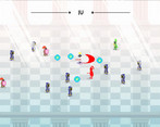
Dang this is good! The overall aesthetic is great, the music also really adds to the experience. I am glad there are random synergies to find with the different character's power ups as well, such as the wider range also increasing the size of the thrown dagger. The only thing that took getting used to was the small dash that happens on every attack added with the way the movement works and the dashers specifically having some strange movement AI, though I think that was probably by design. The only bug I found was that the sound of the dashers continues on even during the death screen, while all the others stop.
Interested to see what the devlog will say!
Thank you!!!
Defo planning for more upgrades & synergies in the future ✨!
As for the small dash, defo will be tweaking that quite a bit, I wanted each attack to feel "powerful" so I added that in, might be quite troublesome for certain enemies, especially enemies that don't die in a single hit so I'll defo will be experimenting with that more!
Dashers are defo one of the hardest enemies to fight XD, I'll be making a devlog soon with how I made the enemy AIs (spoilers: they're not that smart, but did some tricks to make them "feel" smart/unpredictable) & so much more interesting design decisions that was needed in order to fit this game in just under 10 days, may take quite a bit longer to make the devlog though so stay tuned ;)
Got tons of feedback from everyone, defo will tweak the game quite a bit more. Thanks for playing!
It's exceptional. If you did DEVLOGS on this I would subscribe to them. I love that main menu and the effects you've got going - its incredibly profesional. Good job - Im sure your game is going to rank very very highly.
Don't worry, I will! I got so much things that I want to share!! Early concept arts, the entire process, stuff that didn't make it in & just how on earth I managed to finish this in 10 days (spoilers: crunched the entire jam, defo unhealthy but hey, I was having soooo much fun creating stuff XD)
I'll post it to my YouTube Channel in the coming months (gonna take a while, I want to experiment with new editing styles!)
I'm still learning how to write interesting scripts & English isn't my main language (got subtitles on all videos) so it's not the best quality yet, but hey if you still want to see it regardless, give me a visit there ;)
Nice! I subscribed to your YouTube channel. I think you have a great video presentation skill as well. I'd love to know how you made the effect on the main menu where the shape behind the king is moving sort of like a slow fire and you have the particle effect coming up to reinforce that - looks absolutely beautiful. I look forward to following your progress.
Thank you :D
Btw it's a simple "pixel wind" shader that I tweaked for this game (followed this tutorial). I'll defo be including more details about the menu design & polish in the video, thanks for following me on my journey! ✨
Wow , everything about the visual presentation is perfect. The pixel art, the character portraits, the menu and all the UI, it's all so gorgeous. Even your itch page is beautiful! The gameplay is solid too, love the rogue-like style upgrade decisions.
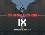
The title screen and game over screen are art all by themselves, it's stunning!
Ayyy thank you! the UI was defo one of the highlights of this game (I made the UI & I'm quite proud of it myself so thank you ✨)
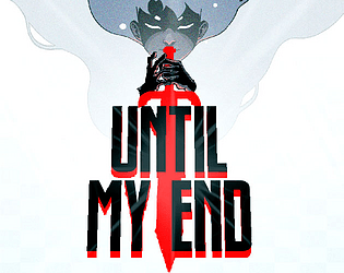
Fun Fact: the entire game originated from the title screen concept art! Originally we weren't sure on what to make, so I made little sketches here & there, until I created this particular title screen concept. And the rest was history! Ideas started showing up naturally after this concept. Will be making a devlog that talks about this a bit more in-depth, I guess stay tuned for more about this ;)
Very FUN and UNIQUE idea on this game! AWESOME WORK!!! GREAT ART!!! NICE MECHANICS!!! This was a fun challenging game. Loved it.
Thank you ✨!!
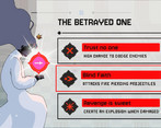
This is the most polished game on this jam of all the game I reviewed ! I love vampire survivors like game and you really did a great job with the upgrades and the gameplay loop ! The little gods showing for each upgrades reminds me of Death Must Die.
Great game !
Thank you!! Defo spent a LOT of time on polish XD
I've never played Death Must Die before, maybe I'll give it a shot sometime soon!
Glad you enjoyed it, thanks for playing ;)
this is really cool, the only suggestion I have is for the dash controls , maybe right mouse and have a dash cool down meter. I loved the art and Music 5 out of 5 in my opinion
Thank you!!
Defo will be adding more control options in future patches (gamepad support, mouse aiming, remappable controls) + tons of polish like dash indicator & so much more.
Glad you loved it!
Very slick and polished experience! Responsive and specific controls, clean yet brimming with neat touches and attention to detail. I also loved the tone of the writing which tied it all together so well! :)
Works very well. Smooth controls, which is a must have in this kind of games.
Upgrade mechanics is also cool. I also appreciate the variety of enemies.
Well done
Incredible jam entry. Whole game feels polished and looks and sound great. Good job
Thank you! :)
THIS WAS SO GOOD! Felt really good to play, very polished, the art is incredible, great music, love the character design and I'd love to see it with more lore and weapons! Also the enemies mechanics were cool. Congrats! Awesome work overall
Thank you!! Defo planning for more upgrades, lore & tons of bug fixes/quality of life improvements (couldn't fit all of them within the 10 day jam limit XD)
Thanks for playing ✨
Really nice way on how you even just swing your attack, I noticed some detail there I really liked and maybe even seemed important to me for the strategy behind it. I really liked how clean it was, and how fun the game felt. The upgrades and interesting story were a nice added touch. I think you did a really great job on this one!
Thank you!! Thanks for noticing the small details XD. I'm a UI/UX Type of person so I LOVE clean aesthetics on games (Massive fan of the monument valley series!). Also spent quite a bit on making sure each ability feels impactful (to the best of my abilities during these 10-days). Thanks for trying it out ✨!
I am so bad at these games lol.
You've done a good job of making it though, love the art style.
No worries XD, it's defo quite a challenging game (I've had multiple skill issues myself too), glad you tried it! Cheers ;) ✨
Really incredible level of juice and polish for a jam game! I was already impressed by the menu and initial gameplay, but I was absolutely blown away when the first upgrade screen popped up. The music was super hype. The only issue I had was that the hitboxes seemed somewhat wonky; I was often hitting enemies I didn't expect to, or missing enemies I was aiming for. There's so much potential here to create something between Hades and Vampire Survivors, and I would absolutely love to see more. Awesome stuff!
Ayyy thanks for checking it out✨!!!
I do agree, hitboxes may feel a bit "off" right now (enemy hitboxes are made extremely small so players don't run into enemies too often, however this may also affect hit detection from the player's weapons in certain ranges), defo will improve the hitboxes in a future patch!
Glad you enjoyed the game! Got even more upgrades & tons of QoL improvements planned, stay tuned! ;)
It's a good idea to err on the side of not annoying players with random unexpected hits from enemies. Have you considered taking a page from fighting games and having different hit/hurt-boxes? Then you could fine-tune each without affecting the other.
This game is Fa nominal; I can't believe it was made in 3 days. Extremely well-polished with great game design and an awesome hades style power up system. You should all be extremely proud of yourselves.
Thank you for trying it out!! (It's 10 days btw XD, We legit can't make this in 3 days). We're definitely patting ourselves in the back for this one, can't imagine that we were able to finish this, great job on your game too!