Thanks for stopping by the stream! If you wanted to look at it again in the future heres the vod timestamped to your game
Play game
Scale it down!'s itch.io pageResults
| Criteria | Rank | Score* | Raw Score |
| Creativity | #63 | 4.422 | 4.422 |
| Overall | #422 | 3.927 | 3.927 |
| Enjoyment | #453 | 3.813 | 3.813 |
| Style | #1742 | 3.547 | 3.547 |
Ranked from 64 ratings. Score is adjusted from raw score by the median number of ratings per game in the jam.
How does your game fit the theme?
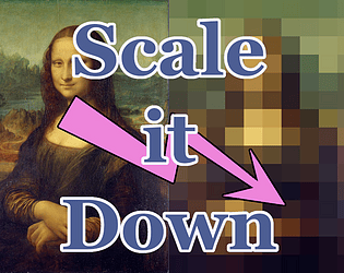
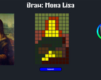
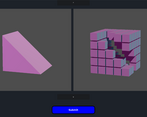
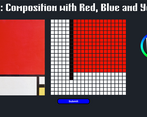
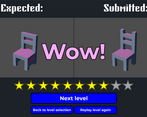
the game is about scaling down images and 3d models as an intern of a videogame company
Development Time
(Optional) Please credit all assets you've used
Music & Sound: Epidemic Music
See other minor assets on full description (sprites and 3d models).
Comments
Just try the last level he says, You'll get the ending then, he says.
Really clever take on theme, fantastic implementation everything worked as expected
I would love to see an undo tool added, as well as some options for sculpting like selection size but for a jam, this is perfect. Good job!
What a wonderfully unique take on the jam. This was very fun.
The fact that you interpreted scale as resolution is very amusing and it made for some great moments. I was also really impressed with how flexible your rating system was. I would have thought the ratings would have been very strict but I was impressed that it appeared to handle deviation nicely.
I don't honestly have a ton of notes, because everything that needs to be done is in fact done.
Great work.
I really like the concept, and the theme "scale" be presented in resolution! Very cool execution, just wish the color picker could show user visibility on what color is being selected without having to put it on a tile :) Otherwise, spent a long time trying to perfect the colors in my gameplay and shape was hard but fun xD
That pen scratching sound effect in the background of the 2d ones was like nails down a blackboard for me. Make it stop!
Otherwise fun little game.
A neat little puzzle game with a simple premise. Not the most difficult though which could be a problem if this was more than a jam game
I liked the 2d style a lot more than the 3d style. I find drawing games like this a lot of fun. I think it could be a good group game to play like how draw my thing works.
Really clever concept and story, and interesting gameplay, really like the ramp up in difficulty. An undo option would be nice, and the color picker being just a little bigger, with the 2 parts more separated could make it easier to use. Creative and interesting game, really great stuff :D
This game got really complex, very fast. The game feels quite unique and well done!
You probably made a few artists cry with this one. This was absurdly fun to play and what a great twist on the theme.
Pressing escape interfered with fullscreen mode, btw.
5/5
unique and charming time that made me laugh multiple times. full of character!! thank u


Leave a comment
Log in with itch.io to leave a comment.