Play game
Plasmo's itch.io pageResults
| Criteria | Rank | Score* | Raw Score |
| Originality | #14 | 3.167 | 3.167 |
| Score Chasing | #15 | 2.917 | 2.917 |
| Fun | #21 | 2.944 | 2.944 |
| Overall | #22 | 2.822 | 2.822 |
| Presentation | #30 | 2.750 | 2.750 |
| Theme | #39 | 2.333 | 2.333 |
Ranked from 36 ratings. Score is adjusted from raw score by the median number of ratings per game in the jam.
Judge feedback
Judge feedback is anonymous.
- This is really well executed, it feels great to move around once you get some speed up - I think the default speed should be quite a lot faster, but otherwise the momentum feels pretty good. I didn't actually know I could shoot, that could do with a little bit of tutorialization, but that's a minor nitpick for the jam :) shooting does trivialise the game, though, even if it does cost mass. If you want to take this further, the next thing you should focus on is JUICE! Animations for every state, more particles and other vfx, that sort of thing. There's a nice push & pull with the scoring, if you get too greedy you'll be punished, but if you play it too safe the game is pretty boring. I'd like to see more to incentivise playing greedy, maybe something like a "near miss" bonus would be nice!
How does your game relate to the theme?
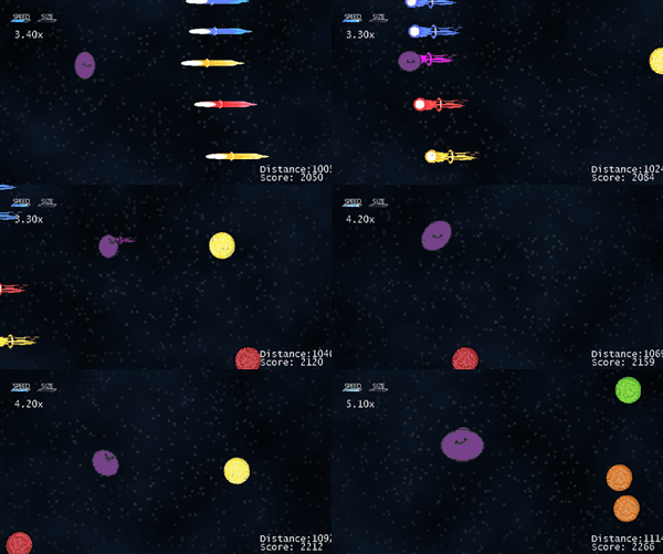
You play as Plasmo, a plasmic orb that is shot into space who is trying to travel as far as he can in one single shot. Colliding with energy orbs or pulses of the same color offer bonuses and score multipliers, while colliding with differing colors cause reduction in multipliers and/or a loss. The leaderboard ranking is based off of distance traveled times the multipliers that you gain throughout the duration.
Leave a comment
Log in with itch.io to leave a comment.


Comments
I was bit confused about the incoming bullets/pulses approaching through me so I kept avoiding it. But I kinda undestand how I play the game. It is a unique long-running simple and fun arcade feel game. Looking forward for you to continue and update your game. :D
Thanks Jerico!
We've really enjoyed a lot of the feedback as it's given us further direction in how we need to tweak the game. We definitely need to be more informative of how to play the game from the beginning, I agree.
Nice game and idea! I don't know how difficult it would be, but it would be interesting if, as the player gets bigger, the camera zoomed out to give a sense of scale, like in agario.
Thanks for the feedback!
That's a pretty interesting idea. We plan on going back to rebalance some of the number for how growth and speed works. Nothing is off the table if we think we can pull it off.
Very unique idea! Simple but addicting
Thanks! glad you enjoyed playing it!
Amazing idea, was easy to understand what to do, can see it becoming addicting :) .
Thanks! We're glad that you liked it. We tried to make something that could get challenging with color changes while keeping it simple overall.
I definitely was playing your game for a good while trying to get the hang of where to position myself. I'll have to circle back around to it again and see if I can get on the top of the high-score list ;P
Very cool idea with interesting mechanics but you probably should have explained them in game. I did multiple playthroughs and each one felt different as I slowly learned more mechanics through trial and error.
Some issues I found were that the orange and yellow colors were too similar which hurt me a few times, the hit detection is a bit innaccurate and made me hit orbs that I should have avoided, the main character dancing to the music is an awesome touch, and I think you might have some performance issues as it started lagging on my high end laptop the longer i played.
Great job putting together a unique game!
Thanks for the feedback!
We spent a decent bit of time trying to come up with an interesting game style that some of the common things got away from us till the last minute. As soon as we published we noticed the colors were WAY too similar for yellow and orange and we forgot to add the "in-game" rules and controls to our little KANBAN (oopsies).
Hadn't heard about the performance issues, yet, so we'll take a look at it and see if we can see what could be causing it.
Hope you had fun with our game, I def enjoyed what you did with yours!
I'm glad I read the comments and gave it another shot, my first time through I only dodged and it got boring.
This was a fun little take on a classic style. I had fun playing. Good luck!
I think the redirect really hurt you because you bypass the information given on the game page. I would include the instructions in the game instead as an initial loading page before gameplay, would be my only feedback :)
Yeah, we ran short on time and wanted to put the controls and game info internally, but after we realized the redirect hit to a new window we cringed a bit, haha.
We really appreciate the feedback!
Woo! Managed to get first on the leaderboard once I figured out the mechanics better.
One piece of feedback I’d have is that some of the colors felt very close and were difficult to distinguish sometimes in isolation. For those with color vision impairments, I think this game would be quite difficult without settings to adjust colors so that is also something to keep in mind for future games. One easy way is if you can pair color + shape to have two different indicators for an object’s function.
Nice work on the game and I enjoyed playing this several times until I could competently place on the leaderboard.
Dangittt! You beat my top score haha.
We appreciate the feedback you gave us. We knew there were a few colors that were really close, but hadn't thought about using shapes to differentiate them, too.
Hope you had fun with our game. I know we had a fun time with yours!
Cool idea with upgrades. Inertia also gives more challenge to it!
Thanks! We have a few other ideas in mind to maybe make it level-based and possibly have a shop between rounds.. maybe.. haha
We're trying to find the sweet spot with the inertia, because we've had feedback from a few people about it being a little TOO excessive, but we definitely still want to keep the mechanic in the game.
We appreciate the feedback!
Solid game! The gameplay mechanics were simple but effective - It was well scoped for a jam, and I had fun playing.
Here is my feedback:
Great job overall!
With a game that requires finite movements to dodge obstacles, I agree. Having inertia based movement seems like a detriment to the gameplay.
Had someone mention having waves of objects that spawn, but have a path carved out through it that you could potentially fly through. That would definitely have been desirable.
Nice game! I like the balance of getting larger to have more ammo while trying to avoid obstacles. I noticed it is possible to get caught on the back wall, but otherwise it played smoothly.
Thanks for the feedback!
We've been back and forth on how we wanted the mechanics of absorbing the orbs and pulses to be. We definitely still need to do some tweaking with the growth and speed rates to make it a little more fluid, but we wanted to have some difficulty exchange for trying to get too many of the bonuses at once.
Hopefully we can get some of the bugs out with getting stuck on some of the walls soon, but we're glad you enjoyed it!
Great idea to increase size and speed. Nice work with the game! It took me a little while to figure it out, but I got the hang of it eventually. There was one moment where I didn't understand, I picked up yellow and died, but then I realized it was actually orange.
Haha.. yeahh.. we had some placeholder assets while we were making the current ones in aseprite.. and after we turned in and I was playing I realized they were WAY too close in color to each other lol. Def something going on the fix list.
We appreciate the feedback and hope you had some fun!
I liked the game, but it would be great to add something for colorblind. I was confused if was yellow or green
After making this, I totally thought that might have been an issue. Especially with orange/yellow being so close to eachother.
Very fun game to play. i like the artstyle, mechanics and sounds. I was a few points shy of the leaderboard LOL, but i will try again!
I got 6700 but didn't see my score in the leaderboard, maybe because I signed in as guest? Fun game though! The mechanics felt pretty deep given how simple it was, nice job with the game design. Nice submission!
Nice score!
Yeah, guest accounts don't get registered.
Challenging but fun, I don't read the pages much so it took me a while to understand the colors. Very good concept. Congratulations.
Thanks!
We were a little strapped for time with putting a controls page in the game itself, so we had to put them in the description but we hope to refine the game more with everyone's feedback.
Glad you enjoyed it!
Not a bad entry for a jam. Perhaps try to scale the UI to match the viewport and make the challenges more difficult earlier on. I was sort of expecting to die immediately when hit by the wrong color (one shot), but it seemed pretty easy to keep continuing on.
Thanks for the feedback and trying out our game!
We were tweaking a lot of things last minute that we probably should have had down a little more concrete in the earlier phases with the concept of it.
I like the game a lot, the two projectiles add a lot of depth. My only minor nitpick is the music being a little too quiet - though this may just be a me problem.
Thanks!
We messed with the volume a bit while adding some of the other sound effects at the end and didn't notice it was too quiet till after the submission time. Ideally we'd like to put a sound control into it.
Great game
GameMaker Studio was used to make this! Had to make my own plugin for Hyplay, but was satisfied that it worked!
LETS EAT THE WORLD!!!
That's what pass on my mind about the game. Good luck🤞