What a well designed game! I liked the reverse gravity mechanic and how it tied in with the inverted colors and the changing music. It all fits together so nicely
qued
Creator of
Recent community posts
Thanks for trying it out. To complete the hacking minigame you gotta remember the keyword floating above the orb before you start (that could have been designed better) and then click it before time runs out. When you fail, it's supposed to create enemies and send them to your position but the pathing is sometimes suck. Thanks for letting me know about the bug when pausing during game over sorry bout that ¯\_(ツ)_/¯
Nice game! What a hard-working familiar, and such a dirty wizard!
Moving around was challenging and took some practice. Finding all the books was a challenge in such a big space, I couldn't track down the last one. I wish I could have zoomed out more or had an arrow indicator for the direction. The music was well-done and the sounds effective (that garbage noise was gross!) I really enjoyed character portraits and the art and animation of the familiar creature. That wizard though...
well done :)
Very well done! The art was impressive, I loved the 3d character and the intro, very nicely done. I liked the variety of levels and mechanics. It felt like one of those precision platformers where you die a lot (but its ok because you come right back). I encountered a bug where often when coming back after dying my rodent character wouldn't appear and I would have to reset the level, sometimes more than once, before it would reappear. Other than that it was bug-free. I really enjoyed playing it
Even without VR the throwing mechanics were solid. I wish there was a crosshair, but you learn where the "bombs" are going to land after enough practice. The graphics are good! I liked all the different poses for the figures, and the zombie variations were nice. I too found you could rapidly throw to drop tons of figures and completely defeat the threat of zombies. I think it would have benefitted from a cooldown, or maybe a recharging ammo pool, or something like that.
All in all, great work
What a nice point-and-click adventure type game! I love the puzzles in this one, they're just the right difficulty and make you feel smart for figuring them out like every good puzzle should. My favorite was the flag one.
Music cues were rewarding for figuring things out. The controls were convenient, i'm glad I didn't have to get close to things to click on them necessarily.
I laughed when I tried the door and there's a dragon sitting there. Well done
Superb pixels and sounds! Great music and animation, too. Love kicking barrels into wizards. Love kicking princesses. Love kicking the king :D
Harsh that you just get game over when you run off the screen, I was expecting to just lose a life and get pushed upward. I hate that the wizards still shoot even if you kick them as soon as they appear. I noticed your score resets between levels, and stage 2 has a weird visual bug where it looks like there's two towers on top of each other for a second? Other than those gripes, everything was excellent.
Stage 2 is hard! Those yellow wizards, man. Never got past it in many attempts.
Kick ass game!
AHHHHHHHHHH
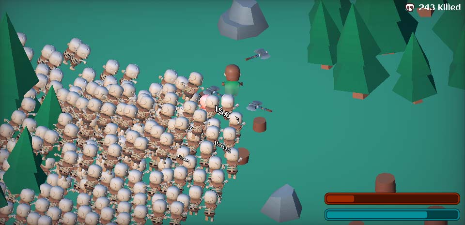
That was hectic! I got to level 6 before the lag was unplayable and I became dead (i played on browser)
The tradeoff mechanic where you go without a power for a round to get it back stronger, real risk vs reward stuff there, nicely implemented. The character models are really nicely done. The music is great. The jenga block system took me a few tries to understand - it encourages planning ahead in a unique way because you can't pick two adjacent upgrades. Does the height of the tower or the level influence anything or is it just a mark of progress?
I noticed the kill counter doesn't reset between runs, but I guess because of the unimplemented upgrade button on the 'you failed' screen that it's intentional and that you'd get stronger each time
Nice game!
Oh I love these kinds of games. Felt like my marble was made of rubber sometimes though. I had fun blazing through to the bottom. Near the end I was confused - i thought i would lose if i dropped off the tower but that was the way to win. The game could really have used some audio, even if it was just a click-clack when you collide with something. Good game overall
There's some skill in this. It's almost like asteroids where you wanna clean up the whole slime/asteroid before you break em all up or else you'll get overwhelmed (or like Houseman games said it's like Buster Bros which i never heard of before but yeah, an accurate comparison). I liked the music and the art too.
Tight controls! I'm surprised how good it feels to control a square!
I didn't know you could pogo jump until I read your description more carefully, but yeah it's there. I can really feel the Hollow Knight influence in this. I noticed the hit slow when you take damage on my second playthrough - nice!
Nevada Desert
Boom
I liked the variety in the minigames in this one. The pixel art was all outstanding and the sound design was well done for each era. The picture descriptions for what to do in each level were fun to decipher - they reminded me of like, Wile E Coyote or something . The "quotes" for each time period were funny :) Nice game!
Reminds me of Neon White. It's way cool punching angels in the face and the designs are weird and interesting and uhh, eldritch, in the way angels can be. The character controller was good and the sound design is effective. I really liked all the silly achievements for doing things as simple as playing two times or opening the options menu :D
I couldn't get past level 2 which is a shame because I really wanted to see the rest. Great work
I couldn't really figure it out. I clicked on things until they disappeared. Then if the HP got low I clicked a heal card. I wasn't sure if I was fighting the cards or if they were fighting for me?
There's a solid foundation of a roguelike card game here, but I think it needed a tutorial or something cause I was lost.
Alright I got to try it this time and it's very impressive. It looks and feels like a classic city builder. My company Company Inc. pretty much just bought every tower it could and won the game with 75% market share. I would have liked more choices to make. It must have taken a lot to get to this level of interactivity though. The camera controls were good, the UI was useful and functional, and the city looks nice. Solid work.
The artstyle is delightful! The music was charming. The character animations were really well done too. The platforms were a little sticky: I had to quit one time because I got hard-stuck on some beams. There was some clipping and strange turning behavior when looking straight down that Theonixie mentioned. Other than that the controls were precise and intuitive. I ended up heading straight to the top to collect all the abilities before doing it again to get the books.
The count Jeffula sure does a lot of reading, dang.


