Most importantly, this was a fun game to play, hitting the difficulty curve quite nicely! I enjoyed the art, and the music is suitable, although I did have to turn it off after a while to preserve my sanity. But at that point I kept playing the game, which is a good sign.
Renons
Creator of
Recent community posts
Thanks for playing! Yeah... difficulty is subjective and nobody is worse at judging it than the author I guess. Ive noted that if I make more levels, which would probably require more monsters and mechanics, they should not all be on a rising scale from where this ended. I really appreciate your feedback!
I agree with the need for a quick way to restart... I just could not figure out how to go about it. Don't want to have something one can hit easily by mistake... yet it needs to be discoverable... and I don't want to introduce a hud just for that one. I though about a soft lock detection mechanism that brought up a hud but that was out of jam scope...
Thanks for the review and the feedback! I put a bit of thought into how to introduce the various mechanics without needing a tutorial so I am right chuffed that you noticed and liked the difficulty curve.
I totally get where you're coming from with the monster sounds, I think I need something longer to get more variation and less interference between the different monsters. Trying to keep the levels short enough that redoing them doesn't feel too onerous while still allowing the puzzles to be interesting and not advertise the solution by always putting the key right next to the lock is... hard. I'll try to think of a way to tweak Thief in particular.
I had a bunch of fun with this, good game with a solid core idea. I like how the glow of the enemies advertise their presence which makes you scuttle around furiously to try to avoid them. Once spotted the mad dash to avoid them feels fittingly chaotic. I liked it!
The difficulty curve is brutal, a couple of levels in it start to feel nigh on impossible. Might be on me though. I don't know that the change in control scheme really felt necessary, the chase sequence version might have been a better choice all of the time? But maybe it was necessary to really bring out the change in pace.
A fun little game with well-chosen graphics. The hiding functionality (at least I think that was what it was) was useful and felt like a natural fit to the theme. A bonus for theme adherence and the name, favorite game name of this jam :-) Very good job over all!
Things that could be improved for me was that... maybe it could be a bit easier? I also found the hiding mechanism a bit obscure, the little icon not entirely obvious. The paths you can use can sometimes either be a bit too hard to spot graphically, or just a bit unforgiving to use from a collision box perspective, which made navigating feel a bit clunky and random when it needed to be fast and smooth, i.e. when you were being actively hunted.
This one sure looks very good, and with an appropriately haunting atmosphere. Sound and music work very effectively as well. The "over the edge" action is frantic and moving down approaching enemies is very satisfying, even though you soon get overwhelmed by their sheer numbers. I like how the long spin up of the weapon feels as well.
The game needs some sort of feedback when you're under attack though, partially for impact but primarily because it's all too easy to take massive damage without really noticing.
I like the way this game looks, very simple but effective, good work! The speed with which the enemies come out of the dark makes for effective jump scares but also makes the game very hard. I died a lot.
A problem with the difficulty is that it also felt a bit unfair... I don't know that I could do anything differently or get myself out of my bind. If you stumble into the wrong spot... which sometimes feels like it's every spot... you will die, frequently without seeing the enemy because they sneak up on you from behind. I think better signaling is needed... both about potential dangers, so that you can balance the risk of going somewhere with the rewards, and about enemies behind you.
All in all though, a neat jam entry, with a good core idea.
Looks good, feels good, fun concept, love myself some building in a game! I especially like the sequence where the great one arrives, nails the atmosphere very nicely. I also liked the flock of birds, and the birds occasionally settling on the roof, and the fact that one gets rid of pieces by giving the to the birds rather than the more obvious solution of throwing them in the sea. Very nice touches that greatly enhances the sense of polish. Good work for sure, with just the right amount of scope for a jam entry.
Some nits: the controls were a bit flakey, I was frequently be unable to pick up the pieces from the tentacles, clicks just didn't seem to register. Same with dropping off the unwanted building at the top, nothing would happen, with no explanation. The latter issue served to aggravate the problem that roof tiles would stack up from early on, frequently leaving me with only a single non-roof tile to pick from. Maybe tweak the frequency as the height increases?
Really polished, feels like a complete package, with nice art and sound, very good work! My two complaints would be that I was similarly confused by the shield, never quite got a feel for when it was active in the midst of the general mayhem, and that the difficulty curve felt a bit unfair... which was chiefly a problem because I wanted to play and see more!
There's a good concept and game lurking in here but it's not quite there, mainly because it's really hard due to the controls. As soon as the camera started moving around the click-n-drag mechanic becomes essentially impossible to use. I think that one could either go for direct WASD controls of the ball, or make it so that you can't fall out of the level, or make the camera PoV fixes. I'm not good enough the current combination :-)
A complete and polished package. Fantastic looks, very charming, lots of attention to detail. On top of that lots of challenging puzzles. Way too good/complete for a 96 hours game jam really.
One might complain that the two-click interaction is unnecessarily clumsy, but yeah, that's a minor spot on a bright sun.
Very solid entry, fun, hard to stop playing, simple but effective visuals, very good job! Really cool how much it achieves with so very little, not even being able to aim the ball. A few levels in the controls start to feel natural which is very satisfying.
Also vaguely infuriating, which some people might enjoy more than others :-)
Great game! Good art style and music, a novel puzzle concepts which fits very well with the theme, and a bunch of great levels that introduce new mechanics at a good pace. A complete package really.
The art style certainly looks good but I did walk into a pit at once, not understanding quite what it was, so maybe it's a little to abstract? Learned that one quickly enough though :-)
Just awesome, such a complete game with a lot of content. Impressive stuff.
Introducing the mechanics slightly slower would have been appreciated, and maybe some kind of "tutorialy" introduction of each item, at times I felt like I didn't quite understand what I they were doing and was just clicking randomly. But that's really a nit here, good game!
Thanks for playing, and for noticing my design choices! The former is as noted an anti-cheesing measure, the second was inspired by a GMTK video where he talked about how Tetris gets more difficult in a natural fashion as the layers of brick on screen grows deeper, so I went for something vaguely similar.
Really neat puzzler with interesting puzzles, very good job!
It could be somewhat hard to place both slimes and boxes on buttons, they would roll off again. I also managed to push the box in such a way that I couldn't progress, could use a level reset button, or if there already is one, could make it clearer what it is. Nits aside, this is a great game.
Cool game, nice graphics, good sound, fantastic idea. Good job!
Unfortunately the performance rendered this one almost unplayable beyond the first minute on my computer. The sounds started skipping badly and then the framerate went down to almost nothing. Maybe it was just me but if that's fixed I think this could be a really really solid game.
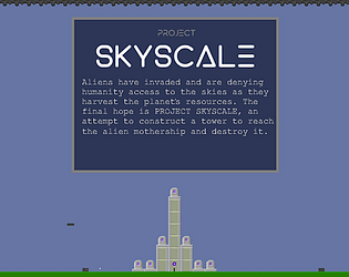
The solar panels make a big difference, but if you put them on or close to the ground you need a bunch of them. The "unstable tile" mechanism work by checking for ground or scaffold tiles three blocks down on each side of the block. If there's any other kind of tile there the block is deemed "unstable" and is rotated by a small random number each frame. When trying to build the game checks that the base isn't unstable.


