Thanks for playing! This is actually going to be an updated version of my last game Untitled Puzzle Platformer, if you're curious to see what the instrument does. 🙂
SquishypuffDave
Creator of
Recent community posts
This is a masterpiece, plain and simple. Genius concept, elegantly executed. The new ways I had to think about the stick when it got longer were really satisfying too.
I did run into a bug where it kept looping the same level each time I completed it. It was the one with a couple of big rows of boardwalks.
This is so pleasant to play, really nicely polished! That difficulty curve gets out of hand fast, I can't decide whether I'd prefer a slower ramp up or if I really like how fast it gets out of control. While I picked up a couple of tactics along the way, I'm also keen to watch other playthroughs to see if other players come up with a different approach.
Great nitpicks! Having jump on both down and release was my hacky way of letting players jump if they press the key just before they hit the ground. I'll set that up properly in my next version.
I've had a few suggestions to improve the control scheme so I'll keep asking around and see what the consensus is. 😃
The technique for the images/animations took a while to start with, but then I could automate most of it once I'd figured out the process.
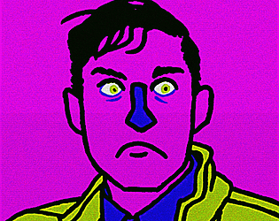
The character sprites are clips with greenscreen backgrounds from a stock footage website (stock footage acting is very strange and uncanny, perfect for this game), then brought into After Effects where I resized the image, reduced the framerate, and exported the frames as a sequence of images. Then in Photoshop I created an indexed colour palette with very few colours, and applied it to all the frames of the sequence to give it that crunched-down look and emphasize the pixellation.
The neighbour character is more like an omen or a prophet than a character who has a role to play in the events of the story, apart from being the one who made the coffins for the deceased characters.
Totally agree, subtitles would have been a good idea!
I spent a lot of time confused and lost to begin with, but had more and more fun as I played. I especially enjoyed the labyrinth with the minotaur punishment for wrong answers, that was a great idea. The music was great too, very quirky and charming.
I'd probably recommend a non-Latin menu, just to lay the foundation for the gameplay first, but on the positive side it's a clever way to force the player to immerse themselves in the language and teach it contextually.
Thanks for the kind words. Regarding the compressed audio, I tried to replicate that horrible early 90s Darkseed-style adventure game aesthetic, but I may have gone a little overboard! It was also partly inspired by PilotRedSun's animations.
I really respect that you shared so much of yourself here, even if some of it was fictionalised.
One thing I found strange about this game was giving the character my name, but hearing them describe someone else's memories in rich detail. I think I would have preferred that you give the character their own name, then you could get even more specific about their gender, ethnicity, geography, etc. without having to worry about compatibility with the player's identity.
As a formatting note, the therapy scenes read almost like a script or an audio log, but they sometimes switch between dialogue and action without warning. I'd recommend either distinguishing between the dialogue and action with the text formatting, or rewriting the scenes as prose. Describing the body language of the therapist could also add a lot of depth to those scenes. I imagine that's something the protagonist would be paying close attention to during such a vulnerable situation.
If there was a category for best title/concept, this is my personal favourite. A lot of it felt like guesswork, but maybe some of the clues in the character descriptions went over my head? I wonder what kinds of puzzles you could build into this. I can imagine "solving" each person via deductive reasoning being really satisfying.
This is super evocative, I never quite managed to piece it all together into a coherent whole though. The combination of elements was cool. It felt like the Deleuze passages and the MRI imagery were equally prominent, and competing for significance. The game might have been more powerful if it leaned more in one direction or the other, perhaps sprinkling the Deleuze passages in every now and then to complement the main narrative about the MRI machine? I'd love to hear your thought process behind the game though.
I'm sure you'll get to see it played on the Twitch stream at some point! I will clarify that the game's description is... unreliable to say the least. And yeah I did the logo on the jam page. :)
Played through yours a second time, had a great time with all the extra content I discovered. There was one glitch I found, where if you go down the well after getting the cross, you lose the cross and two different music tracks are playing. I also ultimately gave up that platforming challenge at the end with all the moving ghosts, I couldn't get past it or figure out any kind of strategy. Could just be my lack of platforming ability but I did find that part frustrating.
As a platform puzzler this was solidly designed! The gradual shift from prey to predator was wonderful.
You might be interested to hear that our last jam had two constraints: it had to contain little to no text, and it had to use the narrative mechanic of anagnorisis, meaning self-revelation. I think had you submitted this to that jam, you may have won it.
What was especially good about this is that you trusted the player to piece the story together themselves. I enjoyed putting two and two together myself, and you even foreshadowed the ending (at least the one I got) so that the conclusion felt both surprising and inevitable.
Also this made me very nostalgic about all the Flash games I used to play on Newgrounds, so extra points there.
The best thing about the game is sensing a distraction coming and bracing yourself in anticipation. You could try gamifying it even more and turning it into a kind of psychological resource management game, but I have no idea if that would actually be more fun. A really simple example would just be having a deadline and tracking the time throughout the game.
It's also fairly low-stakes, which gives it a lighter tone. I wonder how it would feel with significant implied consequences for not finishing that night? I imagine the emotions would be heightened and self-loathing would kick in, really highlighting the absurdity of the human brain's tendency towards procrastination at its own expense. My experience with procrastination has often involved real despair, which contrasts with the sheer pride and accomplishment of actually getting work done.
As it stands it's a short, sweet and relatable experience where the choices feel meaningful, and that's a success in my book.
Her response to the dog is making a lot more sense now having seen the ending, I really like it in retrospect! It depends how committed you are to naturalism, but it would be cool if you found a way to depict her sensory overload in such a way that the player is also experiencing what she's experiencing. Like a bright flash and a tinnitus noise or something?
I think you were successful with the anagnorisis, though I reckon the scene structure could be even more developed in your next version. Good job!
I loved it. What else is there to say? Incredible use of shaders, the story completely pulled me in, and the anagnorisis hit hard. For a game that's nearly all just "walk to the right", it somehow used that mechanic to communicate all sorts of ideas. Slowing his movement in the office scenes was a clever move; since my objective is to get to the door and I have no other ways of interacting with the world, I get a tactile sense of the frustration and hopelessness he's enduring.
I have concrete answers for some of those questions and not others. With the burning book ending, the flame attack caused the book they were in to catch fire. With the framed portrait, that's an alcoholic beverage he's holding, which hints at the potential origin of his "monstrous" nature. I certainly think this could have benefited from being longer, and supporting those ideas with extra details along the way. Even exploring the implications of what it means to live inside a picture book: torn pages you can't cross, walking into pages from other books, etc.
EDIT: Also I'm glad you mentioned the music progressing even when you return to the start, I wanted to make it clear somehow that it wasn't a complete reset and that the story had progressed in some way.
Great illustrations Strood! I love how bendy and expressive they are.
You've been consistently good at planting little details that help the player immerse themselves, like the choice of weapon at the start feels like an objective correlative where I got to express my character's personality in-game, and start to paint a picture of who they are.
I'm juggling multiple different interpretations of that ending. My first thought was "Is this a time loop? Is he killing himself over and over again to steal that item from himself?", then "Did the guild leader turn red from the blood? Did the yellow signify their leader status?". If the player character had somehow turned yellow, that would have felt extra poetic. The overall emotional and thematic beat of the ending works regardless though, it's a classic tale about the cycle of violence.
Also, I did a second playthrough where I made intentionally bad tactical choices to see what would happen, and I still won. Would have been nice to see a fail state there.
Real cute! Unfortunately I'm stuck at the part where the dog is looking at the hole in the brick wall, Scarlett freezes when I interact with the dog at that point. The mysterious dog leading you away from your ordinary world is great though, classic narrative device. It would also be cool to see more evidence of some need or desire that Scarlett has, like maybe she's in a monotonous routine and keeps seeing other people doing exciting things? Or a scene at the start where where she sees the dog but can't follow him because she has other responsibilities to attend to (refusal of the call).
What was your thought process behind the dog making Scarlett cry? I took it as Scarlett wanting to befriend the dog, and the dog rejecting her. I guess that means the dog isn't intentionally leading you somewhere?
I need to see what's in that dang building though!! XD
Thanks for the review! I'm sure The Twits was an unconscious influence, and Roald Dahl in general. A lot of his stories are basically monster stories where the protagonist is a child and the "monster" is an evil adult.
Honestly I think the anagnorisis in the very last shot was a bit weak, though I tried to plant a lot of mini-anagnorisises throughout the story: Who scribbled everything out and what does that represent? What is your dynamic with the boy on the roof? What is the significance of the man in the picture?
I'm really happy that you felt an emotional arc throughout the game, that was much more important to me than coming away with an intellectual understanding of the story.
Really interesting to see how you approached the constraint with a text-only game, almost like an oulipo exercise. I thought it was a well-conceived scene, moving from "I am a hero" to "I am being used for evil", though I did have to give it a replay to try and get my head around what was going on.
Also, because there was so little extra visual information, I was trying hard to figure out if there were extra meanings attached to the font choices and text colours. Could be a fun thing to explore more?
This game really came together with the "not a cult" song and "hey there cthulhu" song. I'd encourage you to go even harder on the comedy throughout the game, it was great.
Loved those weird glitch effects. Less enamoured with those slide transitions though, I think it pays to be minimal with that stuff and let the imagery speak for itself.
Not a lot of feedback to give at this point, but the opening passages did intrigue me and I found myself wondering how it tied into the story with the kids. I would have liked a little more detail about the school situation, there was a certain suspension of disbelief having the teachers confiscate the kids' phones while also essentially abandoning them. The logistics confused me a little. Also there was a bit of a readability issue with that light grey gradient, I'd recommend a flat colour that contrasts well with the text colour.
You've married the UI with the story/setting perfectly, really well done. It also feels confident in its worldbuilding and gradually drops information in a way that creates intrigue rather than feeling like an exposition dump.
The line "current processing depth set to 2" really sparked my imagination, in fact it's an excellent hook. How many settings are there? Why is it set to 2? What do other processing depths look like? As the player I'm restricted to the answers it provides me, so the idea of increasing processing depth sounds like it directly affects my options, almost like levelling up.
This felt much closer to a classic mad lib than Pick Me Up, where most of the entertainment comes from how disjointed the final story is. It actually made me appreciate in hindsight how strong the tone and setting of Pick Me Up was, which genuinely landed an emotional punch at the end. I really think there's a lot of potential in this format for something I've never seen before -- a story that's really personalised to the player in a way that isn't just multiple choice. Especially if it's combined with other forms of gameplay. Well worth exploring further.
The ambiguity of this game really drew me in, and I really appreciated the subtle animations rather than just having still images. The prose read almost as poetry, which I think served it well; it meant I didn't expect explicit answers and could just sink into the dreamy headspace of the character. I also appreciated that it didn't run longer than it needed to.
I'm only partway through, but I've already collapsed into hysterical laughter several times. Also the narrative structure is actually really solid, you've got a strong grasp on the mechanics, plot beats and tropes you're working with. Interestingly, the protagonist reads as female to me regardless of the gender you choose. That's not even necessarily a flaw, it really brings certain aspects of gender politics to the surface.
Thanks for the review! There are a couple of problems you mentioned that I'm aware of and would have liked to fix if I had time.
You made an interesting comment though about the fact that making the same decision could lead to a different outcome, and that you didn't enjoy that aspect of the game. I guess you could call this a "powerlessness fantasy", in the sense that your fate is mostly outside your control. I think that fits the theme of the game pretty well, but perhaps it should be more of a 50/50 split where you can make stronger or weaker tactical decisions but there's still a chance of failure.
Additionally, it might be more satisfying if the player could actually see the chance of success next to the option they choose. You've given me a lot to think about! 🙂


