Play game
Floodworks's itch.io pageResults
| Criteria | Rank | Score* | Raw Score |
| Theme | #80 | 3.888 | 3.888 |
| Overall | #93 | 3.685 | 3.685 |
| Graphics | #108 | 4.121 | 4.121 |
| Innovation | #133 | 3.542 | 3.542 |
| Audio | #165 | 3.514 | 3.514 |
| Game Design | #193 | 3.570 | 3.570 |
| Fun | #226 | 3.477 | 3.477 |
Ranked from 107 ratings. Score is adjusted from raw score by the median number of ratings per game in the jam.
How does your game fit the theme?
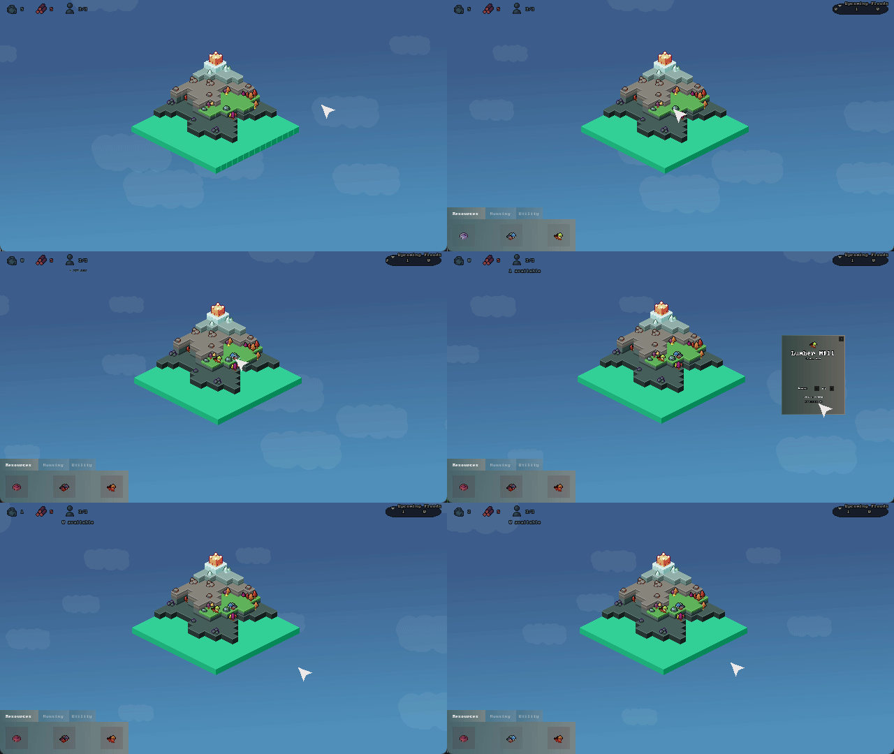
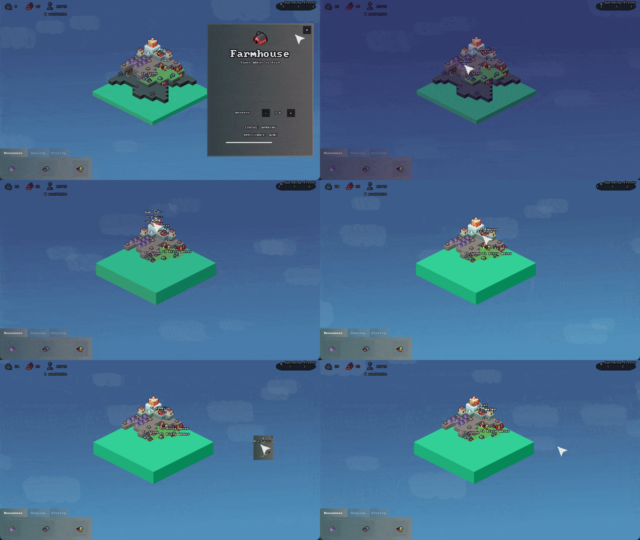
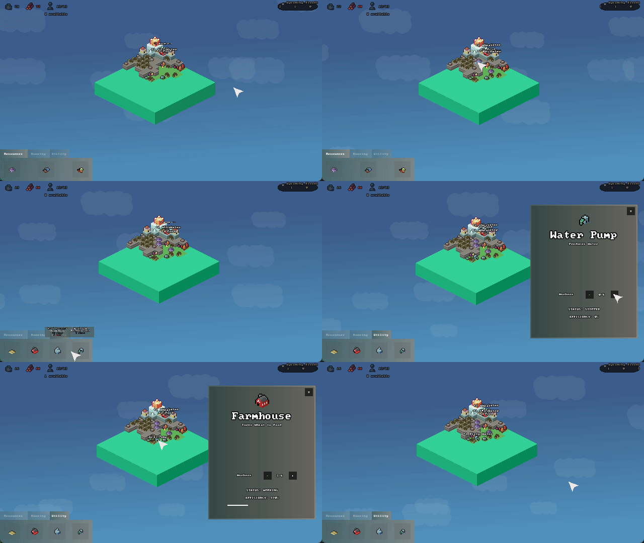
The game involves needing to manage a city as it is getting progressively more flooded from a storm occuring. Theres a relatively calm early game where you can build anywhere and then eventually everything becomes flooded in late game as the storm gets stonger
Did you write all the code and made all the assets from scratch?
Yes
Leave a comment
Log in with itch.io to leave a comment.


Comments
It's a really beautiful game! I like the music and the audio as well. The gameplay is very interesting - a little bit tough to get into just because of the lack of the explanations behind the food / water mechanics, or maybe I just missed that, but it's pretty fun after!
The art is beautiful, I love it! haha, overall I really liked it, the mechanics work well and it's a lot of fun.
The only problem I see is the fact of not having visible resources of food and water like the others, it was difficult for me to understand why I was losing.
But despite that I was able to get quite far, it's excellent work! :D
What a lovelly game this is, I hope you continue working and ironing the bugs, this could totally be a thing.
Fun, charming resource management sim :D I especially enjoy the art and beautiful soundtrack! The game could afford to tell me more useful information with less guesswork (food/water can be shown as a resource on the top left as well, show me the qty of “invisible” resources such as wheat and dirt water, etc)
Overall, the experience and economy was really well executed within the time limit, great work coordinating such a large team for the jam! xD
Solid amount of depth for a jam, love the vibes and the sinking realization that my plans have all been ruined.
Awesome game! I like isometric games. Give me fftactics vibes, hehe. A in game tutorial would help a lot. I was a little confuse on what to do at first
Cool game ^-^ Super cool that all the assets came together so coherently, and the gameplay loop is fun! If you expand on this game and make longer survival requirements, etc., a way to protect your buildings from the flood would be sick. Like flood barriers or something. Nice job on this one :D
This is a really cool game, I liked the flood system and the fact you need to manage a little village! One note is it could have more noticeable indicators for something like food/water, but it was overall very good and the graphics were nice!
This is a neat little experience (barring of course the bug with buying buildings). I think having a more clear end goal as well as player guidance could go a long way in making the player's choices feel more impactful. Sound effect feedback could also be helpful as I did not realize a flood had happened when it first happened in my run. Beyond that, I really like the very compact feeling to the graphics overall and would love to see an expanded version of this game mechanics wise. Good job!
The music is very relaxing and also a very smooth experience. A few more indicators for this kind of games because it took me a while to figure out the gameplay, or maybe it was just me :)
Great start to the game. I think the game requires a clear objective, because otherwise you can just have minimal workers and turtle through the days. Also more indicators as to what is really going on: how much food/water you are spending, how many resources are being produced, how many workers are in each building without having to click individual buildings, etc. Also sfx would have been helpful
Nice submission otherwise
Doing the turtle strategy gets you far but you cant beat the game that way with the balancing (only gets you up to day 15)
But yeah definitely will clean up a lot of aspects including the UI and have some better onboarding in post jam
I like the visual so much but it would've been better if there was a tutorial, I did not know why the resource buildings dont work but then figured out later but still, it was a bit confusing at first. A really solid game tho!
Very nice!
Great concept, solid graphics and music.
The ergonomy is a bit weird (why not put all the resources in the top bar?).
The polish is good overall, despite the lack of SFXs.
Awesome game. I really enjoyed it. Though I think that food and water could have been part of hud just as the rest of the resources and the mechanics could have been explained within the game as well but that is just a nitpicking. Really good job!
Great work. I like the simple game loop. You did a great work on the art. I would have liked to have indicators for wheat, food, dirty water, and clean water just like you have for wood and stone. I also think that you could just display all the buildings at the bottem instead of heving them in tabs.
Pretty good game, really liked the concept and mechanics with the floods and water levels a lot, Though in my opinion it seemed to take quite some figuring out to be able to truly appreciate it. I could see someone easily giving up or even thinking the game is bad because they actually didn't understand something in the game, whether they even really realize it or not. Actually, when I first played the game a few days ago, I immediately quit and skipped rating the submission entirely as I thought the game could not be played. After I tried it again I was able to play it, and I actually really enjoyed it!
I think to improve it, there could be some more indicators to hint to the player what's going on. For example, when a water pump cannot have people added to it, maybe a red text appears at all times that says "too far away from water" (while it's still true, since I guess that can change even for the same water pump depending on the water level).
To try and check on more reasons why I might have quit right away at first, I think one was that everything being extremely tiny (in my opinion when I first saw this) and not able to zoom in or really do much of anything, as well as the huge amount of space around the main area also was a factor that turned me away from the game as well, well at first. However the problem is when I play it now I kind of like this aspect and found it appealing, so I'm not really sure if it really indicates something should be changed or not. It's possible there's something about this game where it's only for a certain kind of person that gives it a chance, but I'm not sure. I also can't tell whether that's a bad thing or may be even a good thing, as it may really depend.
I think some additional things probably have to do with indications and user feedback. Especially since the style is zoomed so far away and there's so little in terms of audio cues, it's almost as if the game assumes a very specific type of person will play it. Either someone that already knows what this kind of game is, or someone who better figure it out, figure it out as fast as possible before anyone in the vicinity might notice they didn't actually know how to play it, and they better also pretend they knew the whole time as well. Usually this might be an indicator that something in the game's overall feel isn't quite clear enough which might limit the accessibility of the game to only certain kinds of players, but that might depend on some things.
It's possible that an additional idea to improve it is that there should be a way to destroy buildings or clean up ruins,. But it's also possible it was intentionally done the way it is here.
Other than that though I really liked the game a lot, it was pretty straightforward once I got the hang of what was going on and it's pretty fun - so nice job on it! I may even consider to play it again sometime.
First off, I have to say... Wow, conduits are insane. I think I had over 1000% efficiency on all my buildings at one point haha. The game definitely has a learning curve but it's fun to strategize and even more fun to break it (without using the negative bug of course). The fact that all the music, graphics, art, code all of it was done in mostly a day is absolutely crazy. My only gripe is that it was inconvenient when workers were assigned to processing buildings and ran out of resources and would sit there, I didn't realize you had to manually unassign them until I almost beat the game. Really fun game, I would love to see the concept expanded on. Amazing work to the team!
Hey, I really like your game concept! You've structured it well (let's ignore the bugs for now). I had a great time playing it, and I believe with more development time, it could definitely be worthy of a Steam release. Oh, and I also love your art style—simple but memorable. Keep up the great work! I'll make sure to give you a good rating ^_^.
This is a really polished product! The art is fantastic, the music is relaxing, and the theme is integrated quite well into the core mechanics of the game. I enjoyed it enough to do multiple runs of the game. The first run didn't go super well, because I didn't really internalize that the lumber mills needed to be at the same height as the trees to harvest resources, but once I realized that it went pretty smoothly.
The only minor suggestion I would make is that it might be cool to have a UI element on screen at all times that tells you the amount of food, water, dirty water, and wheat you've collected. I thought it was just a bit difficult to determine when I had hit a good production rate of resources and found myself constantly mousing over the town hall to check.
Amazing work!