Play game
Bound - Jam Version's itch.io pageResults
| Criteria | Rank | Score* | Raw Score |
| Presentation | #732 | 3.754 | 3.754 |
| Overall | #1414 | 3.256 | 3.256 |
| Fun | #1618 | 3.014 | 3.014 |
| Originality | #2361 | 3.000 | 3.000 |
Ranked from 69 ratings. Score is adjusted from raw score by the median number of ratings per game in the jam.
How does your game fit the theme?
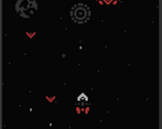
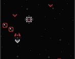
A space shoot em up where you're bound to the enemy
Did your team create the vast majority of the art during the 48 hours?
Yes
We created the vast majority of the art during the game jam
Did your team create the vast majority of the music during the 48 hours?
Yes
We created the vast majority of the music during the game jam
Leave a comment
Log in with itch.io to leave a comment.


Comments
This is quite fun but hard game . I like the art and sound too much since you made them.It is a solid entry overall and i would like to hear your feedback about my game too .
Thanks for the feedback, will definitely check out yours!
Hey, really nice game! The art works great! Congrats for your submission :)
Thank you :D
nice game, I really like the art.
Thank you!
The visuals are good, and I had fun for a while. But then I realized I could kill enemies as soon as they appear, and since the difficulty does not increase, I could play forever. I think this game needs more variety to enemies, preferably those who require you to switch.
I also didn't realize the red ship is an enemy until I read the description. Are you planning to add more stuff that requires this setting? I know "red ship shooting at you when in full health" is missing content, but I think that will only add minor annoyance to the game(you can prove me wrong though). Maybe controlling the red ship will make enemies behave differently or unlock new areas. Or, if you can't come up with good reasons, you can scrap the idea of bounding to the enemy ship and make the game about two ships with different abilities joined together.
You're definitely right, I'll be looking to add more enemies after the jam so that there's more of a reason to switch between the two ships. Thanks for the feedback!
The aesthetics of this game are on point! The controls are snappy, and everything feels great!
However, I disliked how the shooting and switching actions were mapped to the z and x keys. It would have been better, in my opinion, to map to the space and shift the keys instead.
Nice work!
Thanks for the feedback!
No problem! Happy to play!
Really enjoy the concept and with its tight control and design that fits a classic arcade game this is really well done! Good work! :D
Thanks for playing!
The aesthetic is very well done and I like the core concept a lot. I felt like I never completely understood why you would ever really need to switch, other than for the big walls of stuff, since the red ship having more heath (which I think it does?) doesn't really matter if you are dodging everything anyway. Something like having the white ships health bar be much smaller in comparison to the red one would help communicate the difference more. Good job overall.
Yeah I know what you mean, the red ship is supposed to launch an attack at you when in full health so you would need to balance both health bars but I didn't manage to get that in, definitely something I'll be adding after the jam. Thanks for playing and for the feedback!
Really love the style. Nice job!
Thanks a lot!
Really interesting main mechanic! Unlike anything I've played for the jam. Once I figured it out, it worked fantastically, but for a while I was completely stumped as to what the point of switching was. Making that clear in game would be great in an update!
Yeah I totally agree, I'll look into adding some kind of tutorial after the jam, thanks for the feedback!
Sweet and beautifully polished space shooter! The main mechanic is interesting and works with the theme nicely. Great submission!
Thank you and thanks for playing!
Wonderful game, I love the gameplay, idea, music, SFX and art! I would totally play this on steam if a few more things were added, personally I would enjoy a boss in the game.
Thank you so much! I totally agree, I will try to add a boss in the next update, thanks for playing!
Well done!
Thank you!
I absolutely love this! The art is beautiful, and I really enjoy the central mechanic. Would love to see a future version with the missing feature you mentioned added in
Thank you! Yeah I will be doing an update after the rating period to add that in, thanks for playing!
Wonderful art. I couldn't quite work out the connection between the red and white healthbars or what to do against those bubbles. Otherwise great game!
The main concept was that you need to balance both health bars, there's a missing mechanic that I couldn't implement in time where the red ship would launch an attack at you when in full health - you can't destroy the bubbles by shooting at them so you have to switch to the red ship to break through them and protect the white ship, thanks for playing!
Nice concept and glorious art. Is it your first game?
Thank you! My first game using GameMaker and my second game jam, I've done a couple of tiny games on Pico 8 before
Love the concept, though in the end I spent almost all time as the white ship, there wasn't much reason to go red. Fab graphics too. After about 150 points the game started slowing down, and by 350 it was snail's pace, not sure what could be causing that.
Thank you! Yeah it seems there's some kind of performance issue there, not sure what's causing it, thanks for the feedback!
Love the visuals style!
Thanks!
Interesting concept I haven't seen too much, at first I thought you had to hit everything with the different sides of the ship, didn't even know you could shoot lmao
It would definitely benefit from a little tutorial at the beginning, something for the next version, thanks for the feedback!
Very cool and well done art style. Gets very hectic very fast. Maybe a bit too fast for me.
Thanks! it is a bit of a fast paced one, thanks for playing!
I like the aesthetics and the color palette. I am really into the idea of defensive mechanics in shmups, and this is a pretty cool implementation of it in a binary sort of Ikaruga style, I like the two separate health bars.
I wanted to play a bit more with having the two healthbars and switching between defensive/offensive play but couldn't quite get everything in. Thank you for the feedback!