Really nice artwork, layout, and color palette. Love the hallway of slugs and Aster the sassy door.
Play game
Beneath The Spindle's itch.io pageResults
| Criteria | Rank | Score* | Raw Score |
| Overall | #9 | 4.190 | 4.190 |
| Fun: Is the adventure fun to play in an OSR playstyle? | #9 | 4.250 | 4.250 |
| Usability: Is the adventure easy to use on the fly? | #10 | 4.107 | 4.107 |
| Writing: Is the adventure original and fun to read? | #18 | 4.214 | 4.214 |
Ranked from 28 ratings. Score is adjusted from raw score by the median number of ratings per game in the jam.
Comments
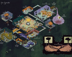
Great adventure! I was sucked in right from the map; linking the trees through the basement was an especially nice touch. Lots of big ideas and cool stuff. I'd definitely like to run this one.
Is this perfection? I do think a few qualifying words could be cut, but that's such a minor critique compared to the creativity and design on display. Everything is nailed down so well from the art to the map and layout. This is one of those adventures that makes me jealous and inspired to create better things. Bravo.
Thank you so much! You are way way too kind!
I completely agree with you regarding the qualifying words – if I were to ever do a version 2.0, I'd definitely do another pass on the entire text.
But I'm really happy that my adventure inspires you – that's just about the best outcome I could have hoped for!
You nailed with the art style and color palette. The texture overlay adds a layer of strangeness that transports you to a vintage videogamey space, in a Vermis style, which works perfectly with all the weirdness that populates these tunnels. Also, I think it was a good idea to show the verticality with a side biew, instead of trying to solve everything isometrically. I'm gonna use that approach in the future rather than overcomplicate the main isometric map!
Great work!!
Robe of too Many Rats is my new favorite magic item. And the hallway of slugs is amazing too. I'm so excited to run this!
Thank you so much! Let me know how it goes once you run it!
Those are two of my favourite concepts as well! I love the idea of a PC not being able to find an important item, in the midst of a stressful situation – and then having to spend a turn rummaging through weird rat–pockets to finally find all the lost stuff. Love the image of that.
Beautiful colourful map. Really evocative art :) I can see me dropping this dungeon in some campaign I'm running. The idea of the book with legs is really fun xD love that hook.
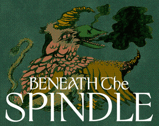
Love the art! You really managed to create such a strong visual style. The colors of the cover even made me think of Vermis! And needles to say, the map is gorgeous.
There is a ton of interesting ideas for every room of the dungeon. I just wish there was more of a theme unifying it all.
Thank you for the very kind words! I'm really glad you like the art!
I totally get the wish for a more unified theme – but the lack of this was very much on purpose: the idea was to create the feeling of a wizard's basement that's run amok in differently weird directions. Very much up to you if that concept came through, and whether or not it was succesful – but I'm glad you still liked my dungeon–room ideas.
Boy oh boy do I love that map. And I desperately want that green Carved Stone Face on page 7 as a pavise shield for miniature making :D
the potions, robes, and wands were nice trick or treat loot in lieu of boring coin. you have to worry a canny knave will eventually decide they're rich enough, but magic stuff? hardly ever. the stuff does ride a fine line between being fun to pick up and being shunned as obviously cursed. I suppose a dm could remind a paranoid group that Halvia plus gem could probably fix things (extra long torso, too many noses, etc) later, just to keep moving.
also, i really appreciate the (remodeled) cloud room and the membrane hall for giving the place a real lived-in feel! plus a wall of slugs that accommodates that one player who would ask "can i?" yes, dive in.
Thank you for the lovely words!
The magic items spread throughout the dungeon definitely rides a fine line between useful and cursed – which is very intentional. I love when players are a little paranoid about an item; that it feels like a gamble, and an important decision whether to try sipping that potion, or flicking that wand, or not at all. Most items has a boon and a curse at the same time: I find this adds layers to the player’s decision making, on whether to use it or not, as they gain a boon but also hamstrings themselves in a different aspect.
I love that you appreciate the more lived–in areas of the dungeon. I like to think the membrane entity has settled exactly in that room because of the endless stream of slugs to eat. And the creatures in the cloud room are trying to either tidy the place, or maybe even expand further into the dungeon – but hamstringed by their short life-spans, so their coordination and plans gets messed up during the day, as the creatures with the plan simply turn into goop; “soo.. what exactly were we doing?”.
And thank you for mentioning the wall of slugs – that’s absolutely one of my favourite aspects of this dungeon. So much treasure beyond, but if the party doesn’t even think in the lines of ‘diving in’ as a possibility, it’s simply too bad. (There’s of course other ways to get to the treasure, but the hall of slugs is the most obvious route).
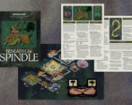
Simply Marvellous, wonderful medieval style imagery, colourful isometric maps, and a simple quest hook to get going! Love it. Only feedback would be nice to have a spreads version of the PDF and a separate map image for reading on dual monitors.
Just looking at the map, this looked like a really fun dungeon, and the room descriptions did not disappoint. The amount of magical weirdness going on is fantastic.
I initially thought the two room 9s were literally the same room, with some non-Euclidean space going on. Sadly, not the case, though the identical rooms will also mess with players in a fun way.
I can't overstate how beautiful this adventure is to look at!
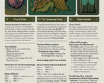
My only wish is that more of Knave's special mechanics had been expressed. I know it's written to be system agnostic, but it would have been cool to get some random encounters, delve shifts, direct damage opportunities and some random rolls since it's a Knave Jam. I did appreciate that the Cloud has a chance of helping you learn a random spell (Knave Spell List opportunity!) And that the Coat of rats adds inventory slots (Game changer for a system like Knave!) Also, just curious what the sun and moon symbols next to the room titles denote?
Overall super fun, I love the wacky characters that are ultimately a long dead wizards crazed experiments, so many great ideas. A flute that speaks when played? A magically bottomless liquid? So good!
Thank you so much for the lovely praise, and for the absolutely fair wishes!
Regarding your wishes: It mainly boils down to prioritising what content made it into the very tight (in my mind) 8 page limit. I was quite hard pressed for space, and had already cut it down into what I found to be the minimum scale of this dungeon. So between Areas, Art, and Delve Shifts or Hazards, the latter unfortunately had to go (in my mind).
When I GM I personally always tailor the adventures to fit what we’re playing, and what lvl the characters are – so in my head it’s quite natural to tinker a bit with pre-written adventures, maybe add a bit of direct damage here, a bigger damage die there etc.
I realise not everyone plays like that, but I find great joy in designing an adventure that can be played at any level – it’s just a matter of very minute tinkering from the GM. (That being said, baking some direct damage directly into the adventure definitely wouldn’t have hurt.)
The Sun/moon/fire symbols are meant to be visual indicators/reminders as to what kind of light is present in the room. Moon = darkness. Fire = glow/torchlight. Sun = bright light/daylight.
I’m really happy that you like the weird and wacky characters in the adventure – and I’m quite curious about how people will interact with the Failed Servants such as the human–mouthed–flute!
Wow, can’t believe I missed that about the light levels! What a brilliant idea! Totally stealing that 😄
Thanks for your reply. It’s interesting seeing how everyone prioritized content for the page limit, those are totally just my wishes 👍 doesn’t hurt the adventure in any way. Just thinking from the Knave perspective. Im trying to figure out if there’s any constructive criticism I can offer with these comments. Hope that didn’t come off negative 😅
The map work is fantastic, and has spooky fresh ideas for a Wizards Dungeon.


Leave a comment
Log in with itch.io to leave a comment.