Poking around in the JS console after the last couple crashes, there were various errors about not being able to allocate memory, and the heap becoming corrupted.
In both of these cases, the game had been running for a few hours with no drama previously.
So I think there may be a memory leak.
euclidean-whale
Creator of
Recent community posts
I have had a few crashes while switching from one zone to another, but also a few freezes while not doing anything in particular, just idling. Sorry, nothing I have reproduction steps for.
But this is still an issue even if there are no crashes. If I want to stop playing, I have to close the browser. With no way to manually initiate a save, I will lose progress every time I do this. It used to be up to 1 minute of progress, so not a huge deal. Now it's up to 5 minutes which is pretty annoying.
Okay, so I can export the files, but there's no way to import them in the web build. I had hoped that maybe initiating an export would also persist my data in the normal way. But no, that doesn't seem to happen. And as far as I can tell, there's no way to even know when a save has happened so I can close the browser shortly after.
This seems like a bad situation for players on the web.
Autosave Interval has been changed from 30s to 300s. You can now adjust it between 300s (5m) and 900s (15m) in Settings -> Saving.
This seems sort of unfortunate given the tons of crashes I have experienced in the web build :/
How does one even manually save on the web? Am I going to lose up to 5m of progress every time I close the browser?
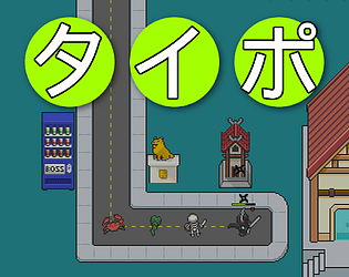
Wow, incredible pack. I'd like to incorporate this in an open source project of mine that is set around a rural Japanese train station. To that end, my suggestions are:
- Train platform
- Train tracks
- Train
- Hachiko Statue
- Vending Machine
I see you've turned down commission offers in the past, but if you're open to some sort of donation-based prioritization of requests, please let me know.
Unfortunately panicked on level 11 with
bevy_game.js:1876 panicked at /home/runner/.cargo/registry/src/index.crates.io-6f17d22bba15001f/bevy_ecs-0.14.0/src/system/commands/mod.rs:1250:13:
error[B0003]: Could not insert a bundle (of type `resnake::fade_out::FadeOutThisEnt`) for entity Entity { index: 4203, generation: 58 } because it doesn't exist in this World. See: https://bevyengine.org/learn/errors/#b0003
and my patience ran out there. At the time I was at the far left end of the map and had just typed a "c" command that I assume would have killed me.
I enjoyed the puzzling for the most part. I'd like to echo the confusion around "total" and "current" rewinds. I also killed myself A LOT without understanding why. I eventually figured it out, but some better phrasing there could save us a minor wtf. I think the tutorialization around anti-doors could use a bit of work too. Maybe the first couple levels featuring them were a bit too easy, because I didn't actually understand them until later.
While I was slightly stuck briefly on level 7, I was convinced that there was something to the mysterious [$] symbols on the map and took a dive through the source code. I guess those are just decoration?
I think that overall this feels slightly odd because the controls are mixed between arrow keys and command input, and it *feels* like a turn-based game at first, but navigating the spikes requires precise timing.
And a minor nitpick, but I feel like the snake movement audio really didn't fit.
I think this could be pretty fun with a bit of polish though. Nice work.
Interesting. The outlines are visible, but faint. The tab button hover effects seem more subtle, but upon closer inspection, they are there. Just at nearly homeopathic levels of brightness.
I am on a 2021 16" MacBook Pro on the "Apple XDR Display" preset. My display contrast setting is "normal" and brightness is ~50%, and "truetone" disabled.
I stuck around for a bit to see if I could put enough energy into the thing to fission it into a couple potassiums or generate some alpha particles or something. Bit disappointing, but it did go brr a bit.
Just echoing that I also found the "cycles" stat a bit confusing at the start. Calling it "delay" or something might help, although I think that fundamentally, having two different stats controlling "time it takes for a cycle" isn't ideal. I wonder about making one of them "energy" or something and having the electrons follow a sinusoidal path with the magnitude relative to the energy. Maybe throw some bloom in there. I dunno.
Okay, so I went back to play around a bit, and part of my problem is that I didn't even realize that you could make the electrons cycle by clicking them. On my first playthrough, I did see "Cycles: s" and try pressing the s key, and clicking around the canvas, but I never deliberately tried clicking an electron. I must have just gotten lucky!
Is the game intended to be open source? After a bit of a google adventure from the credits screen, I see a public repo, but there's no source link in the submission anywhere. BTW, the URL in the credits screen just leads me to a redirect loop.
What do you mean by hover effects for the tabs?
I phrased that poorly -- I meant the buttons that control which tab is currently shown. It's not *totally* obvious that they're clickable, because unlike other clickable stuff in the game, there's no hover effects. The borders are a clue, but they are very subtle.
I was finding that I could draw random zigzags and still end up with valid attacks. Was curious and took a peek at your circle detection -- that's quite simple / elegant and seems to work well enough for a little jam game. Cool.
I wish there was a little more feedback about the state of / result of an attack.
Am I right that the only effect of food is to direct the ducks? They seem frustratingly uninterested in food. I had to go look at the source code to make sure that food was even supposed to do anything at all, which isn't ideal.
I did have a bit of fun doing a bunch of clicking and watching the ducks reproduce. Although I wasn't really sure what was going on there for a bit. I thought that maybe I had fed a duck enough that it got an "extra life" powerup or something. Eventually I figured it out.
I could see this getting interesting if you expanded the types of things with different effects you could drop on the map. Maybe give the player a random thing to drop.
Even though I found the gameplay a little unsatisfying, I am tempted to get back in there for a better score, so the leaderboard seems like a great use of time.
Really slick UI and relaxing gameplay. I played to 160A supernovas.
I have played a number of incremental games, and this is actually the first time I encountered the alphabetical naming scheme. I don't mind it at all, but it does seem to take away a bit of the "whoa big numbers" feeling, and I feel like it might be a little confusing for folks new to the genre.
There were a couple tiny things I noted during my playthrough:
- I would often accidentally close a panel because I would mix up the satellites / science panels. A different style for the currently active tabs would help
- The borders around the panels are very subtle, and there's no hover effect for the tabs
- Because the panel borders are so subtle, it sort of looks like the tab bar is strangely aligned
- It seems that the itch canvas is a different aspect ratio than what's intended -- the UI is slightly cut off unless you go full screen.
- Even with the game as short as it is, progress-saving would have been nice. I had to take a short break mid-pay and in my paranoia, just let the game continue progressing. My instincts served the right, I'm not sure I would have come back if I had to start over. A pause button would be an odd feature, but that would have worked too. I didn't want to miss anything exciting during my break.
- I still don't understand how science works. It seems like stuff orbits many times before I earn science. I actually just went back to test this, and I see now that science is earned per earth orbit. Maybe the color of the science icon is a clue there, but this didn't seem obvious at all.
- The lack of a win condition was a little sad.
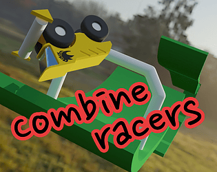
The friction and sluggish steering were very frustrating for me. I think that giving the cars a slightly more obvious front and rear would have helped too.
The track progress / scoring system seemed to work pretty well, and at least the AI seemed to be struggling as much as I was.
I managed to get a point, but couldn't muster the willpower to finish a race, sorry!
What's the bouncing ball for?
I figured out that I could reverse to enter the chasm, eventually, but was pretty confused for my first run. I refreshed probably 10 times and never started inside.
Once I was inside the chasm, the colliders were a bit janky. I'd recommend using a round shape like a ball or capsule for the bike collider and look into TrimeshFlags::FIX_INTERNAL_EDGES to prevent sticking on edges of the chasm.
It's pretty cool that the rapier debug collider aesthetic sort of works, actually.
Nice little puzzler, a great showcase of your crates
- polyanya for navigation
- bevy_easings for fancy ui animation
I have a few nits to pick:
- The UI colors seemed to clash, and overall the UI just seemed all over the place with padding, font size, etc.
- There is very little contrast between the dialog background color and the dialog text
- I don't understand the dialog timer. Sure, I can maybe read that fast, but I am trying to read and simultaneously understand how it relates to what I am seeing on the screen. I was often not done with the instruction text as the countdown ended and I awkwardly followed the text to the top right corner as it reflowed. I would have greatly preferred a "continue" button.
- I really would have liked to look at the level before the action started. The action is even starting when the camera is way zoomed out which just seems unfair.
- It would be great to be able to remove an obstacle by clicking directly on the obstacle model. I often could not remember which specific obstacle icon was associated with a particular obstacle and ended up needing to redo the whole thing.
- I was weirdly distracted by the shadows -- I wasn't sure why the hobbits' shadows were disappearing as they approached. .Not sure what's going on there, but it seemed like the point lights were too low, perhaps. I was going to look into this, but the game failed to load when running from source locally with this error:
thread 'IO Task Pool (2)' panicked at src/levels.rs:213:14:
attempt to subtract with overflow
note: run with `RUST_BACKTRACE=1` environment variable to display a backtrace
Great entry. Nice little zelda-survivors-ish sort of thing. Some of the little things I particularly enjoyed:
- the pants icon
- seeing a bunch of "+1 pants" and thinking "how many pants do I need?"
- the text shadows
I think that the balance could use a bit of tweaking -- the dialogue seemed to be directing me to the church first, but I found that the goblin zone seemed easier. And by the time you're ready to handle the lava boss, you've pretty much dealt with all the ranged enemies, so the mirror seemed a little useless at that point.
I also had a few moments where the RNG on boss placement in a level seemed to help or hinder me a great deal -- the necro / healer bosses seemed relatively easy compared to their hordes. And another time, the very first boss spawned directly next to the level entrance, and I kept getting knocked back to the cottage.
It also took me longer than I care to admit to realize that I needed to bump into enemies to fight them. I was running around and dodging and looking for some sort of weapon. I have probably been playing too many survivors-likes.
I'm not sure if it's because I'm on a high-dpi display or what, but the dialog / button backgrounds and their text were misaligned for me and it looked a bit sloppy.
Some sort of additional fanfare for defeating a boss would have been nice. After the initial item unlock, defeating them for a second time felt very anticlimactic.
Really fun, but drawing joints and placing apartments was a bit frustrating. I would often unintentionally start drawing a second joint, or have two clicks registered immediately on a joint so that it is zero length, etc. I also might just be confused, but I often had a "green box" seemingly indicating that a placement was okay, but clicking did nothing.
Eventually my tower seemed to achieve orbit, which seems sort of implausible.
I made it out of debt! Cute little game.
My biggest frustrations were that the game seemingly would not reset completely between tries, the oxygen generator which didn't seem to give an obvious indication that it was a toggle, and clicking on the middle of the workstation, only to have my character obstruct me when he arrives, and make me wonder why my clicks aren't working anymore.
I was totally ready to rage over the controls... I really wanted separate "lean" and "accelerate" buttons. But I accept now that they make sense and are pretty elegant, actually.
I will say that the "motor" sfx and seeming disconnect between wheel rotation and actual movement at times was pretty disorienting.
Not really my sort of game but I pushed myself to the finish because the vibe seemed uniracers-inspired, and that game is my jam. Thank goodness for the checkpoints. Took me nearly 12 minutes.
Congrats, there's a lot going on here. A rare combination of rust and go code!
On my first play through I didn't notice the "type your name" part of the leaderboard screen and didn't end up submitting the score. It took a couple back-and-forths between the game and directions on the itch page before I actually figured out what on earth was going on. I wish there was a bit more feedback in-game to distinguish clock-setting and clock-winding, and to indicate when a clock is "set enough."
Unfortunately I had a fair bit of trouble as well. Both on macos native (and I played around with a local web build for a bit), I had some issues with mouse lock, especially when tabbing out of the game to look at the controls on itch.
So I think I nearly built a thing, but not quite. So my feedback doesn't cover very much of the game.
One small thing that would have made an impact for me is a crosshair. I also found the behavior of blocks as Im mining them a bit wonky -- The little shrinky animation they do lets you "mine through" them to the block in the next layer, which is quite confusing.
I was also mildly triggered by the little voxel platform not being laid out in the shape of a hexagon 😅.
There's so much going on here between the character controller, tilemap, animations, inventory, etc though. Impressive amount of work!
Agree with others that the controls are challenging. One thing I think might help a lot is "adaptive steering" -- that is, slow down the turning when the ruumba is moving forwards so things don't feel quite so jerky while driving around, but also don't feel sluggish when rotating in place. But this is just begging for gamepad support!
I also wish I had a first-person camera mode where the rotation follows the ruumba.
I think that adding more mass to the containers or friction to the shelves would could help, but maybe the ultra precision required to grab them is intentional.
Editing my dude works really well, I'll have to check out pmetra.
Sadly unable to play on a macbook due to the following error:
re-cycle.js:517 panicked at C:\Users\logan\.cargo\registry\src\index.crates.io-6f17d22bba15001f\wgpu-0.20.1\src\backend\wgpu_core.rs:751:18:
Error in Surface::configure: Validation Error
Caused by:
`Surface` width and height must be within the maximum supported texture size. Requested was (20480, 11520), maximum extent for either dimension is 16384.
20480x11520 is a pretty insane / totally inexplicable size for the canvas.
It seems that while your project is open source (found it after a bit of google stalking), the source code or a link to it is not included in the submission. So officially, I am unable to play and rate, even if I wanted to build from source.
Unofficially, I removed WindowMode::Fullscreen and that seemed to fix the error with the web build.
The game is simple, but the trash-grabbing-moving mechanic works really well, which I'm sure wasn't trivial to figure out. And it's complete, so nice work!
As someone who enjoyed two dimensional mario kart in his youth, this was a nice little throwback. The jank got me on the second race, where I was flung way off the map and seemed to lose all control. I like that the art style was super cohesive, but I had some trouble understanding how collisions with other eyes worked.
Really cute, but pretty janky and not in a fun way. My dude just seems to be bouncing around randomly and I have seen some weird issues where my inputs seem to "get stuck" or something.
A couple tiny tweaks might help.
- Make it possible to restart the level after finishing without refreshing the page
- Add a total / percentage to the hamster counter
This would just make replaying a little bit more satisfying.
Got to level 8. A lot of survivors-like seem to try to innovate by adding more active controls, and I appreciate you not doing that. Even boiled down to the very basics here, the gameplay is pretty fun.
This reminds me of a very old game called "swear" which was basically snake, but on various non-euclidean geometry. I think it was clearly better than normal snake. But I'm not sure if "survivors on a sphere" is a breakthrough.
Still, it works. I enjoyed getting forced over to the dark side and having to claw my way back into being able to see again (sort of).


