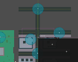
Very visually technically impressive, but the controls and interface are very clunky and make it hard to get into. Also, the best strategy seems to just be rushing for the portal (at least until the stage with the big ship, at which point the portal didn't work).
sendhelpidfk
Creator of
Recent community posts
Solid foundation and great art, but the gameplay leaves a lot to be desired. Because you can't really shoot and move at the same time and the enemies get incredibly overwhelming, the game incentivizes simply not interacting with the enemies whatsoever - I got to 5525 by just not shooting anything I didn't absolutely have to and only going for the pickups, which made the game a lot less fun (and also turned the game into a powerpoint - something to address the performance would be great). I think more diversity in enemy types and addressing the movement would do wonders. More enemy types could encourage different playstyles as the game goes on, and force you to change your tactics as you get bigger and bigger. As for movement, you could go for the Geometry Wars twin-stick approach, or you could try to elaborate on the current movement and combat to make it less punishing to play the game as was presumably intended. I think also providing some incentive to scale up in general would be great - all it really seems to achieve is additional health and the camera zooming out.
Great work overall, though! :)
The aesthetics are utterly immaculate - the sound and visual designs do wonders for how unsettling the game gets. That being said - is there any reason to not fill the screen? I feel like fleshing out the initial module construction would be great. What if modules affected more than just a single stat, or had their stat influences change with how other stats were doing - for instance, a defense module that increases defense but takes supplies each year, or education modules that perform better than the normal ones so long as your morale is high enough? Alternatively, what about grafting modules on - for instance, getting to add another module each turn? On a related note, the attachment system is interesting but not really expanded upon - what about modules with less than 4 connection points that, if destroyed, snap off everything that used to be attached to them?
In any case, great work! :) I'd love to play a fleshed out post-jam version of this, if you get around to it.
Really cute presentation, but it really feels like a lot of the game is trial-and-error and pixel hunting - sometimes the scaling controls just fail and snap an object to its smallest size, forcing you to carefully track back and forth until you can grab it and scale it back to a manageable size. The puzzles with scaling order were cool, but they really had a lot of the wind taken out of their sails by how finicky it was. What if the camera slowly zoomed and panned around to eventually fit the entire room? That way there could be a sense of progression as you correctly scale things - maybe starting with the bookshelf and then going to the right half of the room, with the chandelier-door-table-chairs-etc. sequence near the end and the cat as the finale. Not only that, but by zooming in on specific parts you get to tutorialize the mechanics a bit better and have things increase in complexity without having the things you need to scale get so small they run into the pixel hunting issue.
Ooooh, this is really cool!
Honestly, I think something that'd really help is having skew and rotation snap to discrete steps the way the grid does - that way, it'd be easier to play with things and reverse engineer how a shape was created. Maybe also a popup for the target shape's transformation matrix as well as your current transformation matrix? That being said, I adore the sound design, presentation, etc. - this is REALLY good.
Well done!
Oooh, interesting take on this set of mechanics! Having the level design center on changing size mid-jump is really cool. That being said, a lot of it ended up being really finicky, and a lot of the opening level design only really made use of the small and medium sizes as progression gates. Some coyote time (or more if it's already present - I couldn't tell) and some more ways to play with the size gimmick would be nice - what about trampolines that scale bouncing force with how big you are as you land on them, or boxes that you need to be big to push into position?
Great work!
Ooooh, this was really clever. I'd love to see a post jam version of this.
(SPOILERS BELOW HERE in case someone is scrolling through the comments before playing)
I think a few more levels with the spider mechanic before the parallax trick would have been great - as it stands, both the spiders and the parallax come off as curveballs instead of puzzle elements. Letting the player warm up to the mechanics by introducing them in isolation before mixing them is generally best, but the last few levels kinda felt like they were trying to rush through their ideas as fast as possible. Really, just more expanding on the ideas here and playing with them would be great. Parallax spiders you can manipulate in the background? Zooming in and out to hide pits, or only keep very specific pathways visible?
Also, a few new mechanics for a post jam version would be cool. Toggleable HUD layouts that block varying portions of the screen? Splitscreen?
My only real complaint other than 'more content pls' is that an explicit explanation of the rules the player follows would be nice. The WASD popup at the beginning was clever, but I think building on that style of second-person exposition to introduce new mechanics and ideas would be great. In particular, the first level requiring keeping the camera low required a lot of trial and error due to having to work out the specific rules of how the player moves.
Overall, amazing work - especially for 48 hours!
The game itself has a mesmerizing vibe to it, and I spent way longer than I care to admit just fooling around with it. That being said, some sound effects or other forms of player feedback would be great - it wasn't always clear when I'd died as the cockroach, so every time after the fist hit the ground I had to spend a few seconds working out if I'd switched or not. Also, some sort of high score system would be great - maybe it counts up when you're the cockroach and counts down when you're the human given the goals of each mode?
Still though, great game!
Super well put together, especially given the 48 hour time limit! Some miscellaneous polish things aside (I saw the ghosthunters walk through the piano - how do we know they aren't ghosts too?!), the voicelines felt kind of like they just happened at random. Also, a timer on how long you have before the ghost hunters lined up for their photo actually press the shutter would be nice - sometimes it felt like I had all the time in the world to stop the painting, and other times it felt like they just lined up the shot and took it immediately.
Still though, the fact this was put together in 48 hours is mindblowing. Massive props to everyone involved!!
Incredibly polished, but as someone who's never played Peggle (I concede I'm probably not the target audience) a lot of it didn't make much sense to me:
-I think either a thing to show the trajectory of the ball when you line up a shot or just making the targets larger would be nice. A lot of times I thought I was lining up a great shot, but then ended up whiffing by a small margin. This is probably a skill issue, but some amount of guidance would be nice for getting into it
-How you actually get another shot wasn't very clear to me - I assume it's just hitting a lot of pegs with one shot, but the specific threshhold would have been nice to know. Even just like a meter to the side showing how close you are to another throw would be greatly appreciated.
In any case, I had a lot of fun just seeing how long of a combo I could get. Great work!
The game is really well polished and fun, and I enjoyed juggling everything at play once I worked out what was going on, but getting to that point felt pretty difficult. Specifically, having everyone asleep when the timer was about to expire would have been nice to have more explicitly stated on Zoodle's page instead of just under the 'tips and tricks' section. Also, so far as I can tell, blocking projectiles with your face is an intended mechanic, but it had the same visual feedback as when they hit the bed. Some sort of 'deflect' animation would be cool - maybe the projectile making a 'ping' noise and bouncing off the screen?
In any case, great work!
Text legibility was something that became a concern early on (much more pressingly, seeing as the pulsing grid used to be white and there was nothing limiting the build area which resulted in the text blending in with the background), but as with many things in this game I didn't really have enough time to address it more properly than changing what the text was drawn over. A font intended more for legibility is smart, I can add that in as a toggle.
The post-jam version is already fully patched and makes some alterations to the game design (mostly just removing the Weighter), although I'll be taking some time to add the font toggle.
I'm pretty sure itch has a follow system? I could be wrong. In any case, I can send some sort of thing letting you know when the patched version is released.
Thanks for the review!
Super polished, love the character designs and art style and world and writing and aaaaaaaaaaaaaaaaaa it's so good
The closest things I have to constructive criticism are that ice seems really overpowered with how it only takes a few results to reduce damage output to nothing and that there's not much feedback for status effects aside from enemies dealing nearly zero damage
Phenomenal game!
I really loved the feel of the game while in the zone - strafing around fire before blowing up the offending turret or robot with a single shotgun blast was super satisfying, and the voice lines to tell you what effects are in play were both funny and informative; they reminded me most of the weapon warnings in the WipEout games in how they allow you to focus on action without missing information.
The dice mechanics feel like they could use some retooling, though. None of the results really changed how I played except for the screen wipe ('every machine is a smoke machine if you use it wrong enough' is now something I intend to quote a lot), and even though there was apparently a button to control timing it never felt like pressing it did anything. My guess is that it's supposed to be a timing thing in order to get the positive effects, but even so it didn't feel like anything really changed when I ignored it and brute-forced my way through.
If roll effects changed how you approach an encounter - say, 'all weapons ricochet', 'both you and your enemies have 1 health', 'you can melee enemies by running into them', etc. - then it would make the dice significant to gameplay, and would make your methods of impacting its outcomes meaningful. Alternatively, you could focus on feedback. Making it obvious that your attacks are less effective via sound design or some sort of visual indicator (healthbars, damage numbers, etc.) would make it much clearer that the dice is in effect.
Overall, really fun game! I'd just like to see the dice have a pronounced impact on gameplay.
I really love the presentation and style here! The character designs were cute and the game was overall well written and highly polished. That being said, it felt like a lot of the dice results were just instant resets for levels, like Laser in some of the open sections. Maybe balancing it so that each result is survivable regardless of context (although not necessarily easy to do so ofc) would be cool, like having laser lock on before just firing once.
Good job!
Really love this! I'm always drawn to roguelikes, and this absolutely scratched that itch. The way all enemies are telegraphed by being chess and checkers pieces was really clever and made me feel smart while fighting them. I only really wish the opening cutscene tied into gameplay more - maybe with intermissions where the characters get mad at the Chaos God?
Super fun!
I really loved this game! The gameplay has a nice flow to it (especially with how the dash mechanics work - using it to reposition while still focusing fire on enemies is super satisfying), and the fact that no die faces are strictly better than one another made it feel really fun. My main nitpick is that because dice faces aren't strictly better by number, it might make some sense to just give them unique icons instead of numbers - that way, the player can't get the wrong impression that only high numbers are worthwhile.
I'd love to play a post-jam version with more enemy types and whatnot as the game goes on!
(edit: added a blurb about the dash)
Fun game! I really like how the game forces you to sequence a route The main things I'd change are mostly minor (not coming to a halt when touching walls, for instance), but one of the things I'd add is a short buffer (maybe 1-2 seconds) where you get to see the level before you play it. That way, you can route your way through the level a little better.
I'd love to play a post-jam version of this!
I really love the attention to detail with the mechanics. Coins only being collectable when they're on the side of the cube, the extra second or so you have to escape the side that's about to be squished, etc.. The only main thing I'd tweak is making the player a smidge more responsive - increasing the acceleration a touch to make it less slide-y.
Cool game!
Thanks for the review!
If I had extra time (another day or something), I would absolutely look into implementing more dice and whatnot. (One of the initial concepts was built around D20s...)
The input and output not being visually distinct enough has been a recurring issue, yeah.
The 'devices keep breaking' thing is a bug. I haven't been able to pin down what causes it (although I do have a couple hunches related to how tile breaking is managed), but breaking and replacing the offending tile seems to make it work again... although placing tiles seems to move the issue to other tiles, which usually leads to just rebuilding entire solutions. I didn't have enough time to track it down after finishing making the game's content, unfortunately.
Sorry about the game breaking for you, but I'm glad you still ended up enjoying it!
Really cool idea executed with a lot of polish. One thing that would be nice is a small splash screen before the game starts explaining what everything does - I was able to work it out, but by the time I did my ship was pretty battered. Even just explaining what each icon does at the outset would help a lot.
Cool game!
A bunch of work went into the polish for this game, and it shows. It's very easy to get into the zone of dodging, ducking, and weaving - very similar to Geometry Wars in that regard. I do have a couple little nitpicks though -
- Do shots get more accurate? I only get popups for damage increases, but not shot accuracy. It felt a bit more accurate in the endgame, certainly, but early on it's hardly noticeable.
- I appreciate that important information is displayed on enemies themselves when they're killed, but some subtle HUD elements (maybe next to the timer) that give you visual info (e.g. a bar) for your health, damage, and accuracy would be appreciated - keeping the information redundant isn't a bad thing so long as it's unintrusive
Great work!
I love games that give me small vertical slices of a world, and this one managed it in spades. (How do people do all this in the time limit??? I'm blown away) I also like that prisoners dying has repercussions gameplay-wise that mirror the weight of your actions. In general, your mechanics are very flavorful. The drums also seemed to kick in dynamically on my first playthrough, but didn't quite line up the next time - I think making it change on the fly once there's only a few prisoners left would be a nice touch.
Great job!


