Play game
Worlds Apart's itch.io pageResults
| Criteria | Rank | Score* | Raw Score |
| Audio - Does the game have nice sfx and music? | #23 | 3.853 | 3.853 |
| Graphics - Is the game aesthetically pleasing? | #28 | 4.147 | 4.147 |
| Overall | #39 | 3.565 | 3.565 |
| Completeness - Is it an unfinished tech-demo, prototype or a complete game? | #52 | 3.706 | 3.706 |
| Theme - How well does it incorporate the theme? | #78 | 2.971 | 2.971 |
| Gameplay - How fun is it to play? | #86 | 3.147 | 3.147 |
Ranked from 34 ratings. Score is adjusted from raw score by the median number of ratings per game in the jam.
Leave a comment
Log in with itch.io to leave a comment.



Comments
Fun game. Autobattling wasn't bad, but after a few battles, it became too predictable -- something that I've experienced with Demon Lord, hence the addition of various skills to keep things interesting.
I also found text scrolling to be too slow for my taste -- I wish it was in a bigger window so I don't have to focus on a tiny text box in a corner.
Overall, it feels finished despite these issues, but it also feels a few improvements away from being more than a fun distraction for a few minutes.
Hey, thanks man :)
yeah, the autobattler was both a quick idea that would enable me to show some effects fast and also because I really wanted to make something that can "stand" between traditional battle mechanics and an autosolver, in time. Definitely requires some quick predefined tactics and other things to become meaningful. For sure, the player has to have a say at least per round for a start :)
Yeah, I loved the skills and the experience gained in your game, very classical implementation, loved it :) In my case, I ran out of time and had to go for some content and "completion" and I also had to work 2 hours after my submission, meaning I didn't slept at all for doing it :D. I guess jam inexperience and not much preparation.
Event and text scrolling is pretty weak, I definitely agree. Regardless, I am going to work on the project as I really like it. It plays quite different from TDB and will be quite different when fully completed.
Thanks a lot man, it seems we're going to end top #20 in this jam :)
Please let the text scroll faster.. And having it pause/restart every time text comes up is just weird. Not to be rude, my game is really really bad, but it was a bit jarring.
I kind of like the autobattling, it's comfy. But I didn't stay for long because the graphics and music weren't so appealing to me. Still, you did a much better job than we did (HA!!)
Yeah, I am going to change the event mechanics and text scrolling for sure, its not ideal. No worries at all, thanks for the feedback, I really want to know all the wrongs of my game :)
You did a pretty good job as well, I was actually very short in content so I kinda failed in that department :) Regardless, I understand that my game is not for everyone, its just another perspective of what I wanted to do. I am already developing my other traditional cRPG The Darkness Below so I really wanted to make something more casual and fast :)
Glad that you liked some parts of it :)
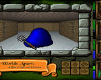
Well presented graphics where were self-consistent for the most part. There were no "meaningful decisions" other than which way to move next. The game player itself in combat. You did away with the button mashing and automated it but perhaps lost something in doing that. It as nice to have 4 characters but you couldn't do anything with them. The turn-around puzzle was nice and had us fooled for a minute. Well done on entering a good looking and complete game into the jam!
Hey, thanks a lot for playing :)
Yeah, there were no "decisions" to make, except perhaps of deciding whether to save a fountain or two or if choosing to battle some opponents. It was meant to be taken / played more lightly than usual. Indeed, I got a lot of feedback regarding the combat and now I have some ideas of adding some necessary complexities to it, although still keeping it simple.
Definitely, having the characters and not being able to do something with them really need some consideration. Indeed, that teleport caught many players by surprise.. Initially, I thought I would had enough time to place similar puzzles and maps but the deadline came much faster than I thought. In the end, definitely needed more love in some levels but I was just happy to make it a complete one.
Definitely I am going to continue the work on that. Glad that you liked it :)
7 days goes amazingly quickly. We had no audio in our game until 10:30pm the night before submission. Then we ran out of time to add audio to everything we wanted to.
I like your game but the combat system is quite wierd knowing that I just have to stay doing nothing but it was a good one ! Well played.
Thanks for your good words :)
Yeah, the combat plays in automated mode and the player is pretty much responsible only to find items for equipping characters, explore the world and solve riddles. It's a lighter version of cRPGs and another take I wanted to try. I will definitely add some complexity in next versions for sure.
Glad you've liked it so far :)
You have a great foundation in this engine, that's for sure! I would love to see more of this but with manual combat, inventory and items etc. I love the visuals and overall retro vibe!
I look forward to TDB!
Well done :)
Hey Dan, thanks man <3
Thanks for your kind words, definitely the engine has matured over (many) years of working its internals and finally I felt it was ready to give a game or three :)
Definitely I am going to add some controlled complexity on the game, while keeping the auto-battle option open. I love the light-hearted gameplay already on it but understand that a bit more complexity will do wonders :)
I absolutely love your comment as I know you have too an eye of what is truly "retro" so I am glad that I came close to it with that game. Definitely more to come out of it after the review period :)
Yeah, I am already wrapping up the final demo version of The Darkness Below. If it wasn't for Worlds Apart, you would probably already playing with it :)
Thanks man :)
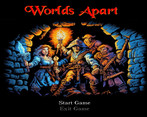
A homage to classical dungeon crawling adds to the flavour pretty much. I enjoyed playing this game and the graphics look so cool!
Thanks, what a lovely comment <3
Although I am not an artist all, basically a game and engine software engineer :) I am always glad when things are coming well visually so I can focus on the developing part. And visually I am always trying to re-create the old look & feel charm of the older games and will continue to do it :) This will definitely get better with coming versions, as I plan to continue the work on it.
Glad that you've enjoyed my game :) More to come out of it for sure!
Impressive visual!
Thanks, I appreciate that :)
Definitely put a lot of work wrapping up the graphics. I am always trying to create something that's visually close to older games, I am all about that if you checked my other game as well The Darkness Below :)
Thanks for your time!
I liked the old-school style to it, gives it a very nice charm! The auto-battling removes a lot of the pressure in the game, but it was still fun to watch the numbers and navigate around the levels! It's insane to me that this is a custom engine, can't imagine the amount of work that entails. Looks like it's coming along well!
Thanks for the comment :)
Yeah, that was intentional, as I have another game The Darkness Below that has a full blown combat mechanics and simply wanted a much "lighter" take on this one. Definitely can be improved and add some complexities while still keeping it automated, which is the basic premise of the game.
The engine (Jolt3D!) is really a very old project of mine, actually much older than Unity and on-par with first versions of Unreal (1999-2000) and had lots of incarnations through the years. There should be traces of my very old websites when I was still publishing versions of my engine, before turned to game development.
Yeah, it has an insane amount of work internally, mostly to support multiple OSes, mobiles and all that. Definitely adds multiple layers of complexity and increased time when you're making games with it, but its faster to fix your own bugs that way and add new low-level stuff :)
Glad that you've liked it and for your time :) Keep coming for improved versions!
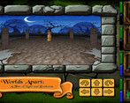
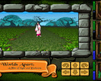
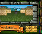
Neat game! I had a little difficulty telling where I was in the town (would turn, and was standing on dirt, and now was on grass, although maybe I just couldn't see my feet). Luckily in the dungeon it all felt pretty good. Well, until the boss one-shotted my healer... but at least everyone else made it out alive... =). Auto-combat was a little boring with no choices at all (equipment or something would have been nice, but probably out of scope ^_^). I liked the wrapping around the game, the title screen, UI for the gameplay, all came together really nicely.
Hey man, thanks :)
Yeah, it takes a bit of time to get used since everything takes one square, including town buildings, floor tiles etc. It might need some tweaks to improve the movement look & feel to open world as everything there is bill-boarded and there are no "cubes", something that changes in dungeons.
I will probably turn these bill-boarded building sprites into proper cubes to give a better impression, as well improving on these ground tiles :)
On dungeons, definitely the fov can be improved for sure, glad that you found it good enough :) It was made really quick as the deadline was already looming. Yeah, the boss, special weapon and wells were put in such a way so you had to think a bit before taking on final boss.
That was an attempt to provide a much "lighter" cRPG experience from my other game The Darkness Below, something that could be played casually and be full of auto-combat, riddles, mini games and such stuff and you the party, would only be responsible to explore and find stuff. Combat can definitely be enhanced to make it more interesting, like selecting predefined battle tactics or adding multiple opponents in front of screen, while still keeping it automated but that was definitely out of scope :)
Thanks for your kind words on the game overall! The game development will definitely be continued :)
Pretty sweet, even more so that it's your own engine, I enjoyed my time playing. I'm personally not a huge fan of auto battle but it turned out great.
Thanks man :)
Yeah, I have two (2) games already that are using my engine (Jolt3D!).
I actually wanted to make a much lighter version of my other game The Darkness Below as I felt that I would never manage something more complex, knowing myself and my tendency to wrap everything to an "appropriate" level, even if that's a 7-day jam :) So, auto-battler was really a quick idea that turned out pretty good.
Definitely not a game that plays like the typical crawling titles; it was more of a traditional cRPG meeting Wonder Boy or something, where your only weapon / skill determines how far you can go or you simply die. No tactics :)
Although, I really wanted to put a lot more content, but had to fine tune the fov, movement and all that.
Glad that you liked, definitely I am going to work a lot more on this one :)
I kinda love autobattlers, but I did wish I had some input into how things went. Looks fantastic!
Hey, thanks :)
Do you mean more action logging, text and all that? Yeah, I definitely need to fix that event button first and make the text or the bar larger or something. I like the idea as the auto-battling is so simple that definitely asks for additional details and will for sure be necessary on a full version with lots of items!
Thanks for your kind words and feedback :)
I love the simplicity of the combat, if it were longer with some very basic party management and maybe a system to pre-define simple battle behaviors for your characters, I would definitely buy it. Awesome work!
Hey, thanks man :)
Yeah, simplicity was the intention of this game, as I am following the more classical approach in my other one The Darkness Below :) I wanted to make something that auto-resolves in combat and that you're only responsible to find items and follow events, clues and all that. Definitely can become a little bit more complex, for certain character managemennt (hiring, attributing etc) and combat (pre-made tactics etc.) that will improve its current behaviour.
Thanks for the great feedback, kind words and your time checking this :) Definitely going to work on this one as it scratches another itch :)
Absolutely gorgeous entry! I loved it!
I loved exploring The Haunted Halls!
The music/sound effects are great but could do with a volume control knob somewhere. Also, the jarring audio stopping, although feels accurate to the style of game, is quite annoying to me.
The only real disappointment for me was the inability to make many decisions. I would absolutely play a full version of this with party / inventory management.
Great work!
Hey thanks man :)
Loved every second of developing that and had to go frenzy the last hour to provide what I could. Glad you liked it aesthetically, that's always my priority and I am a sucker for old retro look and feel, if you know my other game as well :)
Yep, options is one of these things that I didn't forgot, it was just that other things were more pressing, like a lot. Yeah, stopping the sound on events was simply a quick solution as I none of my sounds was fit at the moment. Actually I had plans to add not only event sounds but also cutscenes so lot of stuff didn't make it.
The real intention for this game to provide a "light" take on cRPGs. But definitely needed some decision making on events. Keep in mind that this game was made by my own custom engine so a lot of code was engine-based so lots of time went there as well. Definitely will consider inventory managing. I also had planned to hire your party through these buildings on village :)
Regardless, thanks for your time and valuable feedback, loved it :)
Really well put together entry visually, lots of high quality assets put together in a pleasing way for sure. I actually mind the auto-combat (though it might get boring in a longer experience), however the text was a bit tough to read in the small text box. Other than that I think this is a fantastic entry with a lot of polish and charm.
I'm definitely interested in checking out your other game considering the quality of this jam entry, and it sounds like you're releasing a new demo in a few days, so I'll check it out!
Great work!
Thanks man, I am glad that you liked it :)
Yeah, pleasing-to-the-eye is what I am striving for in both of my games (so far), always trying to reach that golden standard of the 90', with an addition of good enough mechanisms to back the graphics / audio up. This game is different than The Darkness Below, which is the classical cRPG experience, with tons of items, stats and all that. This one is a very light version of such an cRPG, like a Dungeon Crawler meet Wonder Boy / Golvellius / Zelda mix. You improve one thing at a time which start making some areas "manageable" to beat. On next version I will expand that to allow other gears and / or skills... Not just for improvement, but actually opening content up. This is a very different approach to other games and my own above.
Yep, I know about the small text and general mechanism; Unfortunately, deadline was looming at the time and had to move on :) But rest assured, this I will get it fixed on the second version.
So, thanks for giving this a try, I so appreciate it.. I know its difficult when you have like ~200 lovely entries to try. Yep, regarding The Darkness Below, I have already a huge (in terms of changes) new demo coming up... if it wasn't for the jam, the new demo would have been already released. Keep in mind that the new one coming in few days is vastly changed from the one on itch.io (old version), so be sure to check both versions :)
Thanks for your time!
Unfortunately I couldn't get this game to run.
error while loading shared libraries: libXcursor.so.1: cannot open shared object file: No such file or directory
I think this may be because it is a 32 bit binary, but I am not entirely sure. I installed libxcursor-dev to no avail, I already had the libxcursor1 library
Oh I am sorry, I forgot to mention this known issue on my itch.io page. In short, the game is built as a 32-bit binary; however, on 64-bit linux OSes one needs to have the 32-bit equivalent libraries for this to play (libXcursor etc.). I have also updated my page with the commands you need to run on the shell of a 64-bit linux OS to play this and also presenting them here.
Hopefully, you'll be able to play now :) and thanks for checking my game!
Thank you kindly for your help getting the game to run, I managed to beat it on my second attempt.
It was a bit of a puzzle, but I eventually figured out that you need to save up two fountains to get past the conga line of shades to get the magic sword. Unfortunately, only two of my party members survived to be victorious.
Overall I liked the game, the aesthetic was definitely one of a classical dungeon crawler, well done on that. The duality concept was appropriate with the alternative dimension of evil.
I wish the game was a little bit longer, or had more to do but I understand the time constraint. My only technical gripe was the text log which scrolled a lot slower than I could read, but that's of no consequence anyway.
Glad that you were able to play :) I made a note to fix these lib issues once and for all.
Yep., you need to save one or two wells close to the boss, in between that nasty spinner :) Truth is, I had plans to make it around 10 maps with multiple items to gain but the time catch up on me and had to fix other, more urgent issues.
My intention was just that, look and feel of a classical crawler, although with a lighter take. I really wanted a game that mostly run on-itself on combat and you're only responsible for exploration, finding items and brains. For the more classical cRPG look and feel, I scratch that itch with my other game The Darkness Below :)
Yep, I have a lot feedback on the slow event text scrolling.. that was really a consequence of the deadline :( Definitely will improve that !
Thanks for trying it out, man!
Excellent presentation, sound and art! Really captures the classic dungeon crawler feel.
The auto-battle system took away some of the enjoyment of actually playing the game, but I still played all the way to the end, so I had fun. Good entry :)
Thanks a lot :) I usually put a lot of work in this department so I am always glad when I hear that its a satisfying experience!
Yep, if you happened to check my other game The Darkness Below, you'd find out that I am all about traditional cRPGs :) Although I only had 7 days for this one to do everything from scratch, so your comment is awesome :)
The fast auto-combat was added to give another direction in the gameplay. The game itself is pretty much a light cRPG, characters have only one weapon/item to use and they only improve that one through searching and finding. Consider it like Dungeon Crawler meets Wonder Boy / Zelda in terms of items. Yeah, the difficulty here is to take note of the general "difficulty" of an area and find out if you're really capable of that dungeon; that's the only strategy at this state of game.
However, in the future versions of it I will improve a lot of that based on my feedback, so keep checking on my page for what's next of this game :) Thanks for checking it man!
Very impressive! I loved the art, the audio, the title screen, the way you handled exposition. Overall very very good! Some areas for improvement - it was painful to wait for the text to slowly scroll up and it was very unclear to me how to prepare special weapons to deal with the wizard that TPK'd my party.
Thanks for your lovely comment and feedback, so much appreciated :)
Yes, the event / messaging system do need a lot of improvement but I was in such serious time trouble that I had to take care of the absolutely necessary stuff. Indeed, the "scrolling" was simply a quick idea that allowed me to move on; I will fix that for adding a button to move to next text which is the intuitive thing to do here, its under my radar for a next version :)
Yeah, I like this kind of riddles that only give you a hint of what you need but not how do you get that. In short, you need to clear the entire dungeon and then you'll find that weapon :) Thanks for playing it man! Stay tuned for it if you liked it!
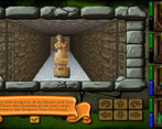
This is such a genuine throwback. I love the UI. It's a bit strange seeing the Venus de Milo everywhere. Your FOV is a bit too high, I wish I could see the floor where I was standing. The music and sfx fit perfectly. HOLY CRAP YOU CREATED THAT ENGINE.
That's lovely, I so appreciate it :) For some reason, I am attracted to such UIs and gameplay.. I just wanted to scratch another itch with that particular game, but on same basis :) Yeah, there's something mysterious, distant to deal with statues and stuff.. Even back in World of Xeen days I didn't mind when I was learning stuff from some statue on clouds :) Yeah, I played a bit the last hours before the submission and I wasn't able to hit the right spot... I mean, it was simply a matter of time. Lots of stuff were one-time coded and I pretty much wanted to fix the absolutely necessary. I actually managed something close to M&M look but other things emerged; I had to decide and let it go first :) But I like your feedback Are you referring to "jolt3d!" ? Yeah its mine for god knows how many decades, last incarnation of it gave already 2 games :)
Honestly a really great game(not even considering that its a jam game) amazing and consistent visuals, satisfying movement and good sound and music! i just wish the text scrolled a bit faster and that the music didnt stop while interacting with something!
Oh, thanks man, what a lovely comment... Its true that I didn't wanted to submit a "jam entry" but rather some that I could build upon later; you can see that the game was submitted like 2 hours before the dealine, but there's only so much that can be done in 7 days from almost scratch... Its lovely that you find these mechanics satisfying because this is what I was striving, was going mostly for "fun of it".. Will definitely work more on the game, after completing the last demo for "The Darkness Below" :)
This was fun, took me one retry, taking care of saving a well for the end.
I like the gfx and walking as fast as I press the buttons, and even if the combat which also goes as fast as I click in The Darkness Below excites me even more I would definitely play a bigger version of this too, going through the process of finding ways to get strong enough then letting fate resolve is cool.
thanks man, love it :) Yeah, it took me enough to sort out the technicals as its quite different from TDB. There are definitely some wins already in this project and lots of ways that I can build around it and I will :) As I see it, it scratch another itch and feels like a lighter take on the stuff I usually do the last years :) Had quite the fun making it, thanks for checking it man!