Play game
Jumpled's itch.io pageResults
Criteria | Rank | Score* | Raw Score |
Style | #92 | 4.525 | 4.525 |
Overall | #436 | 3.917 | 3.917 |
Enjoyment | #825 | 3.625 | 3.625 |
Creativity | #1464 | 3.600 | 3.600 |
Ranked from 40 ratings. Score is adjusted from raw score by the median number of ratings per game in the jam.
How does your game fit the theme?
You need to build the map yourself, you need to build up momentum and the player can shrink to then jump higher afterwards.
Development Time
96 hours
Leave a comment
Log in with itch.io to leave a comment.
Comments
Clean and minimalist, I love it! The base game felt a little basic, but on the last levels I eventually get into the speedrun aspect of the game and took pleasure in optimizing my level-design like a Trackmania course. The game has a great physics for that!
I didn't use that much the shrink mechanic, only occasionally. The best strategy ended up building momentum thanks to gravity or boost, and keeping it. Also the idea of having to build with random pieces is interesting, but in the end not restrictive enough: it's really easy to put aside something we don't want to use, and sometime I would just draw until I get something useful.
I must also mention that the UX is kinda disconcerting. I was very lost at first on how to play (even after seeing the tutorial pictures on the game page). And the first time I finished a level, I had troubles exiting it to select the next one.
Overall it's a simple concept, but well executed in a neat small game. Well done!
Really well done. Took a bit to figure out what I was doing, but then it became a pretty interesting physics simulation with a speedrunning twist. Great submission! :D
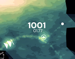
Great concept, great style. I wish there was a limit to how many items I could use. Nothing is stopping me from placing as many boosts as possible to get to the end quickly. Constraints bring creativity!
Yep, that's why the leaderboard is sorted by least objects, and then time. Not the other way around.
AH I see, I thought it was time due to the big timer and how the UI made a big deal out of the PR. In that case I would say what you have works well! Would just give the freedom to the player to place anything rather then picking from a random 3. Great work again!
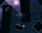
Nice work! The visuals are very chill and the leaderboards definitely make it a bit more interesting. It's kind of hard to see some of the blocks you can select when there is level geometry overlapping the hud, but otherwise it's pretty solid!
You said that the game was mid but I honestly really enjoyed it. I can only explain the gameplay as "crisp", every single aspect is polished as hell, the sfx, visuals, music - everything is tied together beautifully. The main gameplay loop isn't turbo interesting but it really doesn't need to be. One minor thing I'd change is to leave the camera where it was during the playing mode when you change to edit mode.
Yeah the camera thing would probably be a good addition. Thank you arcy, very cool 👍
Would make a cool phone game
Nice concept, i like the art style and mechanics :)
What a great style! had a bit of a hard time figuring out controls but its a small speck in comparison to this joy of a game
Could have used more tutorialization, and dunno if there's RNG on the objects or not. Felt like I wasn't getting things I wanted/needed. Also those things weren't explained - what's a booster, jump orb, gravity orb do? Also the scaling mechanic kind of felt like it was just charging up your jump.
But it was really pretty and sounded great!
The objects are randomly chosen but they are the same for every player to make sure leaderboard competition is fair.
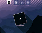
For jump orbs you can jump on them, when you jump on gravity orbs the gravity changes, and boosters boost you when you go through them.
I really liked the dual nature of the game with the focus on building yourself an optimal path with as few objects as possible and then racing through it. The leaderboard was a really nice touch. As far as feedback goes, I think the mechanics could be better explained, it took me a little while to fully understand the process.
As far as presentation goes, I mean the game just has so much style. I really loved the dynamic shadows from the boxes, and the light trails, but honestly it was all pretty.
Very cool, nice work.
You created a really nice mood - I'm definitely taking notes on the particle trail, lights/shadows, and the quantization shader in the background!
I like your game's concept but had too much difficulty with the controls, and the two-mode gameplay wasn't really explained. I have a lot of patience for game jam games, but unfortunately these things (+ the performance!) held me back from enjoying it completely.
Buuuut I saw you comment that you wanted to really polish the aesthetics a ton, and you very much succeeded on that front! I've been working on learning how to polish myself, and I think you have a more masterful grasp on it than I do. Take what you learned from implementing these effects into your future game jams!
The graphics and the soundscape are really cool
The movements feel a bit awkward, but the idea of the game is good
The leaderboard is a nice idea
Keep it on!
I LOVE THE GRAPHICS STYLE
Pretty fun game imo, great work!
Very creative game indeed. But I think you need to clearly some items in this game (especially the jump orb and the gravity item). Not everybody played the same game, and they may not know about how the item works.
Anyway, well done. The graphics looks very beautiful.
this was actually quite relaxing. great take on the concept!
The game has a very relaxing vibe. The leaderboard makes for great replayability. Some of the items are hard to understand but the overall game is really fun and well thought out!
I love the feels the level of polish gave me, I have kinda the same feedback as the other about the s to charge up feeling akward, but I got hooked anyways !
This game is super fun! The style and the atmosphere is amazing!
The map builder part feels extremely well polished and easy to control. I especially like the trail effects that help you see where to put stuff. The only slight issue I encountered was that the more I played, the more elements would start to wobble around when I drag them.
The platformer part was a little more stale for me, but still impressive. I think that the fact that there’s no explicit limitation on object count stops it from feeling like a challenge. Although the leaderboard helps with that.
Overall, remarkable entry!
The wobbliness is most likely a webgl thing. I have to use the single threaded export otherwise leaderboards wouldn't function.
Thanks for playing!