Indie game storeFree gamesFun gamesHorror games
Game developmentAssetsComics
SalesBundles
Jobs
TagsGame Engines

FallNight64

45
Posts
5
Followers
3
Following
A member registered Jun 25, 2021 · View creator page →

Creator of

Recent community posts

Good game! A rails shooter is a fun thing to play, the music and the enviroment we flew through was very nice and it was fun overall but a few things could've been polished up.

We need a health bar to know how close we are to losing the game. Along with that we need some SFX or effects when we're taking damage, same for when throwing rocks and when enemies are destroyed. More Sound Effects and Visual Effects would have gone some way to making the actions more impactful and satisfying. 

The enviroment could've also done with a few more splashes of colour too instead of it all being just grey. There's a point where the camera suddenly snaps to sideways view, I feel it could have been smoother and less jarring if it was a transition.

However, good job on the game! The rail journey was very nice and entertaining, music was good and flying thorugh the enviroment was very fun.

(12 edits)

Great game! I'm not sure what 2d assets you'ved used, but most of it seems to be made by yourselves, which is excellent work, the game looks great and plays well, the puzzles are simple enough to understand and the music rising and falling with baterry and progress is great for creating emotion (Mostly anxiety and Swelling truimph)

I found it a bit surprising that diagonal movement wasn't possible, but oh well. The Volume bar in the menus doesn't work, the game also starts paused and requires two presses of ESC to undo.  It's also possible to press R without controlling a bot and it still shows up the screen. I would have also prefered the black screen with text when disconnecting a bot to be a bit faster as I'm fairly sure battery is draining and we can still move about.

This Hack can't be started ^

This Hack doesn't seem to do anything ^

Great job on the game! It was well made, the transcripts give some story, text boxes were helpful, batteries were enough to keep going without problems, SFX was nicely done and the battery being 0 but giving you a bit of time is good design. A good job all around.

(2 edits)

Good game! Not much of a platformer myself, particularly hard ones like this. It controls nicely enough and the levels are varied and well done, but I do have gripes here and there.

SFX for jumping would probably be nice. Ghosts having a bit more tell before they appear would also be good or else they'll just blind side you. Restarts should be quicker and automatic rather than having to press try again, it slows us down slightly with that extra step. A game like this should also have a level select just so we can go back to where we left off instead of right back at the beginning.

The graphics and lighting is very nice, the levels I got through were very nice and well done, the steady ghost sounds are good for timing purposes and movement is precise, I did like the menu's sliding across, though it was a tad slow. Good job on the game!

Good try! A few packs used, did it include characters and items or was it just the enviroment? Well, it was a enjoyable little game, I would say that a few things were lost due to a lack of explaination.

I can sprint with Shift apparently and also use Space Bar to Jump. I don't think I need to use E to pick up trash so much as just be near them,  using E on the machine uses a bottle and processes a recycle bin and drains energy, with that recycle bin, I can delete people dropping litter, whilst trash bags are to refuel it.

An interesting Idea, but it definitely needs better explaination on how this all works in game. I would have liked some SFX for our actions, walking, picking stuff up, processing and so on, along with more visual feedback perhaps, some dust puffs when objects disappear, etc. SFX would have gone a long way for making actions satisfying and impactful. The music was upbeat, but it was very flat which detracted it a little.

Was able to beat the game the second time round once the mechanics dawned on me and I knew what to do, but the first one was lost. I did like the processing UI animation! Good job on the game!

(2 edits)

Ooh, fair enough, yeah, I can complete the game now, haha.

Another thing to spot is that the text in the top left corner disappears instantly after they're finished so it's hard to read.

(3 edits)

Good game! Single use moment mechanics, after the bit of polish with controls at the start, it's nice and easy to use and control. Managing to do the original assets is great work, visually it's simple but nice, there's alot of variety to the puzzles there, but there's a few problems.

Namely in the levels, the moving platform's timing feels absurdly difficult for level 10 + 11, I've using the tree below for timing and getting myself stuck on the white rock on the left inorder to pass level 10, but for Level 11, I have absolutely no idea, unless there's supposed to be a trick to it that I don't know about. Level 15, waiting for that vine to drop fully was time consuming and tedious, I really wouldn't recommend making difficult levels require a period of waiting as people want to hurry and try again.

Each Level after the first, restarting the level has that Wyah sound effect which was a cool, exotic SFX but it gets really, really annoying quickly as it accompanies every restart as a mark of faliure and every Level's start. It's like putting your favourite song as your wake up alarm, eventually when you hear that song, all you'll think about is how horrible it is to have to wake up at that time.

The graphics are simple, though things like the rocks and trees are very well done. There's variety of levels in there, though alot of it is hold right at a right timing and never let go because then you can't move to the goal. I would have liked to get more use of Left. The SFX is very nice, footsteps, vines and jumps all sounded good.

Good job on the game!

(1 edit)

Great game! One use abilities for a runner is interesting, though I wish the different abilities had their own effects and animation instead of just the simple 3. The way the Main Menu tilts with the mosue was nice polish. 

The fact that everything was done by yourselves is awesome and really good work, the music, enviroment and character were great, though the SFX was a little too muted and not impactful enough. The UI is nice, clean and minimal.

The Highscores doesn't seem to work.

All in all, it's a simple game with really well done models for the enviroment, nice animations for the character, good design spacing obstacles and ability collecting, I was a bit surprised it wasn't an endless runner but considering time it's fine. Great job on the game!

(1 edit)

Great game! I like the concept, river styx ferryman theme.

Like the others, the formatting for highlighted text shows up, sometimes instead of apostrophies  ['] it just comes up as a box, at first the text appearing bit by bit was nice, but got in the way once we were trying to read through it, I tend to set text speed to instant because I don't want to wait for it and sometimes you'd press the button to show the whole thing immediately, but it just skips here.

I knew I was searching for dialogue options, didn't expect I'd have to click the highlighted words, probably could have made that a bit clearer, but it was a very nice and seamless way to do it. Probably some polish was needed for the dialogue choice buttons as well. 

Alot of the work was your own, which is amazing, it's a shame that the hunter doesn't have any animation. The characters and their stories are nice, quirky and interesting, I'm hoping there's only 6 endings, 2 for each character. (At least, that's the endings I've managed to get) Great job on the game!

(1 edit)

Good Try! It's a fun little game, it's impressive to make all the assets yourselves, there's only one music track, but it's good, the town itself looks pretty impressive too, being able to only pick up stuff with the hands is fun too, but there are a few problems.

  • In the Controls Menu there's a Credits Headline Instead
  • When you tab out, the main menu plays a second music track from the beginning, overlapping each other.
  • Characters and Player animate steps even when standing still
  • Melee Attack is really inconsistent and along with special attacks will freeze the character's animation rendering them unable to do anything as they slide about without animation.
  • Lack of feedback or sound effects for most actions. (Gunshots, damage, etc)
  • Music doesn't loop

Still, good job on the game! The models of the city and people are very nice and the gameplay itself isn't bad, though any item not a trash bag seems useless as an attack.

(3 edits)

Great game! The assets and eviroment are very nice to look at, the sound is also great, though the main menu has none and there's no music, probably to emphasise the SFX. I really like the particle effects and the sound that goes with it, the charge SFX properly cuts off it you stop mid way, the particles for charging are nice too, the same can be said of the one panel in the first room that you hold to activate, the sound fades off midway properly which is nice polish.

However, there's a few problems. The Controls option in the pause doesn't work nor does the Reset Stage command with R. I do wish there was more effects for Dash and Force Push. There's also a double jump that's probably a bug, as it's super inconsistent. Green and Blue for the 1 use abilities is fine, but Yellow is had to tell from the Clear colour of a used ability.

In the first room, you would test all your abilities, probably, and then come up to the doorway blocked with cubes and not be able to use the ability. It's a lucky thing that crouching lets you push boxes with your gun mesh.

I also wish the platforming was more forgiving, as it requires alot of precise jumping and failures boot you with death, the platforms are usually too far apart and requires last moment jumping, it's precision makes it feel inflexible, at least, until you get very used to how the jumping works. 

The SFX for Robob shooting lasers is eternal, even when they're not shooting, even when they're firing a laser instead of projectiles, and even when they're dying and into the credits sequence, I've reproduced this by dying in the boss room while it was shooting, which is bound to happen to alot of people first time through. There's also the fact of why the Final boss even has a health bar when all I'm doing is standing still behind cover and firing this laser to kill it with no threat. If it was flashily exploding due to damage then it would fit, but it just felt a tad tedious.

Good looking game, nice sound design and particles, good assets and textures, Great job on the game!

(10 edits)

Good try! It has a good core in terms of design, though there are some problems. It's hard to see how the theme ties into it, one shot to clear the tests is mostly flavour. I would have to say that having the control scheme appear after you've already moved a fair bit is not good, it'd be nice to have it up front and the right click to attack is only a one time thing and there's no attack animation for it either which was unfortunate.

Shift to Sprint is the norm, but since it's a speedrun, I feel like it should always be sprinting anyway. There's a few gripes with level design, it's always better to have more obvious markings like a consistant object or source of light to guide them, like a specific glowing crystal to act as a guidepost. (It's mostly linear, so it wasn't a problem and searching the perimeter usually found us the way, but in a dim setting like a cave, guideposts are important I feel.)

At the start, there were also crystals on either side of the walkway down at the start hid the path from the angle you approach it, the corner piece was in a dark spot so it was a little hard to tell first time round. (though I usually found my way in general, it's just a thing to note. Granted in a speedrun, the first run is a probe.)

Enemies have no attack animation and auto-kill you on touch, that aspect could have been polished I think. Their animation states are also interuppted once you touch them and they stop walking and slide towards you instead once you respawn.

The giant red sphere obscures our vision, at first I didn't know we could attack because when I tried it earlier there was no animation at all. Maybe the objectives needs to be more noticeable. I should point out that the red sphere was hard on the eyes too, just a area on the ground or even a more transparent, neutral foggy sphere would be better. (At first I thought the red sphere was to purposefully obscure our vision and we had  to run from the monsters and find a path) The rock spikes on the ground in that particular room have no collision as well.

The Puzzles are nice, though the one with attacking the orcs was the most disappointing one, since the right click to kill thing was a little uneventful. The platforms that were sometimes illusions was a bit frustrating, the jump's ending animation was a tad too slow to let us bounce between platforms with speed as well. But, I really liked the maze puzzle at the end, that camera shift to top was really cool!

SFX would have gone a long way to setting an atmosphere and making it more lively than just cave ambience, even just echoing footsteps would have been amazing.

Good try on the game! The puzzles were varied from each other and interesting. The foggy, dim but bright enough to see effect in the cave distance was also really nice. I think the enviroment was put together really well and seamlessly. My fastest time is around 2:28.

Good try! It's certainly a very cool concept with nice magical effects and spells, I think those are really well done and beautiful, but there is something to be said about a need for visibility. 

It's problematic when some of the spells make it hard to see anything, it's also a spellsligning game in tight quarters and small rooms which is also a little hard to handle, attacks often come too suddenly that way.

You have a basic cooldown system which is good, but it feels too short, granted, it'll be rough to not be able to do anything at all. I would have suggested having a free basic attack, but if that doesn't work, having seperate, longer cool downs for the 3 types of spells would be nice.

You had it before, but making those red enemy projectiles stand out more would be nice, even if you can't add a new effect, making them glow brightly or something would be nice. Also sound effects, though we can't things now, sound effects would go a long way to giving it some impact.

Good try on the game! The only thing you didn't do was the audio, the enviroment is really well done and you made a character which is always a fairly tough task, the special effects were also really cool!

(5 edits)

Thanks for the feedback!

I'm glad the tutorial was able to explain and teach well, I think it's always nice to have a gradual, practical example that's easy to follow and quick to breeze through. And you're not wrong, definitely, with the movement it should have been more important but the combat mechanics with a single use only sword clashed with it a little. Maybe more open enviroments and static enemies like ghost runner might have been good, I ended up wanting to emphasise combat mechanics when the other would have better fluidity, momentum and satisfaction.

WIth only 2 enemy types (at the time) and a sword that only works once or twice, I was having a bit of a hard time trying to make interesting combat scenarios, I ended up creating a Boss type just to be able to have a final obstacle to round it off. Probably could've gone the path of parkour instead.  That's fair about the Theme, didn't think about that, I guess it DOES seem like a two use instead.

I was hoping to have melee combat AND magic spells / abilities that enemies drop that are one time use and enemy attacks would force parkour and using spells would require a bit of parkour positioning too, but alas, overscoping and my first 1st person melee focus game (Though I've done 3rd person combat and 1st person shooters with slight melee before), I wanted to swordfight too badly like Chivalry or Mount and Blade, haha.

(2 edits)

Good try! The game's technical mechanics seem impressive and in depth. It's hard to control, which is probably par for parcel, but it's also hard to tell where to go and land, whilst I understood which angle to orient myself, I had no idea on where to land for the Hub. (The raised platforms I assume, but it's so dang hard to even get there)

There's also a few problems, such as Stepping SFX continuing to play when we're just flying, then there's the lack of SFX or ambience for anything else. The plain landscape makes it hard to detect scale or speed and Sheer White is never a good thing to look at. The fact that it's ESC to unfocus from the steering wheel makes it hard to play due to the nature of Itch's ESC to unfocus or exit full screen. Getting off the steering wheel and whatever direction the Blimp is going, the player character slides across instead of staying in the same spot within the Blimp.

But otherwise, I think it's a fairly impressive, technically speaking, but it's hard to appreciate when the effects are so vague, for something like Wind direction and strength, it'd be good to have a visual representation or even a compass effect for it.

Good try for the game!

Thanks for the feedback!

Glad you enjoyed the combat mechanics, I seem to focus on that alot in projects. Thank you for your feedback on the wallrun, that's interesting, I didn't really imagine the wallrun would be hard to get used to, but it's true that it's trace is a 45 degree angle backwards, allowing the player more leeway to look to their side when wallrunning, not that needed here and many people tend to face the wall they're running on. So for the polish I'll adjust the trace forward a bit more.

(1 edit)

I believe that despite it's harsh difficulty, it's tightknit and small game space allows for rapidity of play and restarts, the puzzlelike element is there because each restart has the exact same variables and mostly same reactions (Same respawn point, same enemy placements, and the placement of the power you have to get to start fighting back,) it works in your favour for the most part as progressing through these tight levels rapidly is fun and satisfying.

Each level usually lasts a minute or so, and even in that space you can die handfuls of times, it's very nice and rapid that way with it's constrained rooms. The problem is that it makes me feel like each room only has one solution, even if it technically doesn't, I feel that the design needs to be a bit more open in that sense, like having more than just the one power available in the room at start for example.

It's probably just that you needed the time to test out a variety of level types really. Otherwise, it's perfectly fine as is.

(1 edit)

Great game! You did the art for this? That's really amazing! The art for this game is quite good, beautiful effects and enviroment. The combat is very much half a puzzle, my only disappointment is that the rooms almost feel constrainted to only have one real solution with the string of powers given. 

It's very punishing, enemies have a high attack rate, instant kill, and the dash doesn't seem at all useful without invincibility frames or a longer range. 

The last room funnels you up a stairwell, with a red arrow firing at you off screen and a funnel point where you have to deal with homing sphere and a laser, which really just comes down to if you're lucky enough to get through sometimes. It's sometimes hard to the point of the definition of madness where you're doing the same thing over and over until you get a result.

The gameplay is quick and designs are diagetic and clean, the character's head filling up for the dash and changing colours for the different powers, a good gradual increase in difficulty and introduction to each enemy power, the starting area with each orb in display to let you test each power, the design is good, I just wish the enemy attack rate was lower, though it's not like it's impossible so long as you try enough, it's still feels harsh.

Great job on the game!

(6 edits)

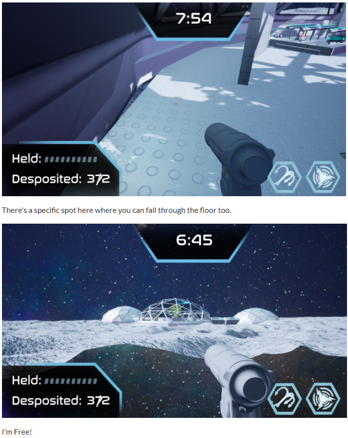
Good game! The intro cutscene's audio work was very clean and nicely done. However for repeat playthroughs, there's no way to check the controls except for the end of that cutscene again, and it would be good to have a way to skip the cutscene for the less patient or those who want to get back to the game quicker.

Minor bugs below

  • There's a problem with the settings - Music and SFX don't actually adjust
  • Jumping and Retracting sounds can be spammed even when they don't work, like spamming jump after double jumping.
  • In the controls, there's never an explaination on swapping to the EMP grenade, it's the 2 button, yeah, but still, it was never mentioned.
  • The grenade also works differently than I expected, rather than a large explosion, I have to lob the thing directly onto the drones, and it doesn't throw too well.
  • Gathering above 20 or so cores, the UI becomes squished
  • Deposit bin was missed the first time around, whilst neon arrows pointed to it and it had a sign, I think it generally blended into the enviroment too much.

You're already polishing gravity and movement, so I won't say it again, the floatiness makes things feel less responsive, even if it matches the moon's atmosphere or so, it'd be nice if it was increased across the board in general. I got used to the grappling, but I can describe it as a bit unituitive, such as it's best to shoot directly up instead of a 45 degree angle, jumping to grapple almost never works at that angle as you'll fall to the ground and grappling gets canceled.

It's concept of gameplay was quite interesting and fun to experience as well. The grappling, once I was used to it, was quite fun to use! (The above are images because there was apparently a server error at the time and I couldn't post, so I can't edit it XD) It was fun, but there are a few small bugs here and there. Great job on the game!

Great game! You had a large team and managed to get everything done yourselves huh? Nice, the art is very well done and it surprised me how nice it was for the intro, however, the lack of sound for the intro was jarring.

Once underwater, constant bubbling noises from movement, ocassional bubbles from breathing and so on help set atmosphere as it's constant and always there, the gutteral monster growl was nice, it gave the sense of a threat, but what I came across wasn't nearly as bad as it sounded, which was slightly disappointing. I also like the work that went into the shadows and light obscuring. 

There's a few problems however, the flashlight, there's plenty of indication from it crackling and flickering before it goes out and breaks, but I expected the little bar in the top left to at least tell me how much is left. Also, whilst you have controls on your page, it's always important to have the tutorial in the game itself. 

The flares, they're limited light sources once the flash light goes out, but they are too dim and last too little to be a good marker for anything than an instance of light, making people grope in the dark. Which is fine for atmosphere and if that's the intention you're going for, but it can get tedious and frustrating since you can't even see anything, if not careful with guidance. 

I had honestly expected the flare to be brighter and last longer than it did for a limited resource. It was much easier when I restarted and was careful with my flashlight isntead of using the flares, which helped greatly. I just sort of expected underwater flares to last longer at least.

There's a problem with playing the game when using the pause menu to exit out and retry, the text boxes don't show up again. Also, it's possible to escape and just go through the boundaries of the top of the map, past the black texture at the top and into a flat green, endless space. I restarted it and escaped the glowing tendrils all the way back up, but nothing happened, does this have an ending?

However, great work on the game! It was fun to experiece the atmosphere and soundscape. With all original assets, it must have been quite the work. 

Good try! I suppose they're one use abilities that rotate? It's hard to tell. The visuals are good and so are the special effects, but outside of that are problems.

The Main Menu's font is stylised, but almost illegible, which is a problem. I've also noticed that the red and blue bar, for HP and MP don't ever change, enemies can't attack you nor does MP go down. You also know that the camera sensitivity is really low for this kind of game too. The lighting in your levels are far, far too dark, it's difficult to see anything, particularly the doorways.

I noticed that it's an endless loop, which is neatly implemented and hidden by making the doorways opaque, but without a goal or any stakes, it's hard to play that far.

Nice try on the game! It's a beautiful game, alot of nice assets and 3d modelling work. However, it has problematic design.

Whilst you might have WASD for movement and E to interact, without an interface UI, it's hard to know what, when and if I can interact with something. Yes, there's a key, a box and the tome, it's just a small polish thing so I'm not spamming E whilst looking at stuff and waiting for the line trace to match up.

Meanwhile, the second room with the orbs and the tome, it's problematic because there's no direction on what to do at all, yes, you used lighting to draw our eye to the broken orb, but what do we do next? Do we select the one that's missing on the page? Select the symbols that ARE in the room? Nope, neither one. Does order matter? Clockwise? Anticlockwise? Also neither. That particular puzzle needs more of a guiding hint.

Another polish is that there's no way to deselect symbols, nor is there a way back out without pressing comfirm and starting over again. Granted it's not that far, but even so.

Great game! Interesting concept, I guess it's one time use because we're using old muskets, I see the attack on titan inspirations from this from giants to being surrounded and needing a timed coordinated attack when they're perfectly in range.

The others have already mentioned that it's hard to calculate the range of the giants, it's not a huge problem, but the last level, I think, or at least the third level doesn't seem possible to win, the giants are never close enough to become highlighted and even a step closer they will destroy the building they on and lose.

On another note, when the quick time event occurs, it's much quicker to just spam random keys and watch them all fall down really quickly, it's really satisfying, but it's probably not intended? Well, most people would probably carefully press the right one, but it doesn't seem like there's consequences for pressing the wrong keys.

Great job on the game! The UI, music and voice overs are good and a nice touch, though a few more voicelines wouldn't hurt to make it less repetitive. 

Thanks for the feedback!

Thanks for playing! Those enemies in my mind were like robots with a boot up sequence, haha, using their bodies to decorate the scene to inform the player of the amount and position before they wake up. A small thing is that the ones that will come awake still have red eyes and the dead ones will not. It was a death animation reversed so it had the uncanny rising back up feel, I'm glad it was subtly creepy and caught you the first time!

Good game! One use plastics is an interesting take on the theme as a descriptor rather than mechanical function.

Like it's been mentioned before, but smaller items generally need to have bigger collision boxes to pick up at all, especially when the belts get faster and more numerous. The small size of the cursor's selection area is a little annoying too, it'll be nicer if it wasn't so precise I think, either that or today my dexterity is down.

Since we're dealing with physics objects there's not much we can do, maybe an invisible wall to prevent objects just falling off the belt and into a bin nearby which happened a fair few times. 

Great job on the game!

(3 edits)

Thanks for the feedback!

Thanks for playing! I understand that the wall jump takes some getting used to even if the whole movement system is smooth, what do you think was the problem? Did you find yourself looking at the wall you were trying to wallrun on? Or did you truly mean the jumping off part of it and thus struggled on the last room of Level 1?

I did have a bit of a feeling about Level 1's last room, so I'll try and polish that up next time. Understandably a fast game that can have a fair bit going on at once isn't to everyone's taste as well, but it's true that the wallrunning has some problems that I'm not too sure about that can invisibly make it harder for people.

Thanks for the feedback!

I'm glad you enjoyed it! The game tends to be dynamic I think because you melee, then have to retreat and throw the sword, and then have to dodge enemies and grab a new one. I'm glad you liked the sound and music, since a good portion of game feel comes from it.

You're not wrong about the wallrun, whilst I do think some skill and adaptation is needed, I imagine you had trouble in the last room of Level 1 with the snipers on the pillars? The wallrun can be finnicky, I think I'll try to nudge the platforms so they line up better and make the pillars larger, maybe lower and easier to get to for the next polish run.

Thanks for the feedback!

I'm primarily a game designer with a love for animation, so that's why these characters and first person have all these attack animations, haha. 

I'm glad you had fun with the game's mechanics, the parkour just always seems like a really good way to make movement more fluid and flexible in many action games like this for me, even if it didn't mesh too well with the combat style except in specific situations. 

Alternating between close to long range was almost an accidental by-product of the core concept of a one use sword, though staying too rigidly did cause problems for me in that flowing and action packed combat was difficult if the sword always broke after one swing. Which was sort of the reason why I ended up having a boss character at the end, wanted to give the player a chance to get a cooler, stronger sword, fight off against a boss with unique attacks that actually use the parkour mechanics.

Thanks for the feedback!

That's fair, I overlooked the gamepad and left default values in there on account of not having one myself and assuming that we'll be using computers anyway. It's a good suggestion and whilst I can't test it, I can try and hook up some gamepad inputs, I do think the fluidity of movement and mouse control with swinging will be lost with a gamepad and I have not used a gamepad in ages, however I'll see what I can do.

(1 edit)

Great game!

Discarding guns after one shot is a decent idea, the gameplay is good and doesn't have any problems at all, limited and recharging movement resources is an interesting way to lean into the theme, the UI for it is great for letting us know the counter too. The guns are great, having no way to recover health is a bit rough and the art is incredible in all aspects, like the menu screen, the way the knight rotates, the detail of two handing weapons and so on are great.

Having to press R to reload after running out of guns... it's hard to tell when it's happening or what's going on with that, so some sound effects or UI for it would go a long way to knowing if a reload is happening and how long it's going to take.

Great job on the game!

(2 edits)

Good try! I imagine the limitations are due to a lack of time or current knowledge of the engine. The concept of using previous one's deaths and persistent states in order to eventually overcome puzzles and traps is a good idea, but would've liked to see more use of that mechanic, like leaving bodies behind to mark the deaths, some way of making the deaths more impactful rather than seeming like just a teleport, spawning a dead body, blood splatter, sound and so on. I think we needed more levels with various traps to explore the concept a bit more. 

It's a simple but functional game, you made all your own assets so I imagine a fair bit went into the minecraft esque indiana jones character and figuring out all the triggers for traps. Having sound effects would have gone a long way into making the game more fun to play. I think a few people have trouble with the menu because you don't click on the buttons but use the navigation keys, it caught me out the first time. 

Good job on the game!

Good try! The game's fairly basic, collecting items that trigger a change in enviroment, letting you collect the next item and so on until you escape. Bar it's simplicity, which might be a time constraint or current knowledge of the engine.

A few things to note are that the pick up items might need more contrast from the enviroment, understandably you want to hide them, but a grey black hammer in a shadowy corner of the room isn't great, granted I didn't have trouble finding it, it's still something to consider (Granted, you do use Line of Sight behind the TV so that the player can see the grate disappear, that's good, though I missed it the first time). There is also a bug where most of the doors can be walked right through without needing items, which is problematic to the game itself.

Apart from that, the camera bobbing and the sound effects of steps put a good atmosphere and sense of presence in a first person horror, even if you don't have a body when you look down, hearing the sound of your steps is a good immersive touch.

Good job on the game!

Interesting game, the story took an amusing twist, didn't expect a horror aspect for this jam but it's welcome. It seems to be a jokey type of game with a few hidden secrets, not bad, good for a bit of fun.

"Normal person, why are you not smiling?"

"... I'll be right back," leaves the restaurant, goes outside, finds someone to `interact` with, I suppose. Interaction happens. "...ah,"

(1 edit)

Great game! A one time use rag, make sense, it's a fairly simple but fun and theoretically endless game as the rate of customers increase, more upgrades are bought and so on until you have had enough fun, or it becomes unmanageable. The core design of creating a system that's logical and can handle continuous advancement naturally with just tweaking variables like spawn rates and limits are excellently done for a game jam's style.

Organic obstructions by making the tables, waiters and tables have collision is extremely frustrating, but also adds dynamic complexity to the game. Sound design is good too and along with the repetitive, predictable actions of getting a rag, cleaning, returning, ad infinitum,  more impactful and satisfying, the breaking of plates is a nice sound that accentuates the task and helps set a flow state along with identical mouse movements throughout the game.  It bums me out when they only leave stains and I don't hear the clack clack of plates being swept off the table and shattering on the floor, haha.

Rush hour is well anticipated, use of progress bars is good to convey information simply and quickly, the time dilation of the rush hour definitely makes things much more chaotic, but also makes all the collisions that much more frustrating, but that's intentional.

Great job on the game! 

(2 edits)

Great work on the game! It's a simple, decent, nice little game, it plays well, though the abilities feel a bit useless and tacked on, the variety of guns are certainly nice, though I almost argue that the sniper is not great at all comapred to the others due to it's lower rate of fire, even if it's damage is better. Perhaps if they could pierce enemies it would be better as a one shot weapon.

The sound of guns breaking is way, way louder than everything else, taking damage is also higher than it needs to be. Pressing F to activate the weapon chests is also really unresponsive, causing a few game overs. 

However, the gameplay is very nice, smooth without problems like a flash shooter and the art is very nice too, the feedback for enemies taking damage is great with their resizing and small cube particle effects and most of the guns work well. It's definitely the kind of game I could find myself playing for a long time with random levels, replenishable health and more weapons. Great work!

Thanks for the feedback!

I'm glad you like the movement! You're right about the enemies, I should really put more control into how many of them are active at a time rather than leaving it to a random timer, leaving out the sometimes quiet sections or sometimes overwhelming sections. More enemy variety would have definitely made things more interesting too. 

Alot of my time went into experimenting with the animations and creating a character that can swing from most of the angles intuitively, probably should've made the different swings more integral to the gameplay if I was going to put all that effort into it, but no time, haha. It'll probably make a good project to further develop though.

(1 edit)

Thanks for the feedback!

You're very much right on that, the movement system and the combat mechanics don't fit too well together, requiring staying close, swinging and parrying, it's not really until the boss fights that the Arena lends itself better to using mobility to avoid their area attacks I believe. 

I had overscoped for sure, yeah, originally I planned a melee system and a spellcasting system, skills you get from defeating enemies which would then be consumable abilities of one time use, with enemy variety, but I realised that having to make all those spells would be too much and focused on the melee.

Having to press E to pick up swords... it does limit what I can do with the combat, since after one strike it breaks and I have to throw and retreat to pick a new one up, it certainly shows I think that I could have done something different with the sturdier swords at the end level.

(2 edits)

Great job on the game! Interesting take on the concept of One-Time Use on plastic and enviromental concerns, at least, I didn't seem to find anything in game mechanics wise about it.

It's a well designed unwinnable style game, with plenty of options to fight off the pesky humans, really reminds me of flash games I used to play. The art is very nice, creating the whole area and then randomly roaming people and increasing rate of spawn, my army of foxes seemed to do quite well, muhahaha! Managed to get a high score of 40845. 

The quest generator was quite nice too, the only problem was it got stuck once and clicking on it to resolve usually requres me to waste some energy by clicking on empty space unless we switch to the 0 cost one. There might also be an exploit of rapidly right clicking to proc the same item multiple times, like trash, or saving an animal, or even getting energy. A pause option might be good too, my streak got ended a little early because I had to leave quickly.

Great work on the game! It was simple but had interactive and naturally, steadily progressing gameplay!

(1 edit)

Great job on the game! The use of the One Time Use concept on platforms with the background of it being consumed by a void and leaning into it was very interesting. The groundhog day style of using previous runs knowledge to succeed the next time is very good too. 

The music is calm, the controls are fine, the different endings is interesting, though the fourth ending of having to cover every single tile is probably the hardest one, it's made more frustrating by the fact that the character's hit box is very odd, unable to walk over small steps and being able to stick to the side corners of platforms. The Skills you get might need names too for indication of what they do, I know the first one's a jump, but what's the second one?

Hiding the safe where it is was quite clever too, Great job on the game!

(1 edit)

Thanks for the feedback!

Yeah, the boss is a bit tough, it'll certainly get almost everyone on the first encounter. I think due to it's damage and slightly small arena, I'll lower it for the update for sure. As for the parry, you're right that it might not feel effective, since there's a % chance that they'll be stunned or they'll actually parry your counter attack, I'll need to see about making it less frequent. The boss also preforms normal attacks that are parryable, but it sounds like I'll need to reduce the frequence of their big attacks.

Thanks for playing through it!

Great job on the game! It has a rather arcadey style, it's art was good and it's variety of weapons warranted a second or third playthrough to try them all, I quite like the quirkiness of the weapons though personally some of them felt less useful than others, even if their damage was quite good.

It was a strange feeling when you never felt like you needed to save money or anything and some cheap weapons were some of the best and so on. Like, the AMIR, Malware gun and flamethrower were my favourites, maybe their rate of fire? I did find the constant screen shake a little annoying when using them though. The Flamethrower's burn effect is a nice touch, though unfortuantely most of the time we're holding down the trigger and burning them with a barrage rather than setting them on fire and walking off. 

The Zooka's slow rate of fire, inaccuracy and low area was a bit difficult to use effectively, especially when so many of the armadillos or rolly pollys show up.

It certainly had a Enter the Gungeon sort of style as well. The sprite work was really nice and the loading screen transition was a good polish. During the gameplay I was confused now and then why I would suddenly have that 70 paper for the expensive guns. 

Great work on the game! There were no real problems with the gameplay or artstyle, it was very playable and good as a game. I love the boss' defeated sprite!