Play The White Light
The White Light's itch.io pageResults
| Criteria | Rank | Score* | Raw Score |
| Controls | #3 | 4.167 | 4.167 |
| Audio | #6 | 4.000 | 4.000 |
| Graphics | #12 | 4.208 | 4.208 |
| Overall | #28 | 3.589 | 3.589 |
| Fun | #30 | 3.583 | 3.583 |
| Accessibilty | #33 | 3.292 | 3.292 |
| Originality | #59 | 3.417 | 3.417 |
| Theme | #96 | 2.458 | 2.458 |
Ranked from 24 ratings. Score is adjusted from raw score by the median number of ratings per game in the jam.
Godot Version
4.2.2
Wildcards Used
Not Dead Yet
Game Description
Magic Survival-like game about fighting an evil AI who wants to impose its standards to you.
How does your game tie into the theme?
You fight against an AI who uses its authority to repress the player. However, its authority itself unintendedly relies on the very power that the player wields...
Source(s)
N/A
Discord Username(s)
bunear
Participation Level (GWJ Only)
10 (this one included!)
Leave a comment
Log in with itch.io to leave a comment.


Comments
Really nice little survival game! The graphics and art were really fantastic and charming. Made the whole thing feel incredibly polished. Visually representing EXP with the character was a really nice touch. Controller support was so nice!
As others mentioned, the scaling needed some balancing. Around halfway through a wave, I was able to put down the controller and just let it go to work :) It would have been really nice to see the gameplay tie into the theme a bit more! I kept expecting to color in some of the world or enemies.
Great job!
great submission, the story is very cool, and the gameplay works pretty well! I do think that some more variety would be helpful, so that you still need to move around even if you have a good build. Maybe by using different enemy behaviours? You also did a good job on the dialogues, the story is pretty good as well. Good job!
I won! I really enjoyed the visuals in this game. I think the concept of gradually bringing more color back into the world via power-ups is cool and clever. I also liked that the experience bar WAS the player silhouette. Didn't see it at first, but it was a fun detail.
Some suggestions for improvements:
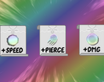
- The icons for 2 of the power-ups are very similar (both just circles) so it makes it hard to tell which you're leveling up at first.
- Difficulty needs a little balancing. Once I got to Wave 3 I no longer had to move because I had leveled up that nothing could touch me.
- I would love to see more variety in power-ups, which would also allow you to bring in even more of the color spectrum.
Overall, it's a fun survivor-like game with a interesting concept that I would love to see explored further!
All the visual and sound elements you manged to get into this are incredible! The Rainbow effects around the AI at the end are stunning! Really polished feel to the game overall. I think the upgrades could use some balancing since there were large portions of the waves I could just stay in one spot and kill most of the enemies. Nice work!
Thank you for playing!
The rainbow effects is frame by frame animation using some weird paint.NET effect, I forgot what it was but it was like a full screen animation (not the most efficient thing to do for sure!)
I'm aware of the balancing issue, but thank you for the feedback nonetheless! :D
The visual effect... I love them *-* I love the concept of colours, rainbows and light. This enemy ‘WHITE’ is also really cool. The music is chilling, but the gameplay is a bit too monotonous for me. It's more of a relaxing game, although it can be stressful due to the amount of enemies. I also find it a bit strange that the beginning of a round is difficult and then gets easier and easier. There could be more power ups. It would also be cool if you could see your stats somewhere.
When I try you run it in the App
Hey Mew! Thanks for playing! I'm glad you liked the whole concept I went for :D!
I do agree the gameplay is pretty monotonous but that's how I feel about that type of game in general (although my version probably was even more monotonous because it lacked good balancing lol!)
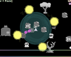
Yeah so the way the waves are spawned is that the code picks a random enemy from a predetermined array, turns our if you're not careful it will deplete all the strong enemies first so there is definitely quite a bit of fine tuning to be done there!
I did think of making a thingy that would show the stats but that was way out of my time limit, I started two days late and published this game on family trip soooo not the most productive environement lol!
I'm not sure I understand what the screenshot is for though..
There is also an app for Itch with which you can play the games. This is particularly useful for games that you would have to download as an exe. And when I try to play your game using it, I get this error message. I don't have this problem with most games.
I'm really jealous of your visual effects tbh >-<
I love the Aesthetics of the game! Really does bring me back to early internet, and the music and character sprites are adorable as well! I was also surprised to see an opening and ending cutscene, you don't usually see that in game jams.
I think the only nitpick I have is that the middle parts might be a little bit too long, but that's easily fixed.
Love the story, the message, and I'm always down for survival games. Good submission!!
Hey thank you for playing!
This is amazing praise haha, I'm not a great artist by any means so this means alot, I did within the limitations of what I know to do, turns out it gives that aesthetic! I'm also glad to see someone enjoyed the cutscenes, they took quite a bit of time to craft (especially the end cutscene) That's... time that I could have used for balancing the difficulty.. but oh well! ^^"
Glad you liked the message, thank you for your feedback!
Really nice work for the time limits we had! I love me some survivors-like games :)
Thanks for playing! :)
An extremely fun game with solid graphics, controls and core mechanics! The arrow indicator for enemy targets is something I haven't seen in a Vampire-Survivors style game yet but is such a great idea!!
If I had one critique it'd be the spinning circle effects were maybe a bit too hypnotizing and made me a bit motion sick, but excellent game and super fun!
Wow that's quite the feedback, thank you! The spinning circle is pretty distracting I'll give you that haha!
Thank you for playing! :)
Didn't quite finish the game, but found the gameplay quite fun for a while! The upgrade menu and the start were really pretty, and I liked how the dialogue was set up. Would have appreciated a little more clarity on the bar being our health bar, and maybe some indicator of how much was left of the wave.
Wave one and two felt very long, especially as you can't even kill the scorpions very easily to start with and I didn't know how to get upgrades until they started surprising me every few seconds when kills became more frequent. At some point they felt a little disruptive because of that, and I wonder if having upgrades around the map would have encouraged more staying-on-my-toes and repositioning to try and grab them.
Once I had a good number of updates the combat felt quite easy, and then the waves just dragged on a long time.
Visual style overall is nice and the audio was good! Can definitely see some expansion potential after the Jam.
Thank you for playing the game! Balancing the game was definitely an issue, and accessibility was not top notch, I could have better indicated the health bar for sure, it started as placeholder because I had different plans for it in the future, but then I just kinda forgot about it ^^"
I do agree the upgrades feel disruptive but only really at the start I feel like, but you're right the game does take a good 20+ mins to finish, had I more time I would have wanted it to be around 10 mins!
Thanks for the feedback, I'll maybe try and expand the game post-jam!
Really interesting concept, well executed and fun to play. The graphics were super cool and I liked the sound too - well done!
Thank you for playing! Glad you had fun!
Nice submission!
Really liked the graphical special effects, assume a lot of them are shaders. The music and sound worked nicely and fit with the feel of the game. The story and gameplay was nice, although a little too easy - never died, a difficulty setting would have been nice. As some others have mentioned the ending of the waves drags out a little with the scorpions and probably could have been shortened.
A boss fight would have been fun at the end, although understand time constraints...
Thanks for submitting - it was fun!
Yep, alot of it was shaders, the enemy dying is using pixel sorting shader, the rainbow and speed line shaders are layered in the upgrade screen and more... It was mostly open source code, I hace very little experience with them, I hope to understand them better in the future though!
But yeah the balancing did need some more work and I would have loooved a boss fight against the AI: I mean I have all its sprites and animations readily available!
Thank you for playing and for your feedback!
I really like the atmosphere of this game! I thought that intro cutscene was awesome, and the art is super cool. So much can be done with this awesome world and concept in the future, great work there! I liked the game but towards the end it just turned into hold spacebar and stand still simulator, and the waves started to become a bit of a slog to get through. Also, I didn't really seem how the theme was implemented at all, but that might just be on me for being a bit oblivious to these things sometimes. But, putting those aside, I found the upgrade card screen was very cool, and I loved the detail of each ability being a different colour. The sound design was also great. Awesome work!
Thank you for playing! I am happy to see you enjoyed the art and the general atmosphere! I do agree that there's very little player input towards the end, but if you've played that style of game it's pretty common to get overpowered and just go for best scoring really, but I could have done something better for sure!
The theme is not within the gameplay itself but moreso in the story: White relies on its singularity and its simplicity to overpower the player, when in reality, white light is the amalgamation of all the colors in the visible spectrum
TL;DR: The White AI ends up corrupting itself, showing that its very power and existence was itself based on the very colors it was trying to fight off. It's death is the unintended consequence it brought upon itself!
It was a pleasure to experience haha. Also I've played a lot of vampire survivors, so I completely get why towards the end of the game it loses the initial difficulty. I kind of picked up some things about the theme from the AI, and in all fairness I feel like with this theme it's kind of hard to implement it in the gameplay, so it's very understandable how it carries through in the story. And yeah, I feel like the art and atmosphere within this game are awesome, I can tell you put a good amount of work into them, and it really turned out well.
Haha thanks I'm really glad those sleepless nights didn't serve no purpose ^^" This has to be the solo project I'm the most proud of so far!
I do think the theme was possible to implement, most game did it in the scenario, some in gameplay but it either ended up being a bit kinda annoying at times (like the game works against you but hey rage games are a thing!) There is also Blasteroids which has a very clever implementation of it in gameplay, but unfortunately it does make for a short experience! Heck, we gotta keep playing and digging up gems in this gamejam! :D
good polished game. I liked the control and the story.
I liked the sounds and the music was ok, i would have prefered a more "pumping" soundtrack.
I liked the animation for level up, and the idea that the xp bar is colorfull inside the sorcerer.
I had a few times an imba build, such a big "force field" and "energie balls^^" that the enemys could not even come close. I think the Pink attack is a little bit to weak, so i put everything in the other upgrades
So the game played itself for 1-2 minutes in level 2 and level 4.
I would strongly suggest, that you add enemies which shoot back at the player, to improve the gameplay.
Also at the "end" of each Wave/Level there only come those small scorpions for ~30s, which is probably a bug? because they are so easy to kill.
Maybe add a bossfight? or some Random stronger enemies?
very well done!
Thanks for playing and commenting!
Whilst I usually like to work more on music, I really did want to focus more on polishing and coding on this project so I definitely didn't spend as much time on the music as I would normally have!
Yeah the pink attack is definitely a bit weaker, but at max level it's very broken with the multishot stat! It doesn't look very good from the get go though, I do have to admit that haha
I actually thought of making enemies shoot at you but didn't find the time to do it!
Same for the boss fight actually, I initially wanted to fight the AI boss at the end but lacked the time! I prefered a less ambitious but more polished project!
The end of the waves being just scorpions is not a bug but a lack of balancing on my end. The enemy waves are predetermined but they are chosen at random from an array: turns out probabilities don't care about difficulty curves x)
Other than that I think I spent too much time on polishing and too little on balancing, I only was able to playtest like 3-4 times the entire run!
Thank you for the thorough feedback!!
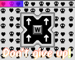
The spritework was very charming, especially on the AI, it looked great. The AWD buttons for selecting upgrades was elegant, and having the character sprite be the XP bar was a nice touch. Great game!
Hey, thanks for playing! I'm really glad you liked the polished UI, and pixel art and graphics not being my main thing at all, I'm really happy to hear good feedback on that!
The art and story are incredible! Very immersive and beautiful. I'm seeing other people saying this already, but I found the difficulty a bit low, and I think of myself as fairly bad at this type of game. Still, it meant that I could beat the game and see all the neat enemy designs, so I'm not totally mad about it xD
Great work!!!
Thank you for playing! I really struggled with the difficulty curve but I did prefer making it easier so that people could see the end of the game, the story being as important as the rest for me, especially in this game!
I also think it's really hard to tell a story in this style of game since they're normally endless scaling and enemy spawning, so it would have been easier to scale if it wasn't trying to tell a story (or the story should have been told more discretely!)
Anyways thanks for commenting and the kind words! :D
Makes lots of sense. I specifically felt that the ends of waves got too relaxed, with only the scorpions spawning and I could just stand still and passively kill them. Oh, I also meant to add, I like how you made the attacks cyan, magenta, and yellow. Nice touch!
It was either that or RGB, but I love CYMK too much, and they are opposite to white so that was the best color choice I could do(I think!)
I think it's perfect since it's white light
Wait I have it backwards. Well it looks pretty though
I don't know color theory that well you might righter about this
Love the concept, and you did a great job with the art + sounds bringing it to life! It's very polished and it works very well, well done!
I agree with the previous commenter about the difficulty; I think that to remedy this, waves could be made shorter, so that they end before they become too easy.
All in all though, very fun and enjoyable to look at!
Thank you for playing!
I did try to make the waves shorter but I found that the start of the game would become way too difficult as a result! Currently the waves scale by deducting a bit more time each wave, but yeah I agree wave 3 and above definitely needed to be faster!
Fun game! I love the art, and the visual indicator on the character sprite for showing how much XP player has in current level is clever and works well. As for feedback, I think the game could do with being a bit harder. At some point I could just stand still and everything would die before touching me most of the time. I also found that
waves start of hard and then get easier. E.g at wave 4, the new monster for that wave, the one with a bunch of eyes, only comes at beginning of wave. Then there's only the easier monsters left, so it's like each level has a descending difficulty curve while the player gains power, resulting in trivial difficulty. Another thing is that the rotating balls and the aura spells look very similar in the upgrade screen, so I ended up choosing the wrong one a bunch of times.
I also love that the AI dominating the world is a .tscn file
All in all very nice work!!
Hey there Elgene!
I'm aware of the difficulty being not super balanced, with the limited I had I preferred an easier game rather than one that couldn't be finished since I wanted everyone to be able to access the ending! I do agree that the type of enemies that spawned definitely needs some extra work, I just had a .pick_random() on the enemy array, but I should have found a way to sprinkle the tougher enemies across the wave, perhaps for an update!
I'm aware that the orbiting weapon is very similar to the aura, definitely should choose more differentiated shapes next!
Anyways, thank you for playing! :D