Play game
My Shadows Are Bright's itch.io pageResults
| Criteria | Rank | Score* | Raw Score |
| Top Marks | #1 | n/a | n/a |
| Creativity | #15 | 4.592 | 4.592 |
| Overall | #37 | 4.354 | 4.354 |
| Enjoyment | #63 | 4.224 | 4.224 |
| Style | #370 | 4.245 | 4.245 |
Ranked from 49 ratings. Score is adjusted from raw score by the median number of ratings per game in the jam.
How does your game fit the theme?
shadows change size depending on distance to light source
Development Time
96 hours
(Optional) Please credit all assets you've used
All art by GGroys
"Gymnopedie No. 1", "Porch Swing Days — faster", "Gonna Start v2" by Kevin MacLeod - https://incompetech.com/
Paper, floor, carpet - https://opengameart.org/
Toy cube, robot toy, toy train, trophy, glasses, toolbox, bags, truck - https://poly.pizza/
Lunch box - https://sketchfab.com/
Yipee, whoosh, yay, applause, lava sounds - https://freesound.org/
Links to individual assets in description
Leave a comment
Log in with itch.io to leave a comment.


Comments
Short and sweet, fits the theme perfectly, good job!
Thank you for playing! I'm glad you liked the game!
Nice style and gameplay! Thou hast created thy splendid experience within my box! (So-called "computer")
Thanks for playing and for fancy comment!
I adore this
Thanks!
wow what a great job you guys did! I think it's my favorite game from this jam, great idea, great graphics, great everything!
Thank you! I'm glad you enjoyed the game!
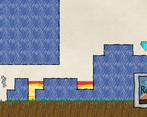
Very cute hand-drawing art style. Spend a few minutes on the last level, Great level design. Clever use of the shadow and the conversion between dream and reality. Well done.
Thanks a lot! I'm actually proud of myself for designing the last level, because this game happened to be a nightmare to level design for (3D world, 2D world and skewed connections between). I personally consider this level the first "real puzzle" after introduction of mechanics. I'm happy to read the feedback and see that my ideas actually worked. Sad we didn't have time for more levels. Thank you for playing!
Love the artstyle and the use of the concept! Only thing that had me think was in level 2 you had to change the player to finish the level, but you also added those trains wich I couldnt move. I get that this is for level design but it wasnt super clear wich toys I could and couldnt change, maybe just a white outline on hover wouldve helped?
Its an amazing game tho and the art, music all fit the theme and imagination of a child! you made something amazing!
Thank your for the comment! To be honest, train is a leftover from prototyping, and shouldn't be there in the first place. We was going for background decorations anyways so it's totally fine, however as the only decoration it probably stands out too much. In any case, it's super helpful to know what players pay attention to. I'll try my best to use every piece of feedback to improve my future work. Thanks for your appreciation of the style, and thanks for playing!
Love the visual style, sound design, and the very creative gameplay manipulating the scale of shadows to alter the platforming levels in the dream-world! Amazing work! Hoping to see this idea further expanded on
Thanks a lot! I'm happy to see people enjoying our game!
Super creative and I love the style. The gameplay ended up being very trial-and-error for me, because I couldn't tell where the goal was until i switched to dreamworld. But this idea has a lot of juice to it. Really really clever.
Thank you for playing! I agree, it's lacking some visual cues, we definitely should've highlighted essential objects on some way. I'm glad you liked the style, GGroys really put his soul into these drawings. Thanks for the comment!
Very good concept, very well executed, and the hand drawn visual style is really fitting! I would have loved more levels :D
Thank you for playing, and thank you for the feedback!
This is actually really clever ! I was stuck on first one until i discovered we can rescale them when we move to the light ! Such a creative gameplay ! Love the game :)
Thank you! It's all about scale so yeah, scaling is a core component in the game. We also tried not to guide the player in a restricted way, and let them explore mechanics themselves. I hope we achieved our goal. I'm glad you liked the game!
Super Unique Game! Bit tricky for me but the art style was fantastic! I would like more levels if possible and maybe a slower difficulty increase, but besides that a fantastic short game that I really enjoyed.
Thanks for playing and thanks for the comment! I will surely take your considerations into account to improve in the future. I'm really happy that you enjoyed the game!
I liked the hanpainted style and the game mechanic that there are 2 worlds, the 3rd lvl was kinda hard
Thanks for playing! I hope you still enjoyed the game despite some difficulty
I like the implementation of the game ! I already played a game called "In my shadow " which had the similiar concept !
Thanks for telling me about this game, neither me nor teammate have never heard about it before. It's incredible how similar it is to our game, especially considering how different our original idea was and how many turns it took through the development. Crazy coincidence! I think I have a lot to learn from this game. Thanks!
Review Dm'd
Review accepted
I tried to msg over discord. Congrats on 1st place!!!!! You very much deserved it! Like I said in my review, incredibly creative.
Really fun concept (my team's game has a similar idea - a "child" view and an "adult" view affecting each other), I love the art style and mood of the game, and the controls work really well. The idea of using a torch and shadows to scale the toys when building the level adds that extra depth to make it really fun to play with. I'd love to see more levels!
Thanks a lot! I will definitely check out your game and leave a review!
so fun
Thanks
Such a fun game! really good concept!
Thanks for playing!
Very nice and fun! i remember seeing this in progress pics and was hoping it would be published ontime. Although there is a little bug where the player sometimes randomly gets stuck on a corner of a platform (a platform i hadnt even moved) but apart form that everything was great! i love the visuals
Thanks! I'm glad you enjoyed the game!
You seem to be the first person to encounter that bug. I know ppl sometimes get stuck on a narrow gap between blocks, but not on a corner. I'd appreciate if you provide explanation or pics of this bug, thanks.
Amazingly enticing tone, style and mechanic. Really special!
Thank you for playing!
This is a really creative idea for a game, and very well executed! One of my favorite interpretations on the theme so far. I love the switch between the more realistic 3D and sketchy 2D worlds, it works together really well. Overall the style is fantastic! This idea has so much potential to become a full-length game, with room to expand upon the current mechanics of the game. It's also great when a game can explain itself without the need for a real tutorial, there was only one point when I felt confused and couldn't figure out why I couldn't move into the "dream" world (I think my character was overlapping with another block). Overall fantastic game, great job!
Thanks for playing and thanks for the comment. Shoutout to GGroys who directed the visual style of the game and single-handedly implemented it, it wouldn't be the same without his part.
We put a lot of game design thoughts into the game, I'm glad to see it works. And yes, you're not supposed to spawn inside of blocks - that part (and many others) lacks some visual cues. Thanks again, I'm glad you enjoyed it!