Play game
Rent-Seek-Kill's itch.io pageResults
| Criteria | Rank | Score* | Raw Score |
| Graphics | #1 | 4.806 | 4.806 |
| Audio | #1 | 4.355 | 4.355 |
| Overall | #2 | 3.848 | 3.848 |
| Accessibilty | #6 | 3.548 | 3.548 |
| Originality | #22 | 3.742 | 3.742 |
| Controls | #24 | 3.419 | 3.419 |
| Fun | #26 | 3.452 | 3.452 |
| Theme | #41 | 3.613 | 3.613 |
Ranked from 31 ratings. Score is adjusted from raw score by the median number of ratings per game in the jam.
Godot Version
4.2.1
Wildcards Used
Gridlock, Roshambo
Game Description
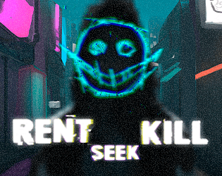
Turn-based Tactics Game where you play as Hacker against evil companies!
How does your game tie into the theme?
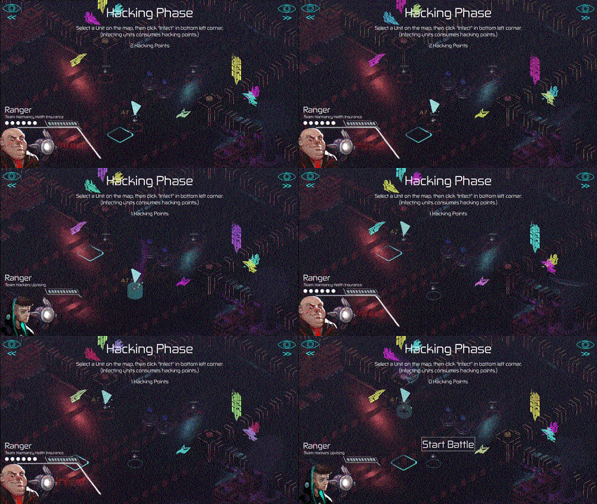
You infect (hack) enemy robots to let them fight against each other.
Source(s)
N/A
Discord Username(s)
maaack, plexsoup, kyveri, xandruher, spilth, l.a.marchetti
Participation Level (GWJ Only)
10+
Leave a comment
Log in with itch.io to leave a comment.


Comments
Amazing game considering the timeframe! Definitely nailed the mood bringing together the gameplay, audio, art and narrative inserts. My only complaint is that I didn't know what the unit attacks did until I figured them out via trial and error. Nice one!
Simply outstanding.
However, having worked with some of you before, I am not in the slightest bit surprised.
A fantastic twist on the them. It has a Transistor vibe to it which I loved, with transistor being one of my favourite games of all time. The game play is intuative and easy to grasp. A personal hightlight is the game world. It really conveys the modern setting you guys are going for.
The only point I can criticise, is the pause menu using the default Godot theme. Next time you guys team up, drop me a DM on discord and I will be more than happy to do the UI ;)
Great audio and graphics! The environmental design was really solid as well, it definitely felt like a cohesive world. There were a lot of solid layers here.
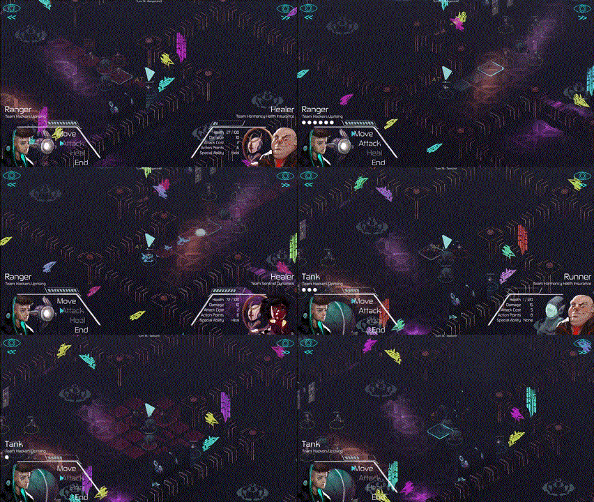
The combat was solid but not without its oddities. It was unclear to me whether the red squares were all hit by a given attack or all options for who I could hit. It kind of seemed like different units worked differently in that regard despite the fact that I didn’t notice anything denoting that. Some of the attack animations were also confusing, they didn’t always seem to be coming from the right place, which probably didn’t help with the confusion of where my hits were landing.
Regardless, those are pretty minor relative to the overall amount of polish on this entry. Very nicely done!
Nice graphics! Good job :) Amazing what one can achieve in such a short span of time.
Also been following Kyveri's art WIP on GWJ discord, I was really hyped about this game. The hype didn't disappoint, this is a really polished and fun game, the art, the music, and the UX everything is top notch. What amaze me more is that this is product made with a team of 6 in a two weekends jam, this shows that the team was really organized, had great management and communication. Amazing entry, great job to everyone in the Team!
Note: I think the animation is reversed? When I attacked the enemy, the animation was played on my unit, not a game breaking bug, it just confused me a little.
Super-polished entry which gave me a lot of fun! I'm amazed by how you managed to have six different people working on this, and still the final product seems so coherent and well-directed! All the artistic aspects were spot-on: from visual effects to environment art, from music to voice acting, from character design to UI graphics, everything contributes to create a strong mood, which I totally loved. You did an amazing job as a team, congrats!
Speaking of mechanics, the simple idea of choosing which units to control, knowing that the others will become your enemies, is fantastic. I've never seen it implemented in a turn-based combat system, and it has so much potential that I'm kinda sad you only had nine days to explore it :P
I'm looking forward to your next release ^^
The art, VFX and sound were all astounding. I liked the core mechanics. I would've liked if the turn ended if I had no more available actions, but overall the gameplay was really good.
Great work :)
This was really fun to play! I like the lil robot designs, the tank is my favorite <3
Love the aesthetic. Impressive to get a 3D tactics game working in the scope of a game jam. Nice work!
This is a hugely polished entry with a big scope and terrifying voiceovers. I think the level of art direction, audio and engineering was incredible, and for me just needs a little tweaking to make the gameplay more intuitive and fun. I would suggest a very simple initial battle with 1 v 1 and odds on your side to ease the player in, then built out to more complex battles.
Incredible achievement all round tho
yeah true UX had been in our focus yet still lots room to improve there. I think the first level with 3 robots is exactly that you cannot lose too since you have more power. we had the struggle with 1on1 if the enemy bot has the first shoot you gonna lose for sure and avoided it.
Thanks for playing and your nice comment! Glad you liked it.
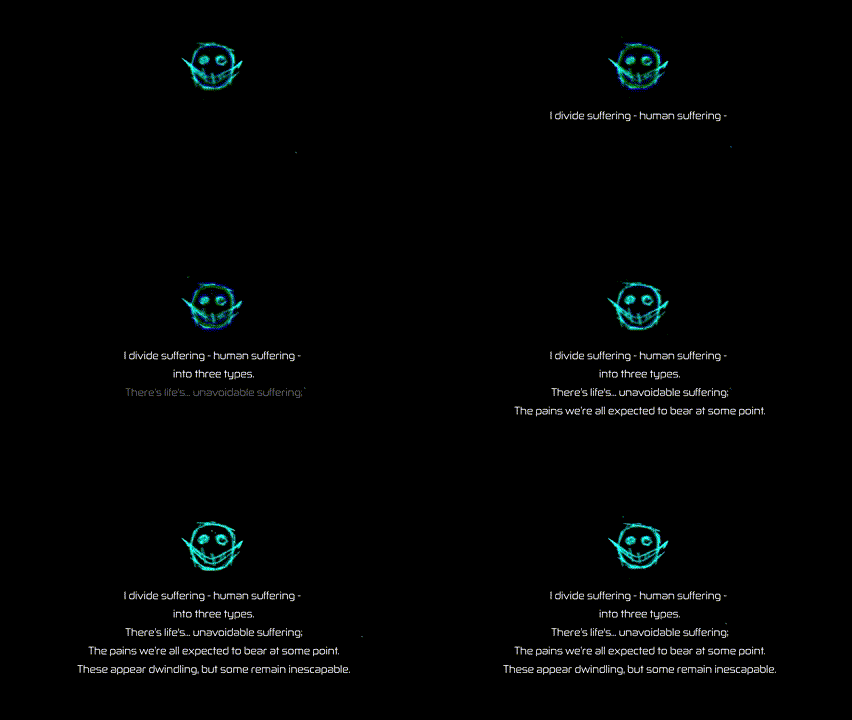
This is hands-down the submission I was most hyped for (been following Kyveri's art posts on GWJ discord). But even those could not have prepared me for the quality and polish of the final product. This is my first game jam ever, and I think this really sets in perspective the upper limit of what is possible within the constraints of a game jam. I have paid for games that look less polished than this! 9 Days!! The fact that this was done in a team is even more impressive because of the unity in direction for art, music, gameplay, writing, atmosphere etc. I'm just going to list a few things that blew my mind, else it would take the entire page.
So much win.
Thanks for the kind words and following the stuff I was posting
Thanks for playing the game and sharing your thoughts! This was really nice to read.
The main menu is from a template I've released to the public. Feel free to use it in your own future projects.
https://github.com/Maaack/Godot-Game-Template
The game looks incredible, the soundtrack is top notch too. Good job.
Thank you so much!
You can download the soundtrack from here if you’d like: https://polymonic.bandcamp.com/album/rent-seek-kill
Art and atmosphere are simply stunning, well done! But it feels like the post processing was a bit much, like the colors were washed out? Hard to describe. Gameplay was fun, I especially like the tactical decision of which robots to take over. If you keep working on it, I'd focus on interface stuff, i.e. how much AP a move/attack/ability costs, what the turn order is, etc. Was hard to keep track of all that sometimes.
Still, probably my favourite entry so far.
very interesting take on the theme. great visuals and story
This was an excellent entry. I’m not a fan of this kind of game, but still had a lot of fun with this one!
The only thing I really felt was missing was an obvious way to use the keyboard for the various actions.
Tank Bots are way OP, tank bots for life!
Well done!
Thanks for playing! The keyboard keys 1, 2, 3, and N will serve to effect various actions and end turns.
We tried to communicate that via tooltips on the action buttons, and on the pause menu (esc), but I agree it should have been more obvious.
[1] = move
[2] = attack
[3] = ability
[N] = end turn
I must have just been blind then!
That was pretty sick! Amazing what you were able to do in the timeframe!
Very unique spin on the theme and I always love a good cyberpunk game. The character art was great too. I had trouble figuring out the exact dynamic of what units were good against which and that probably led to me having a hard time than I would have otherwise. I think a little more of a tutorial to explain the different unit types and their strengths/weaknesses would be good. A way to undo actions would be nice as well since I didn't see any warning how much ram I would lose when moving to a space/whether it would prevent me from attacking. That said, quite a lot here and fantastic presentation for such a short time.
Those are all great points. Thanks!
UX is hard!
Really unique take on the theme, I really liked the idea of picking which units to infect from the battlefield. Also yeah the graphics are INCREDIBLY polished for a game jam, nice one!
Wow this looks insane for a game jam game. Very impressive. I struggled with what I should be doing exactly in the gameplay, it was a little hard to follow for me but wow to the visuals.
I feel a bit lost in the game. A tutorial or instructions whats going on might help me.
Really like the graphics and audio.
Colors seems a bit washed out though: image.png
Thanks for trying the game, There is a in-game tutorial for the first level but maybe we need some more love on it.