Play game
Cursed Castle's itch.io pageResults
| Criteria | Rank | Score* | Raw Score |
| Metroidvania | #16 | 3.581 | 3.581 |
| Enjoyment | #19 | 3.129 | 3.129 |
| Overall | #27 | 3.145 | 3.145 |
| Presentation | #29 | 3.161 | 3.161 |
| Design | #34 | 2.710 | 2.710 |
Ranked from 31 ratings. Score is adjusted from raw score by the median number of ratings per game in the jam.
Engine
Godot
Team/Developer
Solo Dev
External assets
Genny VST for LMMS, Kenia Font from Google Fonts
Leave a comment
Log in with itch.io to leave a comment.


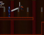
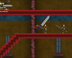
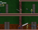
Comments
I really appreciate the completeness of what you were able to accomplish during this jam! The sprites look pretty darn good as well. Maybe a bit more fluidity and reaction for attacking, moving, getting hit, etc. Oh, and I wish you could walk up the stair looking blocks.
Really cool, keep it up!
Thanks :)
Like i told your teammate i packed in as much as i could , and most of the absent elements are due to a mix of lack of time / knowlege on my part so hopefully i'll keep improving as time goes on along my journey.
Specifically on staris, i made the collisions classic box shapes and didn't try to change them in fear of breaking the game completely as i'm not sure if this would have made some jumps more difficult, but i should have tried a capsule shape instead just so that the stairs would be less annoying to climb up, or not have any like these in my level design.
Nice solid entry! You did a great job adding lots of content and things to do. The weapons all feel different and provided a cool spice to gameplay and the checkpoints were a fantastic addition. Will be cool to see where you take this one.
I would polish the stuff that happens on hit to both the player and enemies, as well as making the enemy attacks more varied, or add more types.
Good job!
Thanks i'm glad you liked it !
I packed as much content as i could make within the allowed timeframe, wasn't sure i could pull off a proper save system for all the upgrades and such for a jam game so i decided on the current checkpoint system instead so that progress is kept and you restart in the last room you reached, i felt this was an ok compromise of it not being too punishing for death.
Yeah enemies need some work, though they do have some variation on their attacks for the skeletons, i would have done the same to others with better planning on mypart and more time, cause as it is, the large guards have all ready to have variation i just couldn't work on more animations to add, and wizards have their palette swaps all in but no code for alternatives in so they remain unseen for the same reasons :/
Thanks again for giving my entry a spin ^^
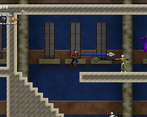
This had a real retro charm to it. It was kind of goofy in a way that I liked, like the spinning sword animations. I particularly liked the spear attack animation though, that looked really slick. The background art stood out as nice, with the light coming in through the windows as a real standout for me. I also thought the variety of enemies was pretty good (ugh those wizards...). The song really fit the environment and tone, but oh god it's stuck in my head now...
Now to some suggestions for future improvements.
- The combat was implemented well, but it gets pretty repetitive. The amount of weapons offsets this, but it ultimately boils down to walk-in, strike, walk away (or wait for the enemy to turn around and then just murder them). It needs some sort of decision point if it's going to be such a big focus of the game, like a block or dodge roll sort of thing. The wizards were fun at first (find a way to get under them to abuse their AI) but were annoying if you met them in a narrow corridor because you were basically guaranteed to take a hit.
- I think the map screens were slightly too large, especially in the beginning. There are a LOT of enemies to kill which paired with the combat not getting any deeper made the large spaces get repetitive fairly quickly. I also explored the Western Catacombs first up until the Guard Quarters where you need the High Jump, which meant I had to go through the Western Catacombs a total of three times with the enemies respawning each time. While it definitely ensured that I remembered where I needed the High Jump once I found it, it wasn't the greatest experience.
- I really liked the two large empty rooms leading downwards towards the Holding Cells. I wish they had been leading up towards the final showdown though, I felt kind of let down when I went through these two giant rooms building up anticipation and then just found a room full of more normal monsters. Still a cool gameplay moment though.
- Some form of healing would be a really, really good addition (outside of finding the healing power-ups).
Honestly though, this was an enjoyable entry. I was sort of annoyed by the western catacombs thing at the beginning, but as I kept playing I felt myself compelled to go further and find new weapons and see where the game would take me. There were a few moments where you teased power-ups or had them on screen just long enough where I could sort of mentally map my way to them and that was good as well. Thanks a lot for the entry, I had a good time. Great job!
Thanks for trying my game out and your very in depth review :D
Yeah the goofy animation is more of a case that i tried to have my own take on a multi weapon system where the player had the same animation. mostly inspired from some Castlevania games on GBA where if i remember right, they seemed to have something like this where some weapons where just literally the weapon sprite poping in rotating and then be gone.
I generally like when small details show up in games so i tried to have some here too, thus the window light XD
Ah the wizards, couldn't balance them properly, and i see they have definitively become the most hated enemies next to the knife skeletons, sorry about that :( hopefully i'll get some balance right on a jam release someday :p
Apologies for the music as it's not my best work, especially since i goofed up and forgot to mention the mute button on the game page and haven't edited it yet cause i'm not sure if page changes are permitted by rules or not while judging is still in progress ^^' but yeah you could mute the music with M or Select on a controller this whole time.
Yeah my ai skills are still pretty weak, especially since i don't really know yet how i could make some that would be a bit more reactive to the player's actions and not just the environement, but then again still learning so i'll get there eventually. And i feel this is most of what makes the combat bland here, although i'll take good note on your sugestion of some way to dodge/roll, cause this could spice things up a bit as well.
Level design i tried my hand at backtrackable maps for the first time here, although i did wanted to have this aspect not be a pain, but failed. I think i should have probably put a stopping point for the high jump way earlier than the guard quarters to have a bit less of a long trek back to the upgrade :/
The later levels i think are mostly bad as i was close to the deadline when making them and didn't feel all that inspired as what i could do with them especially since players would reach these spots with all upgrades.
Healing was planned, but couldn't implement it in time as i lost a lot of time fixing issues with bugs and i had to publish early to not miss the deadline due to scheduling stuff.
Not the greatest level designer that i can't argue at all XD Glad you liked the teaser of powerups and weapons as that's something i've been trying to have almost everytime there are important items in games i made cause i know that that's the best way to guide players towards "cool stuff" they might get curious on how to get.
Happy you seemed to have fun despite all the issue present, cheers :)
This was a nice game. I really like the style of the characters they look pixelated 3d and with the music even if a bit repetitive i get a sega genesis vibe. The combat is a little bit hard it feels like you cant really dodge the hits when aproaching enemies from the front and some areas lead to dead ends which can feels like a waste of time but overall a fun game :)
Thanks :)
glad you like the artstyle, the characters are indeed built from 3D but i manually tweaked them in 2D afterwards, it's been my go to method to help have consistent sprites and saving time on animation not having to redraw all poses by hand.
Music is not my best that's for sure but hopefully the genesis sound sorta made it less wonky XD though all the credit for the vibe goes to the Vst i used wich has some amazing instrument presets from most of the console's favorites ^^
yeah combat isn't the best as i still don't know how to make some more reactive enemies yet, this jam i iterated on some stuff i knew and added some experimentation in terms of attack variety and trying to see if i could get a good system that synched up ok to the anims without breaking, so hopefully despite the fact that it's not that all engaging, i managed to get these aspect somewhat ok :p
Lastly some dead ends were supposed to have stuff in them, but i didn't really know how to balance it all and didn't have all that much time for proper level design so i let it as it is for now, an example of this = while you can only have 3 available Hp upgrades for 250 hp max in the game, there are actually 8 that i made but assumed people would think the game would be too easywith so much hp so i left those out.
Anyway, happy you've enjoyed the game ^^
Really nice entry... I really liked the different areas of the castle, it felt like the different backgrounds and tile sets gave it a lot and made each area feel unique.... I like the different weapons, but sometimes found my self wishing I could switch between them (ie I know I want a quick sword for this enemy, and a heavy powerful sword for this one).
I hate those wizards (but only because they kept killing me, I loved their sprite work), but I kept coming back, which is a sign the game is addictive enough!
Thanks glad that you liked it ^^
I tried to have as much variety as i could, although i had no choice but to reuse quite a few things in the end XD
Yeah switching and letting players use the weapon they want for each situation would be an improvement i can't argue with that, the wizards are some of the most unbalanced enemies in the game next to the knife throwers so i totally understand the hate :p
Nice job! It might be a bit clunky and I just kinda jumped over most of the early enemies, but you've got a lot here and I still enjoyed my time with it. Keep it up!
Thanks :)
yeah while i kinda got the platformer part down from various jams now, i still gotta work on making interesting enemy AI to have them be more engaging, hopefully i'll get there eventually :p
I am amazed by the rich content of your game, there are so many areas to explore and weapons to use. It's a very classic and good Metroidvania sample, maybe the best sample in this jam. If the enemies can turn around after being hit by the player, the combat experience will be better. But after all, very impressive game! :D
The double jump is really funny because at the end of the game I can almost fly lolll.
Thanks dude ^^
Glad you like the content i managed to cram in as i tried to make as much as i could, and i'm humbled that you think my game's a strong example of classic metroidvania formula ^_^
However i know i should have put more / more variety, cause people rightfully pointed out some areas are indeed a bit empty :/
Yeah enemy reaction is something i still haven't figured out how to do from my current knowlege yet and i totally get combat would be way better if they did actually could fightback when hit not just when they "saw" the player.
And yeah the jump is a bit floaty still haha, hopefully as i learn along jams i'll manage to make a better platformer controller, at least i think this one comes a long way compared to my first XD
I liked the background and pixel art a lot
Thanks for playing :) glad you like the art !
It took a lot of effort but i always try my best and it's always the best reward to see when people like it ^^
Very classic Igavania style! I played through the whole thing. The thing that kept me going the most was finding new weapons. That said, it would have been nice to switch between them, rather than it having to be a full replacement. I kind of missed the spear after getting the next one. Maybe they could swap on the shoulder buttons or something similar feeling on keyboard.
I like the sound design, and the music (I even downloaded Genny VST to play around with myself).
The combat encounters I think could use the most work.
Skeleton of Infinity Knifes are rude and i do not like them much. But I realized they were pretty easy to tank. The wizards are just those, but this time they float and can shoot in more than one direction. I think there may be some ways to explore more memorable encounters beyond just, there are more things to fight now. In general, add an attack pattern to any enemy that can keep firing. Even if it's slightly randomized. Having a few attacks to dodge, then a change to get a hit in would be a big improvement. Could have a random roll for like 1 - 3 attacks, iterate a counter, then start an attack delay timer for a couple seconds.
The weapons, while nice to have a variety, did not feel super impactful when the health of the enemies scaled as well. I was taking out the large soldier type enemies in two hits with the spear, got the next weapon, and found the same enemy type was taking 3 hits.
I noticed there was slowdown when loading any of the rooms with lots of enemies, and the transition from one room to the next was near instant. Perhaps adding a short buffer with some fade in would be helpful to hide this.
I was a bit confused at first by the stairs and slopes (I know, especially ironic after what I did in my game...) There were some sections that I could go down like they were slopes, but not up. But the height of each block made it seem like stairs.
I hope I have not piled on too many negatives, really its a group of small nitpicks. I think overall the game has a great unified feel to it, and lots of potential to grow into a great "love letter" of sorts to the Igarashi era castlevanias! If there was more content I absolutely would have kept playing way longer than I did, as I was definitely hooked on finding out what would come next! Great job overall!
OH, really weird bug I forgot to mention, but you should know about. I thought there might be a menu to switch weapons at first, so was pressing all the buttons on my ps4 controller. I noticed that for some reason the share button would restart the music and sometimes stop it, with it starting again on the next press. Not sure why that's happening, but thought you should know.
And about that glitch, the restart of the music is one i couldn't figure out, but the start/stop is a feature i forgot to mention on the game page and didn't add yet cause i don't know if changes to the page are allowed during judging period.
In short, since i realised that the music i made for this jam wasn't really all that greatand that this was also just this one track, i made a mute button with "M" and "select" on controller
so that people could turn it off if the loop got annoying after a while, so it's officially M to mute but probably more like M for mercy on people's ears XD
ahh, that explains it. Nice feature to have. But the music was good overall!
Haha yeah i tried my best at having it close to an igavania but obviously can't reach that level :p
If i didn't lose as much time on trying to get the persistent items and such working (cause it was a first for me during this jam) i probably would have had more weapon variety with more distinct mechanics between different types, and since i havan't made any inventory of any kind yet, i'm not sure if i could have acheived one in a jam context even though this would be the ideal system for this type of game, but i did consider at least a weapon swap to let players choose, but couldn't get to it cause of the previously mentioned lost time :(
Awesome to know, can't wait to hear what you'd make with it ^^ cause honestly my track for this jam doesn't do justice at all to all the awesome instruments it comes with like to site a few : the full sonic 3 instruments (including the voicesamples), shinobi instruments, Thunderforce guitars and all, and the Matt Furniss Terminator instruments. So in short awesome stuff :o
Combat is definitively not great, that i can't argue
haha and of course there are so far everyone's nemesis, the knife throwing skeletons now thanks to you with a fitting name XD but jokes aside if i get time to work on a post jam version i'll fix those for sure and i'll try both lowering their firing rate and a proposed fix of them not attacking if the player crouches to have them approach on their own.
Weapons and health have their issue, although one i didn't catch untill feedback and looking back quickly myself is that some weapons apparently untintentionally multi hit, so that's why some of the stronger enemies melt down instantly with the spear and zerk sword so i'll have to see if i manage to understand why that is :p
For rooms i tried for once not to have fade transitions as i did in my past more linear entries, as i thought it could annoy people to have this every room change in a metroidvania but then again i could have them in to have the transition be less instant, optimisation wise, i don't know how i could fix this cause some of the more technical stuff like that i still have very little to no knowlege on ^^'
Haha and yeah ironic for the stairs right ? :p
but again jokes aside i still haven't try slopes in the engine yet so everything is square tiles and square collision, i just shouldn't have made so much single tile angles as yeah they probably weren't all that fun to climb up :/
And no probelm dude, all negatives about the game are legit, glad despite all that it still came out as the homage it is trying to be XD
Thanks for stopping by and giving it a shot and all ^^
You're welcome, and if you continue I'd love to play more! I did slopes for the first time myself. At first I had an over-complicated separate stair node that I placed over stair shaped tiles. But what I found out is that when you are adding collision shapes to your tile sets in godot you can click to add a polygon collision.
All you need to do is click the top corner of your slope, the bottom from there, and across from that point, and it will automatically make a 45 degree angle slope collision in a triangle shape, and as long as your player movement code allows for sticking to slopes equal to or lower than 45 degrees, it will work. I suppose this would all be very dependent on what your base movement code is like, but the tileset builder allows for slope collision.
I also removed gravity application to the player while on the ground to allow for smooth movement, since I didn't want the player to go slower up slopes and faster down them.
Also very hype to make some genesis jams now. Thunderforce is not a name I have heard in a while but it was one of my faves on the console.
First I'll start off with the positives. The game feels very polished, I only found like one or two visual bugs in my playthrough, the sprites are amazing and I like the crispy retro sound design.
Now for my criticisms. First off is the combat, it felt like there wasn't really a good way to dodge enemy attacks until I got larger weapons, I found myself just having to brute-force my way through. And the combat also started to feel a bit stale fairly quickly, I was hoping it would spice up a bit more.
Overall, pretty polished, beautiful sprites, and I can tell you worked hard on it, but some of the gameplay felt a bit lackluster. But nonetheless I think you did great :)
Thanks ^^
i always try my best to get the most detailed sprites possible, even if i still get the occasional wonky animation, but hopefully i'll get it all right eventually. As for sfx i always spend time tweaking whatever stuff i get from Sfxr in my Daw to have something a bit more elaborate than the default output but try to have it still be retro, and hopefully fitting with the game, but always nice to see people apreciate the effort.
Yeah combat isn't all that great, i iterated upon things i learned but didn't stray too far from them in fear of breaking everything and having no functional game at the end, and i think most of the staleness could possibly come from the fact that i still didn't learn a good way to make enemies react to the player attacking them so as is they only react to "seeing" the player in front of them.
Thanks again for giving my game a shot :)
Really fun, I wish there was a map as I kept getting lost, and I wish there was a shield because those guys are RELENTLESS! All in all, great game, good job!
Thanks ! Happy that you enjoyed it, yeah i've done minimaps for past entries but only post jam cause it still takes me a while to get everything right so here i just names areas to help a bit, and i don't really know how i can make a full on pause toggle map, but if i did i would have had one for sure cause i know my levels always (understandably) get people lost.
Also the enemies are quite unbalanced i should have adjusted their animations a bit more so they would be on par with the big armor guys when it comes to having a window to dodge their attacks, and the projectile ones i'll try to combine proposed fixes from feedback and see if this makes things better ^^
Very much plays like a metroidvania, you get stronger weapons and new abilities etc.. The art is pretty damn alright for being a solo dev and having a month's time. Are the guards a 3D render?
I feel like some weapons made me too overpowered (the spear and huge sword), and most enemies were a breeze to kill. I had insane range and damage. Do different colored enemies mean they have more health and/or strength?
I guess music variation would've been nice to accompany the colorswap levels, just to give it a little more variation despite your limited dev resources.
The final boss was.. disappointingly easy as he hardly attacked me. There was no real mechanic to the boss other than to whack like you've been doing and poof he ded. It's not a big complaint but I guess you had time constraints.
Finally, I feel like the levels had too many stretches of walks with not much interesting going on. I'd add more decoration and maybe more variation in the platforming (think about spikes, swinging maces, flying axes,..). If you purposefully made this decision I respect that though. I just feel like it missed something to make the levels themselves more interesting.
Good job on making the title card and some of the graphics and congratulations for making it to the end of the jam! I did play through the whole game so it didn't really bore me which is a good sign!
Thanks for playing it till the end and your detailed feedback ^^
Glad you like the art, and yes to be more precise every enemy and the player character are made from 3D models, it's been my go to method to save a lot of time making animations for characters and keep them consistent, they are just manually worked on a bit in 2D afterwards.
The weapons are a bit too OP i'll admit i incrementally made each deal a bit more damage but didn't fine tune everything as much as i should have at the end. Enemies are indeed different in damage dealt and health values, though same as the weapons i didn't fine tune all that much so the difference in only really noticable compared with the base damage of the default sword, they do also have different attack patterns according to color for the skeletons, i planned to have these type of variations as well for the armor guards but couldn't do it in time, and wizards even more so as their intended variation are only unseen color swaps in the current build.
Yeah current music track isn't my best work here, and i only got inspired for one track to have at least something to break the slience other than SFX.
The final boss was aded a bit last minute and i only gave him a few patterns, but since i couldn't really manage to make an interesting enough chain of them i made a small system when the attacks or just moving are chosen at random... so sometimes he doesn't doo much, and some times he spams the same move 3 or more times in a row before finally moving or standing still :/ so sorry for the disapointment ^^'
Yeah the levels i also intended to make more, like more weapons to find etc... This jam most of the thing i did wrong were also due to the metroidvania mechanics (interconnected rooms, and persistent items mostly) that gave me a hard time to figure out how to do and have working without bugs so i lost a lot of time glitch hunting and didn't have much left to flesh out the level design and other more fun aspects for the jam's time especially since i had to publish early to not miss the deadline.
Anyway happy that you had fun regardless the many flaws my game has, cheers :)
ART
Simple and clean - the palette swaps were ok, but it got a little boring after a while, some decor would really help.
SOUND
Liked the loop, nothing offensive or outstanding here.
GAMEPLAY
Big weapons were funny but could be abused to hit enemies through walls and floors and with the health issue (below) it made me play the game in an un fun manner.
Enemies had a good variety, knife throwers need balancing (too fast) and the mages were a little strong (slower projectiles?) - though I did mostly resort till the had thier backs to me and just attacked (or hit them through the level).
I felt like there could have been more health pickups - I only died once to the last boss and only because I started it on 8 HP :) would have made exploring and finding the dead ends better to be rewarded with something.
Boss was ok but there was a spot at its feet that you were basically invincible - not a massive fan of hurt on touching enemies, but its was everywhere else so it surprised me not to be on the boss :)
OVERALL
Really fun entry and loved the different weapons and expansive map - had a great time with this one! Well done on Submitting!
Thanks for playing ^^
Yeah i should have tried to push a bit further the environement variety, th music i agree not my best work, however i forgot to mention on the page if it ever gets annoying since i only manage to make one track, you can mute it any time by pressing m or select on a controller.
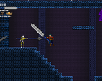
The big weapons i wanted to have as a bit of a nod to Aria of Sorrow and some of the crazy big swords you had in there, however the exploit is unintentionnal cause i didn't know how i could prevent a hitbox to get stopped by walls without it being a solid object that could get in the way of movements or animations so i'll have to investigate how i could solve that.
Definitively the knife throwers have been the biggest issue from feedback so far so like i said i'll probably combine both fix proposals into one, have them shoot slower and have them stop attacking constantly when in range to give the player a chance to get close enough to fight back.
I wanted to have hp drops on enemies but got sidetracked fixing stuff that almost broke near the end.
The boss was completed really last minute so it's super janky and i didn't really thought about having him have a hurt zone at least when he's walking so yeah he is quite exploitable.
Glad you enjoyed the game nonethe less, i figured that for a metroidvania if it's a month long jam, i should try to make the map somewhat big but not quite big enough that poeple would get bored or lost so it was a tough balance to achieve and i'll admit i didn't quite completely achieved it :p
As said I really enjoyed it :)
It was funny as when I found the wall exploit your level design changed for a while to have this big meaty 5-6 tile floors, which stopped me, and i was like aha they know! but then it went back to the 2 tile floors and me chopping shins :D
Haha well i usually try to go for these kind of game breaking mechanics myself when i play a game so i knew this would be exploited to hell and back :p but since i don't know yet how i could prevent collisions going through walls here i did what i could to limit it through level design while knowing poeple would still try to find a way to do it... cause i know i'd do just the same in their place XD
don't mean to jump in here but i noticed the nod to Aria and the second I got that sword I was like "oh hello my old friend, Claimh Solais".
No worries :) and yep that's the sword ! Even if it's not quite as broken as the Claimh Solais, mostly cause i can't imagine the complexity of trying to make a similar Strength/Weakness damage type mechanic especially on a jam deadline considering my still limited dev knowlege :p
although design wise it's also a little nod to Berserk hence the in game name "Zerker" XD
This is impressive work for just one person and the level design is definitely outstanding.
However, as there is a lot of re-use assets, I found myself coming back to the same spot on the map without being really aware of it. That could be easily fixed by adding some small decoration items here and there, that could help players identify their space around tho.
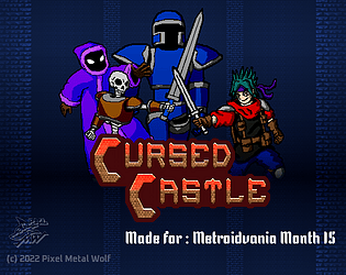
Overall, the game feels really alive and the thumbnail caught my eyes straight away... clearly, you got something powerful between your hands if you want to give it some extra time after the jam!
Thanks a lot ^^
Not sure if the level design deserves such praise but i'm really glad you like it :p
I wanted to have more variety both with enemies and backgrounds but i only managed to do so much for the jam so i had to reuse some stuff, i lost quite some time with experimenting with stuff on this game, as i didn't do any kind of "persistent items" on past entries and had to figure out how to do so during the jam, the only deco item i made is the animated torch in the background but i initially wanted to have more, the best i could do during the jam to help with navigation was to have the area names displayed when you first enter so that the player could have some sense of the layout of the castle, not ideal i'll admit ^_^'
Really happy you like the thumbnail art :D
always nervous to see how people are gonna receive my character designs so it's always nice when they end up liking them :p
I'll see how this goes for post jam if i get the time to at least polish it up a bit and fix the issues.
Thanks again for giving my game a shot, and for your kind words :)
A cool game that almost gives me that castlevania vibe.
It's visually appealing, and the exploration is totally worth the time.
Now for the little setbacks...
some of the enemies attacks are too hard to dodge. For example, the wizard that shoots fireballs at the player, when I'm focused on another enemy, that ends up being a huge challenge. Then there's the knife throwing skeleton, that one throws knives faster than an AK-47.
Maybe slow down the attack speed of some of the enemies a bit.
Nevertheless, it's still a good game.
Thanks ^^
That's the vibe i was going for, i wanted to have a bit more to the exploration (like more weapons and upgrades) but couldn't due to issues with implementing some of the mechanics i tried first time here, and scheduling stuff which made me have to publish a bit earlier to not miss the deadline.
Yeah the enemies are quite unbalanced :/ i tried to have the wizards shoot only after a specific frame of their animation to give time to the player to dodge but this didn't turn out to be a large enough window. The knife throwing skeletons are defenitively too OP but i think the best fix would be combining your suggestion with a previous one from feedback which is having them fire only when the player stands, and reducing their firerate.
Glad you liked the game regardless, thanks again for playing and your feedback :)
Another Godot fellow!
Tbh at first I thought it was too simple and thus boring, but the sheer simplicity of it made me want to grind all the way to the end, so in the end it was a surprisingly fun experience! Congrats on the submission!
Yay Team Godot XD !
Yeah i didn't manage to make some super fun level design mostly cause i lost a lot of time and struggled with some of the purely metroidvania stuff : which is making some items persistent and keeping track of what's collected or not, as well as finding a way to make connected rooms you can go back and forth to.
Glad you stuck with it and had fun in the end ^^ i tried my best to put as much variety as possible with enemies and weapons as i felt this was always a weak aspect of most of my jam entries.
Thanks a lot for playing untill the end, and sharing your thoughts on the experience, as well as the end screen, hope you didn't have too much trouble with my janky boss haha :)
I were sceptic about those Huge Weapons, but turned out to be enjoyable, feels much like Castle Vania.
the Skeletons that are throwing should shop throwing if the player crouches, that's my major Critics!
Fun to play, good Maps and cool visuals but i would improve them still, keep the good work up!
Haha yeah i guess i shouldn't have put so many screens with the big sword XD
Happy that you ended up liking it regardless, i tried my best to nail the Castlevania feel down with the multi weapon system to have it close to similar to the more Rpg entries of the franchise.
Good idea to fix the ranged skeletons, if i go post jam for this game i'll have them attack only when standing.
Agreed also that the maps are not the best, if i didn't lost time ironing out bugs i encountered along the way i would have tried to improve them, even though i admit that level design is not really my strong point ^^'
Thanks for playing and for your feedback :)
man, how cool old man, just missing a map! Congratulations
Thanks ! Glad you liked it, i didn't manage to make a good map system sorry :(
It took a moment to get my bearings straight, but other than that, this game is great. I love the multiple weapon types (except the spear), you had a wide assortment of enemies (those wizards tore through me like wet toilet paper), and the controls felt perfect. The art was really well done as well. It really felt like a perfect mix between Castlevania 3 and Symphony of the Night. Great job!
Thanks for giving my entry a go :)
Glad you liked the weapons, it took me a while to try and make an Ok ish system inspired by the Castlevania games that let you have multiple weapons, i tried to have some variety, even though if i could i would have made even more weapons.
Enemies i also wanted to have a bit more variety so here i tried something new as well, and no worries, the wizards are a bit too tough, the fun fact is that the ones that made it for the jam are just the base ones, i had planned to have them have some other variants as well but couldn't finish in time so they just have their palette swaps in the files but are not used :p but yeah most enemies are not very well balanced, even if i playtested a bit more this time around.
Anyway happy that you like the art ^^ while my sprites are nowhere near as detailedas the Sotn ones that's for sure, but i did my best to have them look good XD
Really Cool! Love the art!
Thanks for playing ! Happy that you love the art :D